Developer News
So, You Want to Give Up CSS Pre- and Post-Processors…
There was once upon a time when native CSS lacked many essential features, leaving developers to come up with all sorts of ways to make CSS easier to write over the years.
These ways can mostly be categorized into two groups:
- Pre-processors
- Post-processors
Pre-processors include tools like Sass, Less, and Stylus. Like what the category’s name suggests, these tools let you write CSS in their syntax before compiling your code into valid CSS.
Post-processors work the other way — you write non-valid CSS syntax into a CSS file, then post-processors will change those values into valid CSS.
There are two major post-processors today:
- PostCSS
- LightningCSS
PostCSS is the largest kid on the block while Lightning CSS is a new and noteworthy one. We’ll talk about them both in a bit.
I think post-processors have won the compiling gamePost-processors have always been on the verge of winning since PostCSS has always been a necessary tool in the toolchain.
The most obvious (and most useful) PostCSS plugin for a long time is Autoprefixer — it creates vendor prefixes for you so you don’t have to deal with them.
/* Input */ .selector { transform: /* ... */; } .selector { -webkit-transform: /* ... */; transform: /* ... */; }Arguably, we don’t need Autoprefixer much today because browsers are more interopable, but nobody wants to go without Autoprefixer because it eliminates our worries about vendor prefixing.
What has really tilted the balance towards post-processors includes:
- Native CSS gaining essential features
- Tailwind removing support for pre-processors
- Lightning CSS
Let me expand on each of these.
Native CSS gaining essential featuresCSS pre-processors existed in the first place because native CSS lacked features that were critical for most developers, including:
- CSS variables
- Nesting capabilities
- Allowing users to break CSS into multiple files without additional fetch requests
- Conditionals like if and for
- Mixins and functions
Native CSS has progressed a lot over the years. It has gained great browser support for the first two features:
- CSS Variables
- Nesting
With just these two features, I suspect a majority of CSS users won’t even need to fire up pre-processors or post-processors. What’s more, The if() function is coming to CSS in the future too.
But, for the rest of us who needs to make maintenance and loading performance a priority, we still need the third feature — the ability to break CSS into multiple files. This can be done with Sass’s use feature or PostCSS’s import feature (provided by the postcss-import plugin).
PostCSS also contains plugins that can help you create conditionals, mixins, and functions should you need them.
Although, from my experience, mixins can be better replaced with Tailwind’s @apply feature.
This brings us to Tailwind.
Tailwind removing support for pre-processorsTailwind 4 has officially removed support for pre-processors. From Tailwind’s documentation:
Tailwind CSS v4.0 is a full-featured CSS build tool designed for a specific workflow, and is not designed to be used with CSS pre-processors like Sass, Less, or Stylus. Think of Tailwind CSS itself as your pre-processor — you shouldn’t use Tailwind with Sass for the same reason you wouldn’t use Sass with Stylus. Since Tailwind is designed for modern browsers, you actually don’t need a pre-processor for things like nesting or variables, and Tailwind itself will do things like bundle your imports and add vendor prefixes.
If you included Tailwind 4 via its most direct installation method, you won’t be able to use pre-processors with Tailwind.
@import `tailwindcss`That’s because this one import statement makes Tailwind incompatible with Sass, Less, and Stylus.
But, (fortunately), Sass lets you import CSS files if the imported file contains the .css extension. So, if you wish to use Tailwind with Sass, you can. But it’s just going to be a little bit wordier.
@layer theme, base, components, utilities; @import "tailwindcss/theme.css" layer(theme); @import "tailwindcss/preflight.css" layer(base); @import "tailwindcss/utilities.css" layer(utilities);Personally, I dislike Tailwind’s preflight styles so I exclude them from my files.
@layer theme, base, components, utilities; @import 'tailwindcss/theme.css' layer(theme); @import 'tailwindcss/utilities.css' layer(utilities);Either way, many people won’t know you can continue to use pre-processors with Tailwind. Because of this, I suspect pre-processors will get less popular as Tailwind gains more momentum.
Now, beneath Tailwind is a CSS post-processor called Lightning CSS, so this brings us to talking about that.
Lightning CSSLightning CSS is a post-processor can do many things that a modern developer needs — so it replaces most of the PostCSS tool chain including:
Besides having a decent set of built-in features, it wins over PostCSS because it’s incredibly fast.
Lightning CSS is over 100 times faster than comparable JavaScript-based tools. It can minify over 2.7 million lines of code per second on a single thread.
Speed helps Lightning CSS win since many developers are speed junkies who don’t mind switching tools to achieve reduced compile times. But, Lightning CSS also wins because it has great distribution.
It can be used directly as a Vite plugin (that many frameworks support). Ryan Trimble has a step-by-step article on setting it up with Vite if you need help.
// vite.config.mjs export default { css: { transformer: 'lightningcss' }, build: { cssMinify: 'lightningcss' } };If you need other PostCSS plugins, you can also include that as part of the PostCSS tool chain.
// postcss.config.js // Import other plugins... import lightning from 'postcss-lightningcss' export default { plugins: [lightning, /* Other plugins */], }Many well-known developers have switched to Lightning CSS and didn’t look back. Chris Coyier says he’ll use a “super basic CSS processing setup” so you can be assured that you are probably not stepping in any toes if you wish to switch to Lightning, too.
If you wanna ditch pre-processors todayYou’ll need to check the features you need. Native CSS is enough for you if you need:
- CSS Variables
- Nesting capabilities
Lightning CSS is enough for you if you need:
- CSS Variables
- Nesting capabilities
- import statements to break CSS into multiple files
Tailwind (with @apply) is enough for you if you need:
- all of the above
- Mixins
If you still need conditionals like if, for and other functions, it’s still best to stick with Sass for now. (I’ve tried and encountered interoperability issues between postcss-for and Lightning CSS that I shall not go into details here).
That’s all I want to share with you today. I hope it helps you if you have been thinking about your CSS toolchain.
So, You Want to Give Up CSS Pre- and Post-Processors… originally published on CSS-Tricks, which is part of the DigitalOcean family. You should get the newsletter.
Using CSS backdrop-filter for UI Effects
This article covers tips and tricks on effectively utilizing the CSS backdrop-filter property to style contemporary user interfaces. You’ll learn how to layer backdrop filters among multiple elements, and integrate them with other CSS graphical effects to create elaborate designs.
Below is a hodgepodge sample of what you can build based on everything we’ll cover in this article. More examples are coming up.
CodePen Embed FallbackThe blurry, frosted glass effect is popular with developers and designers these days — maybe because Josh Comeau wrote a deep-dive about it somewhat recently — so that is what I will base my examples on. However, you can apply everything you learn here to any relevant filter. I’ll also be touching upon a few of them in my examples.
What’s essential in a backdrop filter?If you’re familiar with CSS filter functions like blur() and brightness(), then you’re also familiar with backdrop filter functions. They’re the same. You can find a complete list of supported filter functions here at CSS-Tricks as well as over at MDN.
The difference between the CSS filter and backdrop-filter properties is the affected part of an element. Backdrop filter affects the backdrop of an element, and it requires a transparent or translucent background in the element for its effect to be visible. It’s important to remember these fundamentals when using a backdrop filter, for these reasons:
- to decide on the aesthetics,
- to be able to layer the filters among multiple elements, and
- to combine filters with other CSS effects.
Design is subjective, but a little guidance can be helpful. If you’ve applied a blur filter to a plain background and felt the result was unsatisfactory, it could be that it needed a few embellishments, like shadows, or more often than not, it’s because the backdrop is too plain.
Plain backdrops can be enhanced with filters like brightness(), contrast(), and invert(). Such filters play with the luminosity and hue of an element’s backdrop, creating interesting designs. Textured backdrops complement distorting filters like blur() and opacity().
<main> <div> <section> <h1>Weather today</h1> Cloudy with a chance of meatballs. Ramenstorms at 3PM that will last for ten minutes. </section> </div> </main> main { background: center/cover url("image.jpg"); box-shadow: 0 0 10px rgba(154 201 255 / 0.6); /* etc. */ div { backdrop-filter: blur(10px); color: white; /* etc. */ } } CodePen Embed Fallback Layering elements with backdrop filtersAs we just discussed, backdrop filters require an element with a transparent or translucent background so that everything behind it, with the filters applied, is visible.
If you’re applying backdrop filters on multiple elements that are layered above one another, set a translucent (not transparent) background to all elements except the bottommost one, which can be transparent or translucent, provided it has a backdrop. Otherwise, you won’t see the desired filter buildup.
<main> <div> <section> <h1>Weather today</h1> Cloudy with a chance of meatballs. Ramenstorms at 3PM that will last for ten minutes. </section> <p>view details</p> </div> </main> main { background: center/cover url("image.jpg"); box-shadow: 0 0 10px rgba(154 201 255 / 0.6); /* etc. */ div { background: rgb(255 255 255 / .1); backdrop-filter: blur(10px); /* etc. */ p { backdrop-filter: brightness(0) contrast(10); /* etc. */ } } } CodePen Embed Fallback Combining backdrop filters with other CSS effectsWhen an element meets a certain criterion, it gets a backdrop root (not yet a standardized name). One criterion is when an element has a filter effect (from filter and background-filter). I believe backdrop filters can work well with other CSS effects that also use a backdrop root because they all affect the same backdrop.
Of those effects, I find two interesting: mask and mix-blend-mode. Combining backdrop-filter with mask resulted in the most reliable outcome across the major browsers in my testing. When it’s done with mix-blend-mode, the blur backdrop filter gets lost, so I won’t use it in my examples. However, I do recommend exploring mix-blend-mode with backdrop-filter.
Backdrop filter with maskUnlike backdrop-filter, CSS mask affects the background and foreground (made of descendants) of an element. We can use that to our advantage and work around it when it’s not desired.
<main> <div> <div class="bg"></div> <section> <h1>Weather today</h1> Cloudy with a chance of meatballs. Ramenstorms at 3PM that will last for ten minutes. </section> </div> </main> main { background: center/cover url("image.jpg"); box-shadow: 0 0 10px rgba(154 201 255 / 0.6); /* etc. */ > div { .bg { backdrop-filter: blur(10px); mask-image: repeating-linear-gradient(90deg, transparent, transparent 2px, white 2px, white 10px); /* etc. */ } /* etc. */ } } CodePen Embed Fallback Backdrop filter for the foregroundWe have the filter property to apply graphical effects to an element, including its foreground, so we don’t need backdrop filters for such instances. However, if you want to apply a filter to a foreground element and introduce elements within it that shouldn’t be affected by the filter, use a backdrop filter instead.
<main> <div class="photo"> <div class="filter"></div> </div> <!-- etc. --> </main> .photo { background: center/cover url("photo.jpg"); .filter { backdrop-filter: blur(10px) brightness(110%); mask-image: radial-gradient(white 5px, transparent 6px); mask-size: 10px 10px; transition: backdrop-filter .3s linear; /* etc.*/ } &:hover .filter { backdrop-filter: none; mask-image: none; } }In the example below, hover over the blurred photo.
CodePen Embed FallbackThere are plenty of ways to play with the effects of the CSS backdrop-filter. If you want to layer the filters across stacked elements then ensure the elements on top are translucent. You can also combine the filters with other CSS standards that affect an element’s backdrop. Once again, here’s the set of UI designs I showed at the beginning of the article, that might give you some ideas on crafting your own.
CodePen Embed Fallback References- backdrop-filter (CSS-Tricks)
- backdrop-filter (MDN)
- Backdrop root (CSS Filter Effects Module Level 2)
- Filter functions (MDN)
Using CSS backdrop-filter for UI Effects originally published on CSS-Tricks, which is part of the DigitalOcean family. You should get the newsletter.
Next Level CSS Styling for Cursors
The cursor is a staple of the desktop interface but is scarcely touched by websites. This is for good reason. People expect their cursors to stay fairly consistent, and meddling with them can unnecessarily confuse users. Custom cursors also aren’t visible for people using touch interfaces — which excludes the majority of people.
Geoff has already covered styling cursors with CSS pretty comprehensively in “Changing the Cursor with CSS for Better User Experience (or Fun)” so this post is going to focus on complex and interesting styling.
Custom cursors with JavaScriptCustom cursors with CSS are great, but we can take things to the next level with JavaScript. Using JavaScript, we can use an element as our cursor, which lets us style it however we would anything else. This lets us transition between cursor states, place dynamic text within the cursor, apply complex animations, and apply filters.
In its most basic form, we just need a div that continuously positions itself to the cursor location. We can do this with the mousemove event listener. While we’re at it, we may as well add a cool little effect when clicking via the mousedown event listener.
CodePen Embed FallbackThat’s wonderful. Now we’ve got a bit of a custom cursor going that scales on click. You can see that it is positioned based on the mouse coordinates relative to the page with JavaScript. We do still have our default cursor showing though, and it is important for our new cursor to indicate intent, such as changing when hovering over something clickable.
We can disable the default cursor display completely by adding the CSS rule cursor: none to *. Be aware that some browsers will show the cursor regardless if the document height isn’t 100% filled.
We’ll also need to add pointer-events: none to our cursor element to prevent it from blocking our interactions, and we’ll show a custom effect when hovering certain elements by adding the pressable class.
CodePen Embed FallbackVery nice. That’s a lovely little circular cursor we’ve got here.
Fallbacks, accessibility, and touchscreensPeople don’t need a cursor when interacting with touchscreens, so we can disable ours. And if we’re doing really funky things, we might also wish to disable our cursor for users who have the prefers-reduced-motion preference set.
We can do this without too much hassle:
CodePen Embed FallbackWhat we’re doing here is checking if the user is accessing the site with a touchscreen or if they prefer reduced motion and then only enabling the custom cursor if they aren’t. Because this is handled with JavaScript, it also means that the custom cursor will only show if the JavaScript is active, otherwise falling back to the default cursor functionality as defined by the browser.
const isTouchDevice = "ontouchstart"in window || navigator.maxTouchPoints > 0; const prefersReducedMotion = window.matchMedia("(prefers-reduced-motion: reduce)").matches; if (!isTouchDevice && !prefersReducedMotion && cursor) { // Cursor implementation is here }Currently, the website falls back to the default cursors if JavaScript isn’t enabled, but we could set a fallback cursor more similar to our styled one with a bit of CSS. Progressive enhancement is where it’s at!
Here we’re just using a very basic 32px by 32px base64-encoded circle. The 16 values position the cursor hotspot to the center.
html { cursor: url("data:image/svg+xml;base64,PHN2ZyB4bWxucz0iaHR0cDovL3d3dy53My5vcmcvMjAwMC9zdmciIHdpZHRoPSIzMiIgaGVpZ2h0PSIzMiIgdmlld0Jve D0iMCAwIDMyIDMyIj4KICA8Y2lyY2xlIGN4PSIxNiIgY3k9IjE2IiByPSIxNiIgZmlsbD0iYmxhY2siIC8+Cjwvc3ZnPg==") 16 16, auto; } Taking this furtherObviously this is just the start. You can go ballistic and completely overhaul the cursor experience. You can make it invert what is behind it with a filter, you can animate it, you could offset it from its actual location, or anything else your heart desires.
As a little bit of inspiration, some really cool uses of custom cursors include:
- Studio Mesmer switches out the default cursor for a custom eye graphic when hovering cards, which is tasteful and fits their brand.
- Iara Grinspun’s portfolio has a cursor implemented with JavaScript that is circular and slightly delayed from the actual position which makes it feel floaty.
- Marlène Bruhat’s portfolio has a sleek cursor that is paired with a gradient that appears behind page elements.
- Aleksandr Yaremenko’s portfolio features a cursor that isn’t super complex but certainly stands out as a statement piece.
- Terra features a giant glowing orb containing text describing what you’re hovering over.
Please do take care when replacing browser or native operating system features in this manner. The web is accessible by default, and we should take care to not undermine this. Use your power as a developer with taste and restraint.
Next Level CSS Styling for Cursors originally published on CSS-Tricks, which is part of the DigitalOcean family. You should get the newsletter.
CSS-Tricks Chronicles XLIII
Normally, I like to publish one of these updates every few months. But seeing as the last one dates back to September of last year, I’m well off that mark and figured it’s high time to put pen to paper. The fact is that a lot is happening around here at CSS-Tricks — and it’s all good stuff.
The Almanac is rollingIn the last post of 2024, I said that filling the Almanac was a top priority heading into this year. We had recently refreshed the whole dang thing, complete with completely new sections for documenting CSS selectors, at-rules, and functions on top of the sections we already had for properties and pseudo-selectors. The only problem is that those new sections were pretty bare.
Well, not only has this team stepped up to produce a bunch of new content for those new sections, but so have you. Together, we’ve published 21 new Almanac entries since the start of 2025. Here they are in all their glory:
- animation-timeline
- interpolate-size
- overlay
- @charset
- @counter-style
- @import
- @keyframes
- @namspace
- @page
- @view-transition
- attr()
- calc-size()
- counter()
- counters()
- hsl()
- lab()
- lch()
- light-dark()
- oklch()
- rgb()
- symbols()
What’s even better? There are currently fourteen more in the hopper that we’re actively working on. I certainly do not expect us to sustain this sort of pace all year. A lot of work goes into each and every entry. Plus, if all we ever did was write in Almanac, we would never get new articles and tutorials out to you, which is really what we’re all about around here.
A lot of podcasts and eventsThose of you who know me know that I’m not the most social person in all the land. Yes, I like hanging out with folks and all that, but I tend to keep my activities to back-of-the-house stuff and prefer to stay out of view.
So, that’s why it’s weird for me to call out a few recent podcast and event appearances. It’s not like I do these things all that often, but they are fun and I like to note them, even if its only for posterity.
- I hosted Smashing Meets Accessibility, a mini online conference that featured three amazing speakers talking about the ins and outs of WCAG conformance, best practices, and incredible personal experiences shaped by disability.
- I hosted Smashing Meets CSS, another mini conference from the wonderful Smashing Magazine team. I got to hang out with Adam Argyle, Julia Micene, and Miriam Suzanne, all of whom blew my socks off with their presentations and panel discussion on what’s new and possible in modern CSS.
- I’m co-hosting a brand-new podcast with Brad Frost called Open Up! We recorded the first episode live in front of an audience that was allowed to speak up and participate in the conversation. The whole idea of the show is that we talk more about the things we tend to talk less about in our work as web designers and developers — the touchy-feely side of what we do. We covered so many heady topics, from desperation during layoffs to rediscovering purpose in your work.
- I was a guest on the Mental Health in Tech podcast, joining a panel of other front-enders to discuss angst in the face of recent technological developments. The speed and constant drive to market new technologies is dizzying and, to me at least, off-putting to the extent that I’ve questioned my entire place in it as a developer. What a blast getting to return to the podcast a second time and talk shop with a bunch of the most thoughtful, insightful people you’ll ever hear. I’ll share that when it’s published.
We published it just the other week! I’ll be honest and say that a complete guide about styling counters in CSS was not the first thing that came to my mind when we started planning new ideas, but I’ll be darned if Juan didn’t demonstrate just how big a topic it is. There are so many considerations when it comes to styling counters — design! accessibility! semantics! — and the number of tools we have in CSS to style them is mind-boggling, including two functions that look very similar but have vastly different capabilities for creating custom counters — counter() and counters() (which are also freshly published in the Almanac).
At the end of last year, I said I hoped to publish 1-2 new guides, and here we are in the first quarter of 2025 with our first one out in the wild! That gives me hope that we’ll be able to get another comprehensive guide out before the end of the year.
AuthorsI think the most exciting update of all is getting to recognize the folks who have published new articles with us since the last update. Please help me extend a huge round of applause to all the faces who have rolled up their sleeves and shared their knowledge with us.
- Lee Meyer
- Zell Liew
- Andy Clarke (I can’t believe it!)
- Temani Afif
- Andy Bell
- Preethi
- Daniel Schwarz
- Bryan Robinson
- Sunkanmi Fafowora
And, of course, nothing on this site would be possible without ongoing help from Juan Diego Rodriguez and Ryan Trimble. Those two not only do a lot of heavy lifting to keep the content machine fed, but they are also just two wonderful people who make my job a lot more fun and enjoyable. Seriously, guys, you mean a lot to this site and me!
CSS-Tricks Chronicles XLIII originally published on CSS-Tricks, which is part of the DigitalOcean family. You should get the newsletter.
Tailwind’s @apply Feature is Better Than it Sounds
By this point, it’s not a secret to most people that I like Tailwind.
But, unknown to many people (who often jump to conclusions when you mention Tailwind), I don’t like vanilla Tailwind. In fact, I find most of it horrible and I shall refrain from saying further unkind words about it.
But I recognize and see that Tailwind’s methodology has merits — lots of them, in fact — and they go a long way to making your styles more maintainable and performant.
Today, I want to explore one of these merit-producing features that has been severely undersold — Tailwind’s @apply feature.
What @apply doesTailwind’s @apply features lets you “apply” (or simply put, copy-and-paste) a Tailwind utility into your CSS.
Most of the time, people showcase Tailwind’s @apply feature with one of Tailwind’s single-property utilities (which changes a single CSS declaration). When showcased this way, @apply doesn’t sound promising at all. It sounds downright stupid. So obviously, nobody wants to use it.
/* Input */ .selector { @apply p-4; } /* Output */ .selector { padding: 1rem; }To make it worse, Adam Wathan recommends against using @apply, so the uptake couldn’t be worse.
Confession: The `apply` feature in Tailwind basically only exists to trick people who are put off by long lists of classes into trying the framework.
You should almost never use it 😬
Reuse your utility-littered HTML instead.https://t.co/x6y4ksDwrt
Personally, I think Tailwind’s @apply feature is better than described.
Tailwind’s @apply is like Sass’s @includesIf you have been around during the time where Sass is the dominant CSS processing tool, you’ve probably heard of Sass mixins. They are blocks of code that you can make — in advance — to copy-paste into the rest of your code.
- To create a mixin, you use @mixin
- To use a mixin, you use @includes
Tailwind’s @apply feature works the same way. You can define Tailwind utilities in advance and use them later in your code.
/* Defining the utility */ @utility some-utility { color: red; background: blue; } /* Applying the utility */ .selector { @apply some-utility; } /* Output */ .selector { color: red; background: blue; } Tailwind utilities are much better than Sass mixinsTailwind’s utilities can be used directly in the HTML, so you don’t have to write a CSS rule for it to work.
@utility some-utility { color: red; background: blue; } <div class="some-utility">...</div>On the contrary, for Sass mixins, you need to create an extra selector to house your @includes before using them in the HTML. That’s one extra step. Many of these extra steps add up to a lot.
@mixin some-mixin() { color: red; background: blue; } .selector { @include some-mixin(); } /* Output */ .selector { color: red; background: blue; } <div class="selector">...</div>Tailwind’s utilities can also be used with their responsive variants. This unlocks media queries straight in the HTML and can be a superpower for creating responsive layouts.
<div class="utility1 md:utility2">…</div> A simple and practical exampleOne of my favorite — and most easily understood — examples of all time is a combination of two utilities that I’ve built for Splendid Layouts (a part of Splendid Labz):
- vertical: makes a vertical layout
- horizontal: makes a horizontal layout
Defining these two utilities is easy.
- For vertical, we can use flexbox with flex-direction set to column.
- For horizontal, we use flexbox with flex-direction set to row.
After defining these utilities, we can use them directly inside the HTML. So, if we want to create a vertical layout on mobile and a horizontal one on tablet or desktop, we can use the following classes:
<div class="vertical sm:horizontal">...</div>For those who are new to Tailwind, sm: here is a breakpoint variant that tells Tailwind to activate a class when it goes beyond a certain breakpoint. By default, sm is set to 640px, so the above HTML produces a vertical layout on mobile, then switches to a horizontal layout at 640px.
Open Live DemoIf you prefer traditional CSS over composing classes like the example above, you can treat @apply like Sass @includes and use them directly in your CSS.
<div class="your-layout">...</div> .your-layout { @apply vertical; @media (width >= 640px) { @apply horizontal; } }The beautiful part about both of these approaches is you can immediately see what’s happening with your layout — in plain English — without parsing code through a CSS lens. This means faster recognition and more maintainable code in the long run.
Tailwind’s utilities are a little less powerful compared to Sass mixinsSass mixins are more powerful than Tailwind utilities because:
- They let you use multiple variables.
- They let you use other Sass features like @if and @for loops.
On the other hand, Tailwind utilities don’t have these powers. At the very maximum, Tailwind can let you take in one variable through its functional utilities.
/* Tailwind Functional Utility */ @utility tab-* { tab-size: --value(--tab-size-*); }Fortunately, we’re not affected by this “lack of power” much because we can take advantage of all modern CSS improvements — including CSS variables. This gives you a ton of room to create very useful utilities.
Let’s go through another exampleA second example I often like to showcase is the grid-simple utility that lets you create grids with CSS Grid easily.
We can declare a simple example here:
@utility grid-simple { display: grid; grid-template-columns: repeat(var(--cols), minmax(0, 1fr)); gap: var(--gap, 1rem); }By doing this, we have effectively created a reusable CSS grid (and we no longer have to manually declare minmax everywhere).
After we have defined this utility, we can use Tailwind’s arbitrary properties to adjust the number of columns on the fly.
<div class="grid-simple [--cols:3]"> <div class="item">...</div> <div class="item">...</div> <div class="item">...</div> </div>To make the grid responsive, we can add Tailwind’s responsive variants with arbitrary properties so we only set --cols:3 on a larger breakpoint.
<div class="grid-simple sm:[--cols:3]"> <div class="item">...</div> <div class="item">...</div> <div class="item">...</div> </div> Open Live DemoThis makes your layouts very declarative. You can immediately tell what’s going on when you read the HTML.
Now, on the other hand, if you’re uncomfortable with too much Tailwind magic, you can always use @apply to copy-paste the utility into your CSS. This way, you don’t have to bother writing repeat and minmax declarations every time you need a grid that grid-simple can create.
.your-layout { @apply grid-simple; @media (width >= 640px) { --cols: 3; } } <div class="your-layout"> ... </div>By the way, using @apply this way is surprisingly useful for creating complex layouts! But that seems out of scope for this article, so I’ll be happy to show you an example another day.
Wrapping upTailwind’s utilities are very powerful by themselves, but they’re even more powerful if you allow yourself to use @apply (and allow yourself to detach from traditional Tailwind advice). By doing this, you gain access to Tailwind as a tool instead of it being a dogmatic approach.
To make Tailwind’s utilities even more powerful, you might want to consider building utilities that can help you create layouts and nice visual effects quickly and easily.
I’ve built a handful of these utilities for Splendid Labz, and I’m happy to share them with you if you’re interested! Just check out Splendid Layouts to see a subset of the utilities I’ve prepared.
By the way, the utilities I showed you above are watered-down versions of the actual ones I’m using in Splendid Labz.
One more note: When writing this, Splendid Layouts work with Tailwind 3, not Tailwind 4. I’m working on a release soon, so sign up for updates if you’re interested!
Unorthodox TailwindYou can probably tell by now that I’m using Tailwind in an unorthodox manner — one that CSS-loving people will likely enjoy. I’m writing up my detailed methodology where I share everything I know about making Tailwind work synergistically with CSS. If you enjoyed this post, you might enjoy Unorthodox Tailwind. It’s still in pre-order mode, so get $20 off for a limited time.
Tailwind’s @apply Feature is Better Than it Sounds originally published on CSS-Tricks, which is part of the DigitalOcean family. You should get the newsletter.
Cascading Layouts: A Workshop on Resilient CSS Layouts
If I were starting with CSS today for the very first time, I would first want to spend time understanding writing modes because that’s a great place to wrap your head around direction and document flow. But right after that, and even more excitedly so, I would jump right into display and get a firm grasp on layout strategies.
And where would I learn that? There are lots of great resources out there. I mean, I have a full course called The Basics that gets into all that. I’d say you’d do yourself justice getting that from Andy Bell’s Complete CSS course as well.
But, hey, here’s a brand new way to bone up on layout: Miriam Suzanne is running a workshop later this month. Cascading Layouts is all about building more resilient and maintainable web layouts using modern CSS, without relying on third-party tools. Remember, Miriam works on CSS specifications, is a core contributor to Sass, and is just plain an all-around great educator. There are few, if any, who are more qualified to cover the ins and outs of CSS layout, and I can tell you that her work really helped inspire and inform the content in my course. The workshop is online, runs April 28-30, and is a whopping $ 100 off if you register by April 12.
Just a taste of what’s included:
Cascading Layouts: A Workshop on Resilient CSS Layouts originally published on CSS-Tricks, which is part of the DigitalOcean family. You should get the newsletter.
CSS Carousels
The CSS Overflow Module Level 5 specification defines a couple of new features that are designed for creating carousel UI patterns:
- Scroll Buttons: Buttons that the browser provides, as in literal <button> elements, that scroll the carousel content 85% of the area when clicked.
- Scroll Markers: The little dots that act as anchored links, as in literal <a> elements that scroll to a specific carousel item when clicked.
Chrome has prototyped these features and released them in Chrome 135. Adam Argyle has a wonderful explainer over at the Chrome Developer blog. Kevin Powell has an equally wonderful video where he follows the explainer. This post is me taking notes from them.
First, some markup:
<ul class="carousel"> <li>...</li> <li>...</li> <li>...</li> <li>...</li> <li>...</li> </ul>First, let’s set these up in a CSS auto grid that displays the list items in a single line:
.carousel { display: grid; grid-auto-flow: column; }We can tailor this so that each list item takes up a specific amount of space, say 40%, and insert a gap between them:
.carousel { display: grid; grid-auto-flow: column; grid-auto-columns: 40%; gap: 2rem; }This gives us a nice scrolling area to advance through the list items by moving left and right. We can use CSS Scroll Snapping to ensure that scrolling stops on each item in the center rather than scrolling right past them.
.carousel { display: grid; grid-auto-flow: column; grid-auto-columns: 40%; gap: 2rem; scroll-snap-type: x mandatory; > li { scroll-snap-align: center; } }Kevin adds a little more flourish to the .carousel so that it is easier to see what’s going on. Specifically, he adds a border to the entire thing as well as padding for internal spacing.
So far, what we have is a super simple slider of sorts where we can either scroll through items horizontally or click the left and right arrows in the scroller.
We can add scroll buttons to the mix. We get two buttons, one to navigate one direction and one to navigate the other direction, which in this case is left and right, respectively. As you might expect, we get two new pseudo-elements for enabling and styling those buttons:
- ::scroll-button(left)
- ::scroll-button(right)
Interestingly enough, if you crack open DevTools and inspect the scroll buttons, they are actually exposed with logical terms instead, ::scroll-button(inline-start) and ::scroll-button(inline-end).
And both of those support the CSS content property, which we use to insert a label into the buttons. Let’s keep things simple and stick with “Left” and “Right” as our labels for now:
.carousel::scroll-button(left) { content: "Left"; } .carousel::scroll-button(right) { content: "Right"; }Now we have two buttons above the carousel. Clicking them either advances the carousel left or right by 85%. Why 85%? I don’t know. And neither does Kevin. That’s just what it says in the specification. I’m sure there’s a good reason for it and we’ll get more light shed on it at some point.
But clicking the buttons in this specific example will advance the scroll only one list item at a time because we’ve set scroll snapping on it to stop at each item. So, even though the buttons want to advance by 85% of the scrolling area, we’re telling it to stop at each item.
Remember, this is only supported in Chrome at the time of writing:
CodePen Embed FallbackWe can select both buttons together in CSS, like this:
.carousel::scroll-button(left), .carousel::scroll-button(right) { /* Styles */ }Or we can use the Universal Selector:
.carousel::scroll-button(*) { /* Styles */ }And we can even use newer CSS Anchor Positioning to set the left button on the carousel’s left side and the right button on the carousel’s right side:
.carousel { /* ... */ anchor-name: --carousel; /* define the anchor */ } .carousel::scroll-button(*) { position: fixed; /* set containment on the target */ position-anchor: --carousel; /* set the anchor */ } .carousel::scroll-button(left) { content: "Left"; position-area: center left; } .carousel::scroll-button(right) { content: "Right"; position-area: center right; }Notice what happens when navigating all the way to the left or right of the carousel. The buttons are disabled, indicating that you have reached the end of the scrolling area. Super neat! That’s something that is normally in JavaScript territory, but we’re getting it for free.
CodePen Embed FallbackLet’s work on the scroll markers, or those little dots that sit below the carousel’s content. Each one is an <a> element anchored to a specific list item in the carousel so that, when clicked, you get scrolled directly to that item.
We get a new pseudo-element for the entire group of markers called ::scroll-marker-group that we can use to style and position the container. In this case, let’s set Flexbox on the group so that we can display them on a single line and place gaps between them in the center of the carousel’s inline size:
.carousel::scroll-marker-group { display: flex; justify-content: center; gap: 1rem; }We also get a new scroll-marker-group property that lets us position the group either above (before) the carousel or below (after) it:
.carousel { /* ... */ scroll-marker-group: after; /* displayed below the content */ }We can style the markers themselves with the new ::scroll-marker pseudo-element:
.carousel { /* ... */ > li::scroll-marker { content: ""; aspect-ratio: 1; border: 2px solid CanvasText; border-radius: 100%; width: 20px; } }When clicking on a marker, it becomes the “active” item of the bunch, and we get to select and style it with the :target-current pseudo-class:
li::scroll-marker:target-current { background: CanvasText; }Take a moment to click around the markers. Then take a moment using your keyboard and appreciate that we can all of the benefits of focus states as well as the ability to cycle through the carousel items when reaching the end of the markers. It’s amazing what we’re getting for free in terms of user experience and accessibility.
CodePen Embed FallbackWe can further style the markers when they are hovered or in focus:
li::scroll-marker:hover, li::scroll-marker:focus-visible { background: LinkText; }And we can “animate” the scrolling effect by setting scroll-behavior: smooth on the scroll snapping. Adam smartly applies it when the user’s motion preferences allow it:
.carousel { /* ... */ @media (prefers-reduced-motion: no-preference) { scroll-behavior: smooth; } }Buuuuut that seems to break scroll snapping a bit because the scroll buttons are attempting to slide things over by 85% of the scrolling space. Kevin had to fiddle with his grid-auto-columns sizing to get things just right, but showed how Adam’s example took a different sizing approach. It’s a matter of fussing with things to get them just right.
CodePen Embed FallbackThis is just a super early look at CSS Carousels. Remember that this is only supported in Chrome 135+ at the time I’m writing this, and it’s purely experimental. So, play around with it, get familiar with the concepts, and then be open-minded to changes in the future as the CSS Overflow Level 5 specification is updated and other browsers begin building support.
CSS Carousels originally published on CSS-Tricks, which is part of the DigitalOcean family. You should get the newsletter.
Feeling Like I Have No Release: A Journey Towards Sane Deployments
When I was young and dinosaurs walked the earth, I worked on a software team that developed a web-based product for two years before ever releasing it. I don’t just mean we didn’t make it publicly available; we didn’t deploy it anywhere except for a test machine in the office, accessed by two internal testers, and this required a change to each tester’s hosts file. You don’t have to be an agile evangelist to spot the red flag. There’s “release early, release often,” which seemed revolutionary the first time I heard it after living under a waterfall for years, or there’s building so much while waiting so long to deploy that you guarantee weird surprises in a realistic deployment, let alone when you get feedback from real users. I’m told the first deployment experience to a web farm was very special.
A tale of a dodgy deploymentBeing a junior, I was spared being involved in the first deployment. But towards the end of the first three-month cycle of fixes, the team leader asked me, “Would you be available on Tuesday at 2 a.m. to come to the office and do a deployment?”
“Yep, sure, no worries.” I went home thinking what a funny dude my team leader was.
So on Tuesday at 9 a.m., I show up and say good morning to the team leader and the architect, who sit together staring at one computer. I sit down at my dev machine and start typing.
“Man, what happened?” the team leader says over the partition. “You said you’d be here at 2 a.m.”
I look at him and see he is not smiling. I say, ”Oh. I thought you were joking.”
“I was not joking, and we have a massive problem with the deployment.”
Uh-oh.
I was junior and did not have the combined forty years of engineering experience of the team leader and architect, but what I had that they lacked was a well-rested brain, so I found the problem rather quickly: It was a code change the dev manager had made to the way we handled cookies, which didn’t show a problem on the internal test server but broke the world on the real web servers. Perhaps my finding the issue was the only thing that saved me from getting a stern lecture. By the time I left years later, it was just a funny story the dev manager shared in my farewell speech, along with nice compliments about what I had achieved for the company — I also accepted an offer to work for the company again later.
Breaking news: Human beings need sleepI am sure the two seniors would have been capable of spotting the problem under different circumstances. They had a lot working against them: Sleep deprivation, together with the miscommunication about who would be present, would’ve contributed to feelings of panic, which the outage would’ve exacerbated after they powered through and deployed without me. More importantly, they didn’t know whether the problem was in the new code or human error in their manual deployment process of copying zipped binaries and website files to multiple servers, manually updating config files, comparing and updating database schemas — all in the wee hours of the morning.
They were sleepily searching for a needle in a haystack of their own making. The haystack wouldn’t have existed if they had a proven automated deployment process, and if they could be sure the problem could only reside in the code they deployed. There was no reason everything they were doing couldn’t be scripted. They could’ve woken up at 6 a.m. instead of 2 a.m. to verify the automated release of the website before shifting traffic to it and fix any problems that became evident in their release without disrupting real users. The company would get a more stable website and the expensive developers would have more time to focus on developing.
If you manually deploy overnight, and then drive, you’re a bloody idiotThe 2 a.m. deployments might seem funny if it wasn’t your night to attend and if you have a dark sense of humor. In the subsequent years, I attended many 2 a.m. deployments to atone for the one I slept through. The company paid for breakfast on those days, and if we proved the deployment was working, we could leave for the day and catch up on sleep, assuming we survived the drive home and didn’t end up sleeping forever.
The manual deployment checklist was perpetually incomplete and out-of-date, yet the process was never blamed for snafus on deployment days. In reality, sometimes it was a direct consequence of the fallibility of manually working from an inaccurate checklist. Sometimes manual deployment wasn’t directly the culprit, but it made pinpointing the problem or deciding whether to roll back unnecessarily challenging. And you knew rolling back would mean forgoing your sleep again the next day so you’d have a mounting sleep debt working against you.
I learned a lot from that team and the complex features I had the opportunity to build. But the deployment process was a step backward from my internship doing Windows programming because in that job I had to write installers so my code would work on user machines, which by nature of the task, I didn’t have access to. When web development removes that inherent limitation, it’s like a devil on your shoulder tempting you to do what seems easy in the moment and update production from your dev machine. You know you want to, especially when the full deployment process is hard and people want a fix straightaway. This is why if you automate deployments, you want to lock things down so that the automated process is the only way to deploy changes.
As I became more senior and had more say in how these processes happened at my workplace, I started researching — and I found it easy to relate to the shots taken at manual deployers, such as this presentation titled “Octopus Deploy and how to stop deploying like an idiot” and Octopus Deploy founder Paul Stovell’s sentiments on how to deploy database updates: “Your database isn’t in source control? You don’t deserve one. Go use Excel.” This approach to giving developers a kick in their complacency reminds me of the long-running anti-drunk driving ads here in Australia with the slogan “If you drink then drive, you’re a bloody idiot,” which scared people straight by insulting them for destructive life choices.
In the “Stop deploying like an idiot” talk, Damian Brady insults a hypothetical deployment manager at Acme Corp named Frank, who keeps being a hero by introducing risk and wasted time to a process that could be automated using Octopus, which would never make stupid mistakes like overwriting the config file.
“Frank’s pretty proud of his process in general,” says Damian. “Frank’s an idiot.”
Why are people like this?Frankly, some of the Franks I have worked with were something worse than idiots. Comedian Jim Jeffries has a bit in which he says he’d take a nice idiot over a clever bastard. Frank’s a cunning bastard wolf in idiotic sheep’s clothing — the demographic of people who work in software shows above average IQ, and a person appointed “deployment manager” will have googled the options to make this task easier, but he chose not to use them. The thing is, Frank gets to seem important, make other devs look and feel stupid when they try to follow his process while he’s on leave, and even when he is working he gets to take overseas trips to hang with clients because he is the only one who can get the product working on a new server. Companies must be careful which behaviors they reward, and Conway’s law applies to deployment processes.
What I learned by being forced to do deployments manuallyTo an extent, the process reflecting hierarchy and division of responsibility is normal and necessary, which is why Octopus Deploy has built-in manual intervention and approval steps. But also, some of the motivations to stick with manual deployments are nonsense. Complex manual deployments are still more widespread than they need to be, which makes me feel bad for the developers who still live like me back in the 2000s — if you call that living.
I guess there is an argument for the team-building experiences in those 2 a.m. deployments, much like deployments in the military sense of the word may teach the troops some valuable life lessons, even if the purported reason for the battle isn’t the real reason, and the costs turn out to be higher than anyone expects.
It reminds me of a tour I had the good fortune to take in 2023 of the Adobe San Jose offices, in which a “Photoshop floor” includes time capsule conference rooms representing different periods in Photoshop’s history, including a 90’s room with a working Macintosh Classic running Photoshop 1.0. The past is an interesting and instructive place to visit but not somewhere you’d want to live in 2025.
Even so, my experience of Flintsones-style deployments gave me an appreciation for the ways a tool like Octopus Deploy automates everything I was forced to do manually in the past, which kept my motivation up when I was working through the teething problems once I was tasked with transforming a manual deployment process into an automated process. This appreciation for the value proposition of a tool like Octopus Deploy was why I later jumped at the opportunity to work for Octopus in 2021.
What I learned working for Octopus DeployThe first thing I noticed was how friendly the devs were and the smoothness of the onboarding process, with only one small manual change to make the code run correctly in Docker on my dev box. The second thing I noticed was that this wasn’t heaven, and there were flaky integration tests, slow builds, and cake file output that hid the informative build errors. In fairness, at the time Octopus was in a period of learning how to upscale. There was a whole project I eventually joined to performance-tune the integration tests and Octopus itself. As an Octopus user, the product had seemed as close to magic as we were likely to find, compared to the hell we had to go through without a proper deployment tool. Yet there’s something heartening about knowing nobody has a flawless codebase, and even Octopus Deploy has some smelly code they have to deal with and suboptimal deployments of some stuff.
Once I made my peace with the fact that there’s no silver bullet that magically and perfectly solves any aspect of software, including deployments, my hot take is that deploying like an idiot comes down to a mismatch between the tools you use to deploy and the reward in complexity reduced versus complexity added. Therefore, one example of deploying like an idiot is the story I opened with, in which team members routinely drove to the office at 2 a.m. to manually deploy a complicated website involving database changes, background processes, web farms, and SLAs. But another example of deploying like an idiot might be a solo developer with a side project who sets up Azure Devops to push to Octopus Deploy and pays more than necessary in money and cognitive load. Indeed, Octopus is a deceptively complex tool that can automate anything, not only deployments, but the complexity comes at the price of a learning curve and the risk of decision fatigue.
For instance, when I used my “sharpening time” (the Octopus term for side-project time) to explore ways to deploy a JavaScript library, I found at least two different ways to do it in Octopus, depending on whether it’s acceptable to automate upgrading all your consumers to the latest version of your library or whether you need more control of versioning per consumer. Sidenote: the Angry Birds Octopus parody that Octopus marketing created to go with my “consumers of your JavaScript library as tenants” article was a highlight of my time at Octopus — I wish we could have made it playable like a Google Doodle.
Nowadays I see automation as a spectrum for how automatic and sophisticated you need things to be, somewhat separate from the choice of tools. The challenge is locating that sweet spot, where automation makes your life easier versus the cost of licensing fees and the time and energy you need to devote to working on the deployment process. Octopus Deploy might be at one end of the spectrum of automated deployments when you need lots of control over a complicated automatic process. On the other end of the spectrum, the guy who runs Can I Use found that adopting git-ftp was a life upgrade from manually copying the modified files to his web server while keeping his process simple and not spending a lot of energy on more sophisticated deployment systems. Somewhere in the middle reside things like Bitbucket Pipelines or GitHub Actions, which are more automated and sophisticated than just git-ftp from your dev machine, but less complicated than Octopus together with TeamCity, which could be overkill on a simple project.
The complexity of deployment might be something to consider when defining your architecture, similar to how planning poker can trigger a business to rethink the value of certain features once they obtain holistic feedback from the team on the overall cost. For instance, you might assume you need a database, but when you factor in the complexity it adds to roll-outs, you may be motivated to rethink whether your use case truly needs a database.
What about serverless? Does serverless solve our problems given it’s supposed to eliminate the need to worry about how the server works?
Reminder: Serverless isn’t serverlessIt should be uncontroversial to say that “serverless” is a misnomer, but how much this inaccuracy matters is debatable. I’ll give this analogy for why I think the name “serverless” is a problem: Early cars had a right to call themselves “horseless carriages” because they were a paradigm shift that meant your carriage could move without a horse. “Driverless cars” shouldn’t be called that, because they don’t remove the need for a driver; it’s just that the driver is an AI. “Self-driving car” is therefore a better name. Self-driving cars often work well, but completely ignoring the limitations of how they work can be fatal. When you unpack the term “serverless,” it’s like a purportedly horseless carriage still pulled by horse — but the driver claims his feeding and handling of the horse will be managed so well, the carriage will be so insulated from neighing and horse flatulence, passengers will feel as if the horse doesn’t exist. My counterargument is that the reality of the horse is bound to affect the passenger experience sooner or later.
For example, one of my hobby projects was a rap battle chat deployed to Firebase. I needed the Firebase cloud function to calculate the score for each post using the same rhyme detection algorithm I used to power the front end. This worked fine in testing when I ran the Firebase function using the Cloud Functions emulator — but it performed unacceptably after my first deployment due to a cold start (loading the pronunciation dictionary was the likely culprit if you’re wondering). Much like my experiences in the 2000s, my code behaved dramatically differently on my dev machine than on the real Firebase, almost as though there is still a server I can’t pretend doesn’t exist — but now I had limited ability to tweak it. One way to fix it was to throw money at the problem.
That serverless experience reminds me of a scene in the science fiction novel Rainbows End in which the curmudgeonly main character cuts open a car that isn’t designed to be serviced, only to find that all the components inside are labeled “No user-serviceable parts within.” He’s assured that even if he could cut open those parts, the car is “Russian dolls all the way down.” One of the other characters asks him: “Who’d want to change them once they’re made? Just trash ’em if they’re not working like you want.”
I don’t want to seem like a curmudgeon — but my point is that while something like Firebase offers many conveniences and can simplify deployment and configuration, it can also move the problem to knowing which services are appropriate to pay extra for. And you may find your options are limited when things go wrong with a deployment or any other part of web development.
Deploying this articleSince I love self-referential twist endings, I’ll point out that even publishing an article like this has a variety of possible “deployment processes.” For instance, Octopus uses Jekyll for their blog. You make a branch with the markdown of your proposed blog post, and then marketing proposes changes before setting a publication date and merging. The relevant automated process will handle publication from there. This process has the advantage of using familiar tools for collaborating on changes to a file — but it might not feel approachable to teams not comfortable with Git, and it also might not be immediately apparent how to preview the final article as it will appear on the website.
On the other hand, when I create an article for CSS-Tricks, I use Dropbox Paper to create my initial draft, then send it to Geoff Graham, who makes edits, for which I get notifications. Once we have confirmed via email that we’re happy with the article, he manually ports it to Markdown in WordPress, then sends me a link to a pre-live version on the site to check before the article is scheduled for publication. It’s a manual process, so I sometimes find problems even in this “release” of static content collaborated by only two people — but you gotta weigh how much risk there is of mistakes against how much value there would be in fully automating the process. With anything you have to publish on the web, keep searching for that sweet spot of elegance, risk, and the reward-to-effort ratio.
Feeling Like I Have No Release: A Journey Towards Sane Deployments originally published on CSS-Tricks, which is part of the DigitalOcean family. You should get the newsletter.
Usable Chat Interfaces to AI Models
Seems like every app these days, including this Web site, has a chat interface. While giving powerful AI models an open-ended UI supports an enormous amount of use cases, these interfaces also come with issues. So here's some design approaches to address one of the most prominent ones.
First of all, I'm not against open-ended interfaces. While these kinds of UIs face the typical "blank slate" problem of what can or should I do here? They are an extremely flexible way to allow people to declare their intent (if they have one).
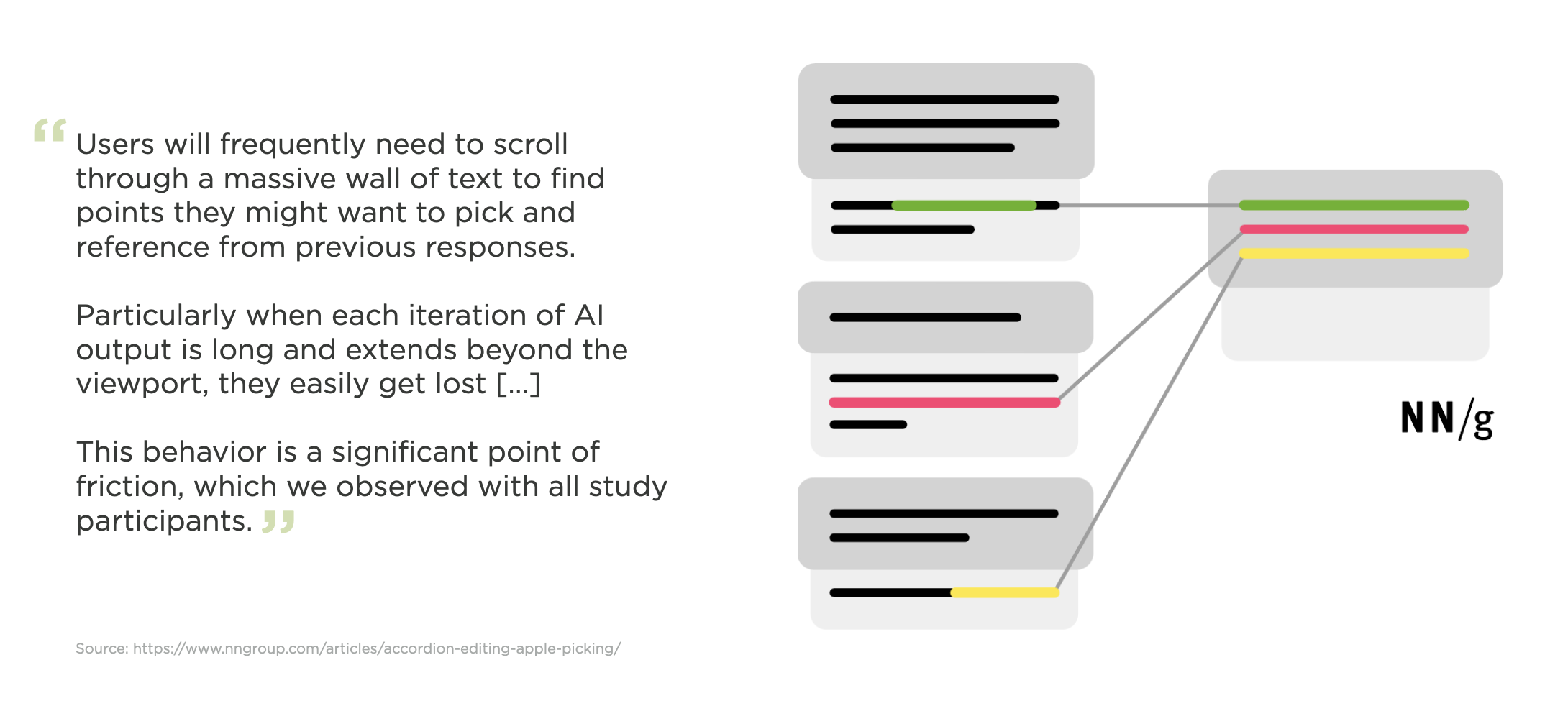
So what's the problem? In their article on Early Generative-AI User Behaviors, the Nielsen/Norman Group highlighted several usability issues in AI-chatbot interfaces. At the root of most was the observation that "people get lost when scrolling" streams of replies. Especially when AI models deliver lengthy outputs (as many are prone to do).
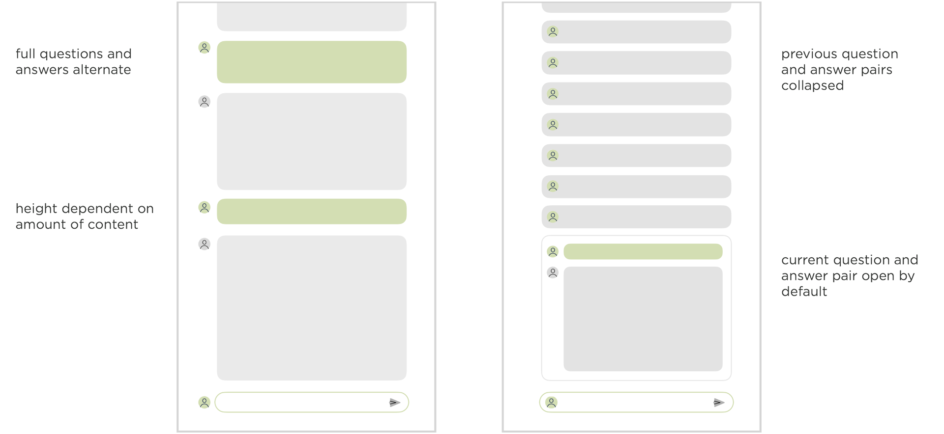
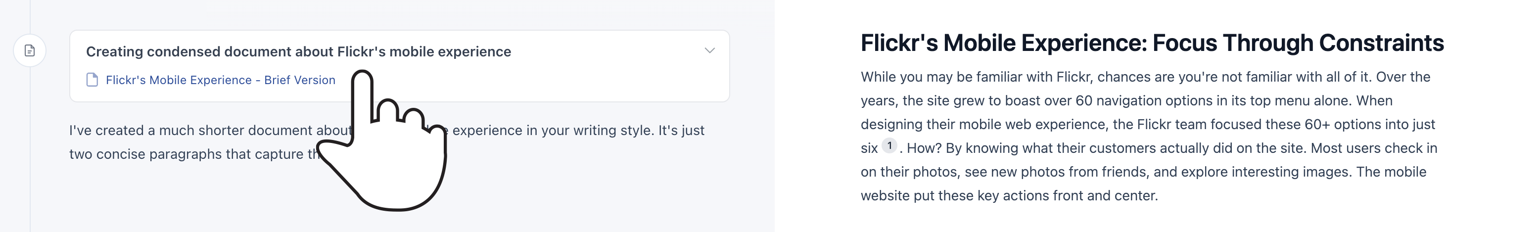
To account for these issues in the Ask LukeW feature on this site, where people ask relatively short questions and get long-form detailed answers, I made use of an expand and collapse pattern. You can see the difference between this approach and a more common chat UI pattern below.
Here's how this pattern looks in the Ask LukeW interface. The previous question and answer pairs are collapsed and therefore the same size, making it easier to focus on the content within and pick out relevant messages from the list when needed.
If you want to expand the content of an earlier question and answer pair, just tap on it to see its contents and the other messages collapse automatically.
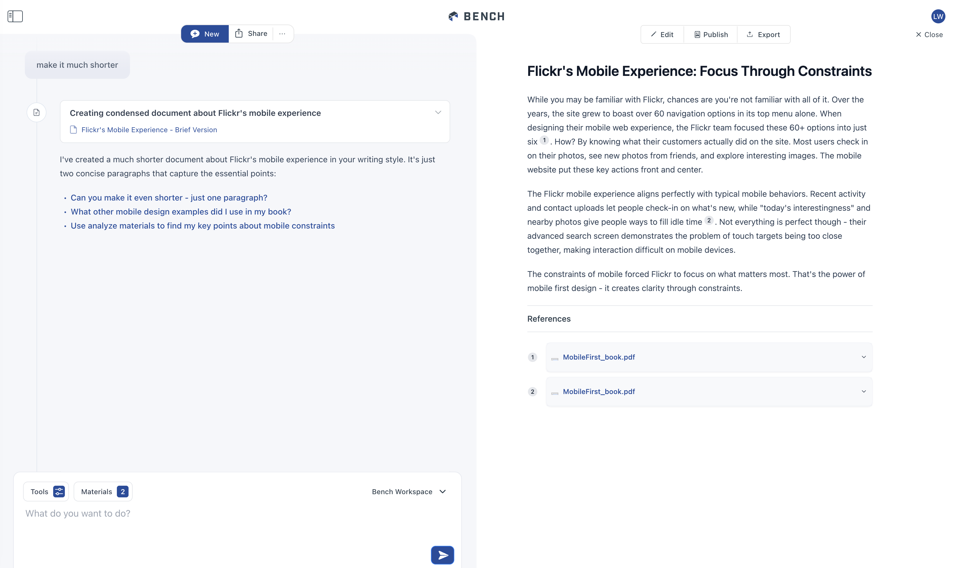
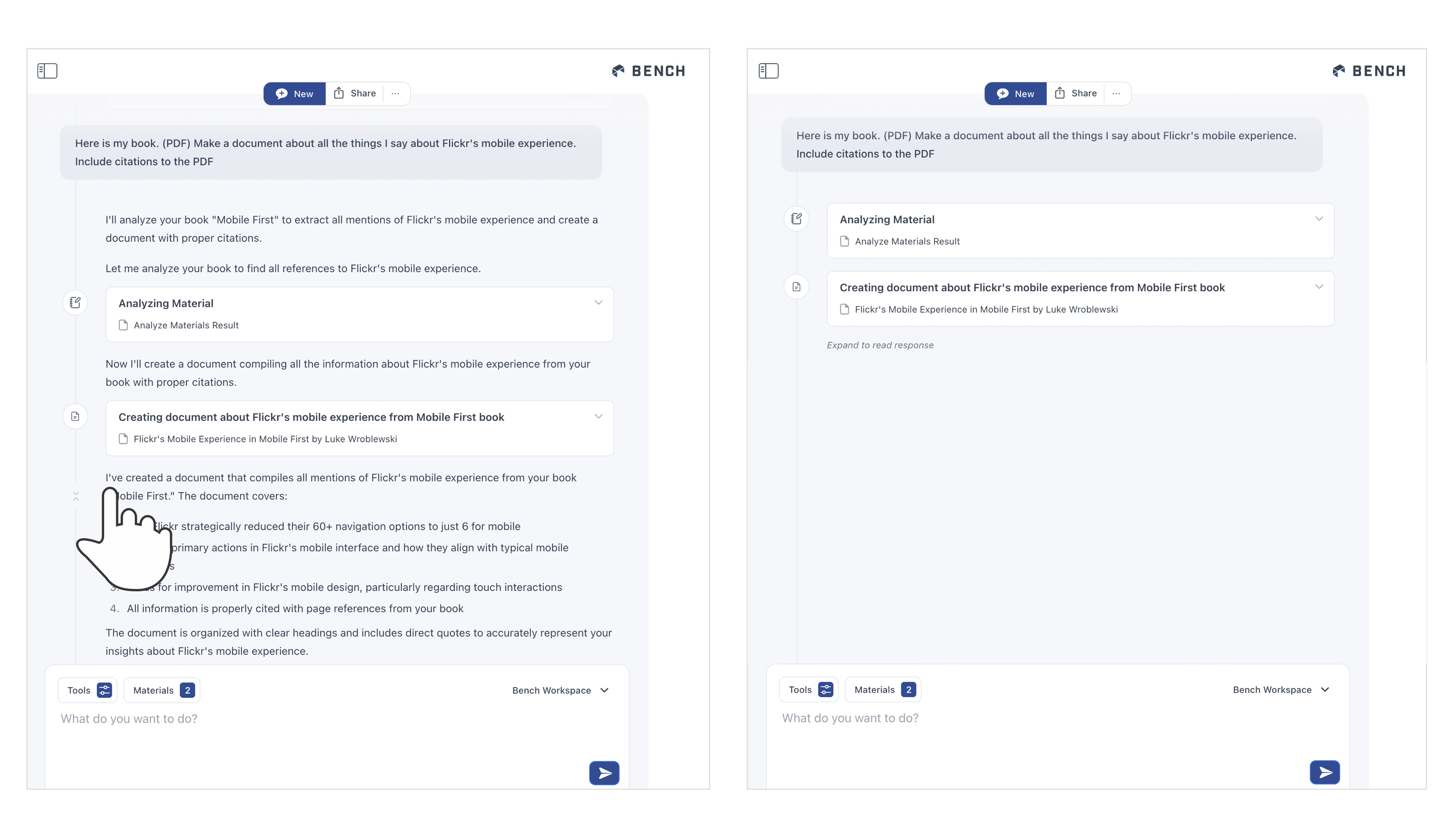
We took this a step further in the interface for Bench, an AI-powered workspace for knowledge work. Unlike Ask LukeW, Bench has many tools it can use to help people get work done (search, data science, fact check, remember, etc.).
Each of these tools can create a lot of output. When they do, we place the results of each tool in a separate interface panel on the right. This panel is also editable so people can refine a tool's output manually when they just want to modify things a little bit.
When the next tool creates output or people start another task, that output shows up on the right. The tool that created the output, however, remains in the timeline on the left with link to what it produced. So you can quickly navigate to and open outputs.
But what happens when there's multiple outputs... don't we end up with the same problem of a long scrolling list to find what you need? To account for this, we (thanks Amelia) added a collapse timeline feature in Bench. Hovering over any reply reveals a little "condense this" icon on the timeline.
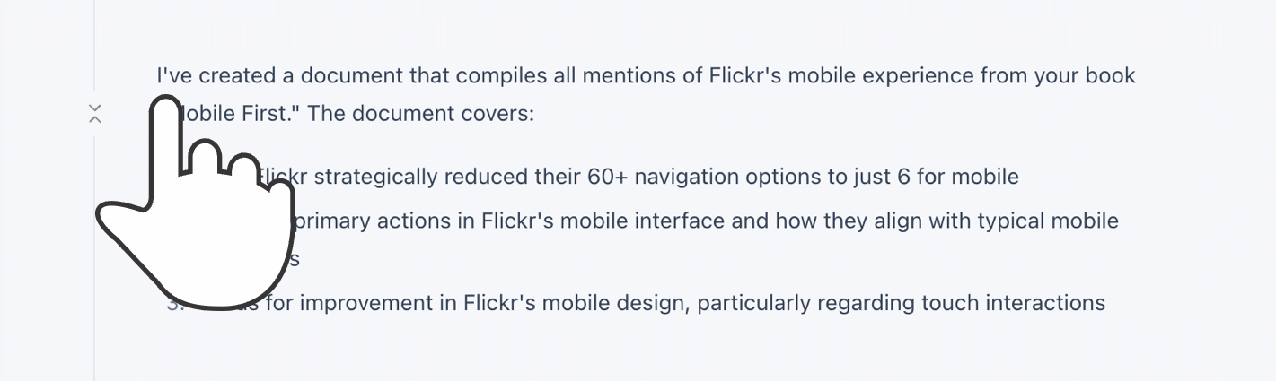
Selecting this icon will collapse the timeline down to just a list of tools with links to their output. This allows you to easily find what was produced for you in Bench and get back to it.
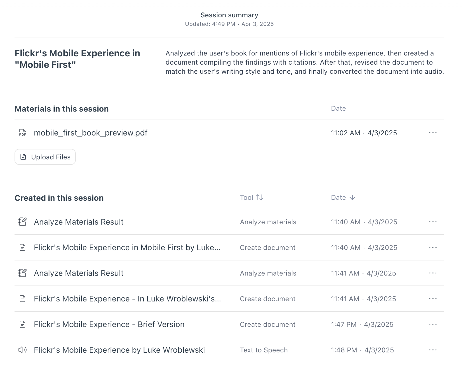
OK but even if the timeline is collapsed, people still have to scroll the timeline to find the things they need right? So they're still scrolling just less? For this reason, we also added a home page for each session in Bench.
If you close any output in the pane on the right, you see a title and summary of your session, all the files you used in it, and a list of all the outputs created in the session. This list can be sorted by the time the output was produced or by the tool that made the output. Selecting an output in this list opens it up. Selecting the tool that created it takes you to the point in the timeline where it was produced.
While I tried to illustrate this behavior with images, it's probably better experienced than read. So if you'd like to check out these interface solutions in Bench, here's an invite to the private preview.
A New “Web” Readiness Report
The beauty of research is finding yourself on a completely unrelated topic mere minutes from opening your browser. It happened to me while writing an Almanac entry on @namespace, an at-rule that we probably won’t ever use and is often regarded as a legacy piece of CSS. Maybe that’s why there wasn’t a lot of info about it until I found a 2010s post on @namespace by Divya Manian. The post was incredibly enlightening, but that’s beside the point; what’s important is that in Divya’s blog, there were arrows on the sides to read the previous and next posts:
Don’t ask me why, but without noticing, I somehow clicked the left arrow twice, which led me to a post on “Notes from HTML5 Readiness Hacking.”
What’s HTML 5 Readiness?!HTML 5 Readiness was a site created by Paul Irish and Divya Manian that showed the browser support for several web features through the lens of a rainbow of colors. The features were considered (at the time) state-of-the-art or bleeding-edge stuff, such as media queries, transitions, video and audio tags, etc. As each browser supported a feature, a section of the rainbow would be added.
I think it worked from 2010 to 2013, although it showed browser support data from 2008. I can’t describe how nostalgic it made me feel; it reminded me of simpler times when even SVGs weren’t fully supported. What almost made me shed a tear was thinking that, if this tool was updated today, all of the features would be colored in a full rainbow.
A new web readinessIt got me thinking: there are so many new features coming to CSS (many that haven’t shipped to any browser) that there could be a new HTML5 Readiness with all of them. That’s why I set myself to do exactly that last weekend, a Web Readiness 2025 that holds each of the features coming to HTML and CSS I am most excited about.
You can visit it at webreadiness.com!
Right now, it looks kinda empty, but as time goes we will hopefully see how the rainbow grows:
Even though it was a weekend project, I took the opportunity to dip my toes into a couple of things I wanted to learn. Below are also some snippets I think are worth sharing.
The data is sourced from BaselineMy first thought was to mod the <baseline-status> web component made by the Chrome team because I have been wanting to use it since it came out. In short, it lets you embed the support data for a web feature directly into your blog. Not long ago, in fact, Geoff added it as a WordPress block in CSS-Tricks, which has been super useful while writing the Almanac:
However, I immediately realized that using the <baseline-status> would be needlessly laborious, so I instead pulled the data from the Web Features API — https://api.webstatus.dev/v1/features/ — and displayed it myself. You can find all the available features in the GitHub repo.
Each ray is a web componentAnother feature I have been wanting to learn more about was Web Components, and since Geoff recently published his notes on Scott Jehl’s course Web Components Demystified, I thought it was the perfect chance. In this case, each ray would be a web component with a simple live cycle:
- Get instantiated.
- Read the feature ID from a data-feature attribute.
- Fetch its data from the Web Features API.
- Display its support as a list.
Said and done! The simplified version of that code looks something like the following:
class BaselineRay extends HTMLElement { constructor() { super(); } static get observedAttributes() { return ["data-feature"]; } attributeChangedCallback(property, oldValue, newValue) { if (oldValue !== newValue) { this[property] = newValue; } } async #fetchFeature(endpoint, featureID) { // Fetch Feature Function } async connectedCallback() { // Call fetchFeature and Output List } } customElements.define("baseline-ray", BaselineRay); Animations with the Web Animation APII must admit, I am not too design-savvy (I hope it isn’t that obvious), so what I lacked in design, I made up with some animations. When the page initially loads, a welcome animation is easily achieved with a couple of timed keyframes. However, the animation between the rainbow and list layouts is a little more involved since it depends on the user’s input, so we have to trigger them with JavaScript.
At first, I thought it would be easier to do them with Same-Document View Transitions, but I found myself battling with the browser’s default transitions and the lack of good documentation beyond Chrome’s posts. That’s why I decided on the Web Animation API, which lets you trigger transitions in a declarative manner.
sibling-index() and sibling-count()A while ago, I wrote about the sibling-index() and sibling-count() functions. As their names imply, they return the current index of an element among its sibling, and the total amount of siblings, respectively. While Chrome announced its intent to ship both functions, I know it will be a while until they reach baseline support, but I still needed them to rotate and move each ray.
In that same post, I talked about three options to polyfill each function. The first two were CSS-only, but this time I took the simplest JavaScript way which observes the number of rays and adds custom properties with its index and total count. Sure, it’s a bit overkill since the amount of rays doesn’t change, but pretty easy to implement:
const elements = document.querySelector(".rays"); const updateCustomProperties = () => { let index = 0; for (let element of elements.children) { element.style.setProperty("--sibling-index", index); index++; } elements.style.setProperty("--sibling-count", elements.children.length - 1); }; updateCustomProperties(); const observer = new MutationObserver(updateCustomProperties); const config = {attributes: false, childList: true, subtree: false}; observer.observe(elements, config);With this, I could position each ray in a 180-degree range:
baseline-ray ul{ --position: calc(180 / var(--sibling-count) * var(--sibling-index) - 90); --rotation: calc(var(--position) * 1deg); transform: translateX(-50%) rotate(var(--rotation)) translateY(var(--ray-separation)); transform-origin: bottom center; } The selection is JavaScript-lessIn the browser captions, if you hover over a specific browser, that browser’s color will pop out more in the rainbow while the rest becomes a little transparent. Since in my HTML, the caption element isn’t anyway near the rainbow (as a parent or a sibling), I thought I would need JavaScript for the task, but then I remembered I could simply use the :has() selector.
It works by detecting whenever the closest parent of both elements (it could be <section>, <main>, or the whole <body>) has a .caption item with a :hover pseudo-class. Once detected, we increase the size of each ray section of the same browser, while decreasing the opacity of the rest of the ray sections.
CodePen Embed Fallback What’s next?!What’s left now is to wait! I hope people can visit the page from time to time and see how the rainbow grows. Like the original HTML 5 Readiness page, I also want to take a snapshot at the end of the year to see how it looks until each feature is fully supported. Hopefully, it won’t take long, especially seeing the browser’s effort to ship things faster and improve interoperability.
Also, let me know if you think a feature is missing! I tried my best to pick exciting features without baseline support.
View the reportA New “Web” Readiness Report originally published on CSS-Tricks, which is part of the DigitalOcean family. You should get the newsletter.
SMIL on?
I was chatting with Andy Clarke the other day about a new article he wants to write about SVG animations.
“I’ve read some things that said that SMIL might be a dead end.” He said. “Whaddya think?”
That was my impression, too. Sarah Drasner summed up the situation nicely way back in 2017:
Unfortunately, support for SMIL is waning in WebKit, and has never (nor will likely ever) exist for Microsoft’s IE or Edge browsers.
Chrome was also in on the party and published an intent to deprecate SMIL, citing work in other browsers to support SVG animations in CSS. MDN linked to that same thread in its SMIL documentation when it published a deprecation warning.
Well, Chrome never deprecated SMIL. At least according to this reply in the thread dated 2023. And since then, we’ve also seen Microsoft’s Edge adopt a Chromium engine, effectively making it a Chrome clone. Also, last I checked, Caniuse reports full support in WebKit browsers.
This browser support data is from Caniuse, which has more detail. A number indicates that browser supports the feature at that version and up.
DesktopChromeFirefoxIEEdgeSafari5411796Mobile / TabletAndroid ChromeAndroid FirefoxAndroidiOS Safari13513736.0-6.1Now, I’m not saying that SMIL is perfectly alive and well. It could still very well be in the doldrums, especially when there are robust alternatives in CSS and JavaScript. But it’s also not dead in the water.
SMIL on? originally published on CSS-Tricks, which is part of the DigitalOcean family. You should get the newsletter.
Crafting Strong DX With Astro Components and TypeScript
I’m a big fan of Astro’s focus on developer experience (DX) and the onboarding of new developers. While the basic DX is strong, I can easily make a convoluted system that is hard to onboard my own developers to. I don’t want that to happen.
If I have multiple developers working on a project, I want them to know exactly what to expect from every component that they have at their disposal. This goes double for myself in the future when I’ve forgotten how to work with my own system!
To do that, a developer could go read each component and get a strong grasp of it before using one, but that feels like the onboarding would be incredibly slow. A better way would be to set up the interface so that as the developer is using the component, they have the right knowledge immediately available. Beyond that, it would bake in some defaults that don’t allow developers to make costly mistakes and alerts them to what those mistakes are before pushing code!
Enter, of course, TypeScript. Astro comes with TypeScript set up out of the box. You don’t have to use it, but since it’s there, let’s talk about how to use it to craft a stronger DX for our development teams.
WatchI’ve also recorded a video version of this article that you can watch if that’s your jam. Check it out on YouTube for chapters and closed captioning.
SetupIn this demo, we’re going to use a basic Astro project. To get this started, run the following command in your terminal and choose the “Minimal” template.
npm create astro@latestThis will create a project with an index route and a very simple “Welcome” component. For clarity, I recommend removing the <Welcome /> component from the route to have a clean starting point for your project.
To add a bit of design, I’d recommend setting up Tailwind for Astro (though, you’re welcome to style your component however you would like including a style block in the component).
npx astro add tailwindOnce this is complete, you’re ready to write your first component.
Creating the basic Heading componentLet’s start by defining exactly what options we want to provide in our developer experience.
For this component, we want to let developers choose from any HTML heading level (H1-H6). We also want them to be able to choose a specific font size and font weight — it may seem obvious now, but we don’t want people choosing a specific heading level for the weight and font size, so we separate those concerns.
Finally, we want to make sure that any additional HTML attributes can be passed through to our component. There are few things worse than having a component and then not being able to do basic functionality later.
Using Dynamic tags to create the HTML elementLet’s start by creating a simple component that allows the user to dynamically choose the HTML element they want to use. Create a new component at ./src/components/Heading.astro.
--- // ./src/component/Heading.astro const { as } = Astro.props; const As = as; --- <As> <slot /> </As>To use a prop as a dynamic element name, we need the variable to start with a capital letter. We can define this as part of our naming convention and make the developer always capitalize this prop in their use, but that feels inconsistent with how most naming works within props. Instead, let’s keep our focus on the DX, and take that burden on for ourselves.
In order to dynamically register an HTML element in our component, the variable must start with a capital letter. We can convert that in the frontmatter of our component. We then wrap all the children of our component in the <As> component by using Astro’s built-in <slot /> component.
Now, we can use this component in our index route and render any HTML element we want. Import the component at the top of the file, and then add <h1> and <h2> elements to the route.
--- // ./src/pages/index.astro import Layout from '../layouts/Layout.astro'; import Heading from '../components/Heading.astro'; --- <Layout> <Heading as="h1">Hello!</Heading> <Heading as="h2">Hello world</Heading> </Layout>This will render them correctly on the page and is a great start.
Adding more custom props as a developer interfaceLet’s clean up the element choosing by bringing it inline to our props destructuring, and then add in additional props for weight, size, and any additional HTML attributes.
To start, let’s bring the custom element selector into the destructuring of the Astro.props object. At the same time, let’s set a sensible default so that if a developer forgets to pass this prop, they still will get a heading.
--- // ./src/component/Heading.astro const { as: As="h2" } = Astro.props; --- <As> <slot /> </As>Next, we’ll get weight and size. Here’s our next design choice for our component system: do we make our developers know the class names they need to use or do we provide a generic set of sizes and do the mapping ourselves? Since we’re building a system, I think it’s important to move away from class names and into a more declarative setup. This will also future-proof our system by allowing us to change out the underlying styling and class system without affecting the DX.
Not only do we future proof it, but we also are able to get around a limitation of Tailwind by doing this. Tailwind, as it turns out can’t handle dynamically-created class strings, so by mapping them, we solve an immediate issue as well.
In this case, our sizes will go from small (sm) to six times the size (6xl) and our weights will go from “light” to “bold”.
Let’s start by adjusting our frontmatter. We need to get these props off the Astro.props object and create a couple objects that we can use to map our interface to the proper class structure.
--- // ./src/component/Heading.astro const weights = { "bold": "font-bold", "semibold": "font-semibold", "medium": "font-medium", "light": "font-light" } const sizes= { "6xl": "text-6xl", "5xl": "text-5xl", "4xl": "text-4xl", "3xl": "text-3xl", "2xl": "text-2xl", "xl": "text-xl", "lg": "text-lg", "md": "text-md", "sm": "text-sm" } const { as: As="h2", weight="medium", size="2xl" } = Astro.props; ---Depending on your use case, this amount of sizes and weights might be overkill. The great thing about crafting your own component system is that you get to choose and the only limitations are the ones you set for yourself.
From here, we can then set the classes on our component. While we could add them in a standard class attribute, I find using Astro’s built-in class:list directive to be the cleaner way to programmatically set classes in a component like this. The directive takes an array of classes that can be strings, arrays themselves, objects, or variables. In this case, we’ll select the correct size and weight from our map objects in the frontmatter.
--- // ./src/component/Heading.astro const weights = { bold: "font-bold", semibold: "font-semibold", medium: "font-medium", light: "font-light", }; const sizes = { "6xl": "text-6xl", "5xl": "text-5xl", "4xl": "text-4xl", "3xl": "text-3xl", "2xl": "text-2xl", xl: "text-xl", lg: "text-lg", md: "text-md", sm: "text-sm", }; const { as: As = "h2", weight = "medium", size = "2xl" } = Astro.props; --- <As class:list={[ sizes[size], weights[weight] ]} > <slot /> </As>Your front-end should automatically shift a little in this update. Now your font weight will be slightly thicker and the classes should be applied in your developer tools.
From here, add the props to your index route, and find the right configuration for your app.
--- // ./src/pages/index.astro import Layout from '../layouts/Layout.astro'; import Heading from '../components/Heading.astro'; --- <Layout> <Heading as="h1" size="6xl" weight="light">Hello!</Heading> <Heading as="h3" size="xl" weight="bold">Hello world</Heading> </Layout>Our custom props are finished, but currently, we can’t use any default HTML attributes, so let’s fix that.
Adding HTML attributes to the componentWe don’t know what sorts of attributes our developers will want to add, so let’s make sure they can add any additional ones they need.
To do that, we can spread any other prop being passed to our component, and then add them to the rendered component.
--- // ./src/component/Heading.astro const weights = { // etc. }; const sizes = { // etc. }; const { as: As = "h2", weight = "medium", size = "md", ...attrs } = Astro.props; --- <As class:list={[ sizes[size], weights[weight] ]} {...attrs} > <slot /> </As>From here, we can add any arbitrary attributes to our element.
--- // ./src/pages/index.astro import Layout from '../layouts/Layout.astro'; import Heading from '../components/Heading.astro'; --- <Layout> <Heading id="my-id" as="h1" size="6xl" weight="light">Hello!</Heading> <Heading class="text-blue-500" as="h3" size="xl" weight="bold">Hello world</Heading> </Layout>I’d like to take a moment to truly appreciate one aspect of this code. Our <h1>, we add an id attribute. No big deal. Our <h3>, though, we’re adding an additional class. My original assumption when creating this was that this would conflict with the class:list set in our component. Astro takes that worry away. When the class is passed and added to the component, Astro knows to merge the class prop with the class:list directive and automatically makes it work. One less line of code!
In many ways, I like to consider these additional attributes as “escape hatches” in our component library. Sure, we want our developers to use our tools exactly as intended, but sometimes, it’s important to add new attributes or push our design system’s boundaries. For this, we allow them to add their own attributes, and it can create a powerful mix.
It looks done, but are we?At this point, if you’re following along, it might feel like we’re done, but we have two issues with our code right now: (1) our component has “red squiggles” in our code editor and (2) our developers can make a BIG mistake if they choose.
The red squiggles come from type errors in our component. Astro gives us TypeScript and linting by default, and sizes and weights can’t be of type: any. Not a big deal, but concerning depending on your deployment settings.
The other issue is that our developers don’t have to choose a heading element for their heading. I’m all for escape hatches, but only if they don’t break the accessibility and SEO of my site.
Imagine, if a developer used this with a div instead of an h1 on the page. What would happen?We don’t have to imagine, make the change and see.
It looks identical, but now there’s no <h1> element on the page. Our semantic structure is broken, and that’s bad news for many reasons. Let’s use typing to help our developers make the best decisions and know what options are available for each prop.
Adding types to the componentTo set up our types, first we want to make sure we handle any HTML attributes that come through. Astro, again, has our backs and has the typing we need to make this work. We can import the right HTML attribute types from Astro’s typing package. Import the type and then we can extend that type for our own props. In our example, we’ll select the h1 types, since that should cover most anything we need for our headings.
Inside the Props interface, we’ll also add our first custom type. We’ll specify that the as prop must be one of a set of strings, instead of just a basic string type. In this case, we want it to be h1–h6 and nothing else.
--- // ./src/component/Heading.astro import type { HTMLAttributes } from 'astro/types'; interface Props extends HTMLAttributes<'h1'> { as: "h1" | "h2" | "h3" | "h4" | "h5" | "h6"; } //... The rest of the file ---After adding this, you’ll note that in your index route, the <h1> component should now have a red underline for the as="div" property. When you hover over it, it will let you know that the as type does not allow for div and it will show you a list of acceptable strings.
If you delete the div, you should also now have the ability to see a list of what’s available as you try to add the string.
While it’s not a big deal for the element selection, knowing what’s available is a much bigger deal to the rest of the props, since those are much more custom.
Let’s extend the custom typing to show all the available options. We also denote these items as optional by using the ?:before defining the type.
While we could define each of these with the same type functionality as our as type, that doesn’t keep this future proofed. If we add a new size or weight, we’d have to make sure to update our type. To solve this, we can use a fun trick in TypeScript: keyof typeof.
There are two helper functions in TypeScript that will help us convert our weights and sizes object maps into string literal types:
- typeof: This helper takes an object and converts it to a type. For instance typeof weights would return type { bold: string, semibold: string, ...etc}
- keyof: This helper function takes a type and returns a list of string literals from that type’s keys. For instance keyof type { bold: string, semibold: string, ...etc} would return "bold" | "semibold" | ...etc which is exactly what we want for both weights and sizes.
Now, when we want to add a size or weight, we get a dropdown list in our code editor showing exactly what’s available on the type. If something is selected, outside the list, it will show an error in the code editor helping the developer know what they missed.
While none of this is necessary in the creation of Astro components, the fact that it’s built in and there’s no additional tooling to set up means that using it is very easy to opt into.
I’m by no means a TypeScript expert, but getting this set up for each component takes only a few additional minutes and can save a lot of time for developers down the line (not to mention, it makes onboarding developers to your system much easier).
Crafting Strong DX With Astro Components and TypeScript originally published on CSS-Tricks, which is part of the DigitalOcean family. You should get the newsletter.
Worlds Collide: Keyframe Collision Detection Using Style Queries
A friend DMs Lee Meyer a CodePen by Manuel Schaller containing a pure CSS simulation of one of the world’s earliest arcade games, Pong, with both paddles participating automatically, in an endless loop. The demo reminds Lee of an arcade machine in attract mode awaiting a coin, and the iconic imagery awakens muscle memory from his misspent childhood, causing him to search his pocket in which he finds the token a spooky shopkeeper gave him last year at the CSS tricks stall in the haunted carnival. The token gleams like a power-up in the light of his laptop, which has a slot he never noticed. He feeds the token into the slot, and the CodePen reloads itself. A vertical range input and a life counter appear, allowing him to control the left paddle and play the game in Chrome using a cocktail of modern and experimental CSS features to implement collision detection in CSS animations. He recalls the spooky shopkeeper’s warning that playing with these features has driven some developers to madness, but the shopkeeper’s voice in Lee’s head whispers: “Too late, we are already playing.”
CSS collision detection: Past and presentSo, maybe the experience of using modern CSS to add collision detection and interactivity to an animation wasn’t as much like a screenplay sponsored by CSS as I depicted in the intro above — but it did feel like magic compared to what Alex Walker had to go through in 2013 to achieve a similar effect. Hilariously, he describes his implementation as “a glittering city of hacks built on the banks of the ol’ Hack River. On the Planet Hack.“ Alex’s version of CSS Pong cleverly combines checkbox hacks, sibling selectors, and :hover, whereas the CodePen below uses style queries to detect collisions. I feel it’s a nice illustration of how far CSS has come, and a testament to increased power and expressiveness of CSS more than a decade later. It shows how much power we get when combining new CSS features — in this case, that includes style queries, animatable custom properties, and animation timelines. The future CSS features of inline conditionals and custom functions might be able to simplify this code more.
CodePen Embed Fallback Collision detection with style queriesInteractive CSS animations with elements ricocheting off each other seems more plausible in 2025 and the code is somewhat sensible. While it’s unnecessary to implement Pong in CSS, and the CSS Working Group probably hasn’t been contemplating how to make that particular niche task easier, the increasing flexibility and power of CSS reinforce my suspicion that one day it will be a lifestyle choice whether to achieve any given effect with scripting or CSS.
The demo is a similar number of lines of CSS to Alex’s 2013 implementation, but it didn’t feel much like a hack. It’s a demo of modern CSS features working together in the way I expected after reading the instruction booklet. Sometimes when reading introductory articles about the new features we are getting in CSS, it’s hard to appreciate how game-changing they are till you see several features working together. As often happens when pushing the boundaries of a technology, we are going to bump up against the current limitations of style queries and animations. But it’s all in good fun, and we’ll learn about these CSS features in more detail than if we had not attempted this crazy experiment.
It does seem to work, and my 12-year-old and 7-year-old have both playtested it on my phone and laptop, so it gets the “works on Lee’s devices” seal of quality. Also, since Chrome now supports controlling animations using range inputs, we can make our game playable on mobile, unlike the 2013 version, which relied on :hover. Temani Afif provides a great explanation of how and why view progress timelines can be used to style anything based on the value of a range input.
Using style queries to detect if the paddle hit the ballThe ball follows a fixed path, and whether the player’s paddle intersects with the ball when it reaches our side is the only input we have into whether it continues its predetermined bouncy loop or the screen flashes red as the life counter goes down till we see the “Game Over” screen with the option to play again.
This type of interactivity is what game designers call a quick time event. It’s still a game for sure, but five months ago, when I was young and naive, I mused in my article on animation timelines that the animation timeline feature could open the door for advanced games and interactive experiences in CSS. I wrote that a video game is just a “hyper-interactive animation.” Indeed, the above experiment shows that the new features in CSS allow us to respond to user input in sophisticated ways, but the demo also clarifies the difference between the kind of interactivity we can expect from the current incarnation of CSS versus scripting. The above experiment is more like if Pong were a game inside the old-school arcade game Dragon’s Lair, which was one giant quick time event. It only works because there are limited possible outcomes, but they are certainly less limited than what we used to be able to achieve in CSS.
Since we know collision detection with the paddle is the only opportunity for the user to have a say in what happens next, let’s focus on that implementation. It will require more mental gymnastics than I would like, since container style queries only allow for name-value pairs with the same syntax as feature queries, meaning we can’t use “greater than” or “less than” operators when comparing numeric values like we do with container size queries which follow the same syntax as @media size queries.
The workaround below allows us to create style queries based on the ball position being in or out of the range of the paddle. If the ball hits our side, then by default, the play field will flash red and temporarily unpause the animation that decrements the life counter (more on that later). But if the ball hits our side and is within range of the paddle, we leave the life-decrementing animation paused, and make the field background green while the ball hits the paddle. Since we don’t have “greater than” or “less than” operators in style queries, we (ab)use the min() function. If the result equals the first argument then that argument is less than or equal to the second; otherwise it’s greater than the second argument. It’s logical but made me wish for better comparison operators in style queries. Nevertheless, I was impressed that style queries allow the collision detection to be fairly readable, if a little more verbose than I would like.
body { --int-ball-position-x: round(down, var(--ball-position-x)); --min-ball-position-y-and-top-of-paddle: min(var(--ball-position-y) + var(--ball-height), var(--ping-position)); --min-ball-position-y-and-bottom-of-paddle: min(var(--ball-position-y), var(--ping-position) + var(--paddle-height)); } @container style(--int-ball-position-x: var(--ball-left-boundary)) { .screen { --lives-decrement: running; .field { background: red; } } } @container style(--min-ball-position-y-and-top-of-paddle: var(--ping-position)) and style(--min-ball-position-y-and-bottom-of-paddle: var(--ball-position-y)) and style(--int-ball-position-x: var(--ball-left-boundary)) { .screen { --lives-decrement: paused; .field { background: green; } } } Responding to collisionsNow that we can style our playing field based on whether the paddle hits the ball, we want to decrement the life counter if our paddle misses the ball, and display “Game Over” when we run out of lives. One way to achieve side effects in CSS is by pausing and unpausing keyframe animations that run forwards. These days, we can style things based on custom properties, which we can set in animations. Using this fact, we can take the power of paused animations to another level.
body { animation: ball 8s infinite linear, lives 80ms forwards steps(4) var(--lives-decrement); --lives-decrement: paused; } .lives::after { content: var(--lives); } @keyframes lives { 0% { --lives: "3"; } 25% { --lives: "2"; } 75% { --lives: "1"; } 100% { --lives: "0"; } } @container style(--int-ball-position-x: var(--ball-left-boundary)) { .screen { --lives-decrement: running; .field { background: red; } } } @container style(--min-ball-position-y-and-top-of-paddle: var(--ping-position)) and style(--min-ball-position-y-and-bottom-of-paddle: var(--ball-position-y)) and style(--int-ball-position-x: 8) { .screen { --lives-decrement: paused; .field { background: green; } } } @container style(--lives: '0') { .field { display: none; } .game-over { display: flex; } }So when the ball hits the wall and isn’t in range of the paddle, the lives-decrementing animation is unpaused long enough to let it complete one step. Once it reaches zero we hide the play field and display the “Game Over” screen. What’s fascinating about this part of the experiment is that it shows that, using style queries, all properties become indirectly possible to control via animations, even when working with non-animatable properties. And this applies to properties that control whether other animations play. This article touches on why play state deliberately isn’t animatable and could be dangerous to animate, but we know what we are doing, right?
Full disclosure: The play state approach did lead to hidden complexity in the choice of duration of the animations. I knew that if I chose too long a duration for the life-decrementing counter, it might not have time to proceed to the next step while the ball was hitting the wall, but if I chose too short a duration, missing the ball once might cause the player to lose more than one life.
I made educated guesses of suitable durations for the ball bouncing and life decrementing, and I expected that when working with fixed-duration predictable animations, the life counter would either always work or always fail. I didn’t expect that my first attempt at the implementation intermittently failed to decrement the life counter at the same point in the animation loop. Setting the durations of both these related animations to multiples of eight seems to fix the problem, but why would predetermined animations exhibit unpredictable behavior?
Forefeit the game before somebody else takes you out of the frameI have theories as to why the unpredictability of the collision detection seemed to be fixed by setting the ball animation to eight seconds and the lives animation to 80 milliseconds. Again, pushing CSS to its limits forces us to think deeper about how it’s working.
- CSS appears to suffer from timer drift, meaning if you set a keyframes animation to last for one second, it will sometimes take slightly under or over one second. When there is a different rate of change between the ball-bouncing and life-losing, it would make sense that the potential discrepancy between the two would be pronounced and lead to unpredictable collision detection. When the rate of change in both animations is the same, they would suffer about equally from timer drift, meaning the frames still synchronize predictably. Or at least I’m hoping the chance they don’t becomes negligible.
- Alex’s 2013 version of Pong uses translate3d() to move the ball even though it only moves in 2D. Alex recommends this whenever possible “for efficient animation rendering, offloading processing to the GPU for smoother visual effects.” Doing this may have been an alternative fix if it leads to more precise animation timing. There are tradeoffs so I wasn’t willing to go down that rabbit hole of trying to tune the animation performance in this article — but it could be an interesting focus for future research into CSS collision detection.
- Maybe style queries take a varying amount of time to kick in, leading to some form of a race condition. It is possible that making the ball-bouncing animation slower made this problem less likely.
- Maybe the bug remains lurking in the shadows somewhere. What did I expect from a hack I achieved using a magic token from a spooky shopkeeper? Haven’t I seen any eighties movie ever?
You finish reading the article, and feel sure that the author’s rationale for his supposed fix for the bug is hogwash. Clearly, Lee has been driven insane by the allure of overpowering new CSS features, whereas you respect the power of CSS, but you also respect its limitations. You sit down to spend a few minutes with the collision detection CodePen to prove it is still broken, but then find other flaws in the collision detection, and you commence work on a fork that will be superior. Hey, speaking of timer drift, how is it suddenly 1 a.m.? Only a crazy person would stay up that late playing with CSS when they have to work the next day. “Madness,” repeats the spooky shopkeeper inside your head, and his laughter echoes somewhere in the night.
Roll the creditsThis looping Pong CSS animation by Manuel Schaller gave me an amazing basis for adding the collision detection. His twitching paddle animations help give the illusion of playing against a computer opponent, so forking his CodePen let me focus on implementing the collision detection rather than reinventing Pong.
This author is grateful to the junior testing team, comprised of his seven-year-old and twelve-year-old, who declared the CSS Pong implementation “pretty cool.” They also suggested the green and red flashes to signal collisions and misses.
The intro and outro for this article were sponsored by the spooky shopkeeper who sells dangerous CSS tricks. He also sells frozen yoghurt, which he calls froghurt.
Worlds Collide: Keyframe Collision Detection Using Style Queries originally published on CSS-Tricks, which is part of the DigitalOcean family. You should get the newsletter.
Ask LukeW: 2 Years and 27,000 Answers
Time flies (insanely) fast during the AI tsunami all of us in the technology industry are facing. So it was surprising to learn my personal AI assistant, Ask LukeW, launched two years ago. Since then I've kept iterating on it when time allowed and two years later...
Ask LukeW is a feature I created for my website to answer people's questions about digital product design, startups, technology, and related topics. It's designed to provide personalized responses using my body of work in a scalable manner.
Since launching two years ago, people have asked (and the system has answered) over 27,000 questions. That averages out to more than 36 a day, which is definitely more than I'd be able to answer using my physical embodiment. So I've certainly gotten scale from the digital version of me.
Ask LukeW works by using AI to generate answers based on the thousands of text articles, hundreds of presentations, videos, and other content I've produced over the years. When you ask a question, AI models identify relevant concepts within my content and use them to create new answers. If the information comes from a specific article, audio file, or video, the source is cited, allowing you to explore the original material if you want to learn more.
In other words, instead of having to search through thousands of files on my website, you can simply ask questions in natural language and get tailored responses. Behind that simplicity is a lot of work on both the technology and design side. To unpack it all, I've written a series of articles on what that looks like and why. If you want to go deep into designing AI-powered experiences... have at it:
- New Ways into Web Content: rethinking how to design software with AI
- Integrated Audio Experiences & Memory: enabling specific content experiences
- Expanding Conversational User Interfaces: extending chat user interfaces
- Integrated Video Experiences: adding video experiences to conversational UI
- Integrated PDF Experiences: unique considerations when adding PDF experiences
- Dynamic Preview Cards: improving how generated answers are shared
- Text Generation Differences: testing the impact of AI new models
- PDF Parsing with Vision Models: using AI vision models to extract PDF contents
- Streaming Citations: citing relevant articles, videos, PDFs, etc. in real-time
- Streaming Inline Images: indexing & displaying relevant images in answers
- Custom Re-ranker: improving content retrieval to answer more questions
- Usability Study: testing a conversational AI interface with designers
Automated Visual Regression Testing With Playwright
Comparing visual artifacts can be a powerful, if fickle, approach to automated testing. Playwright makes this seem simple for websites, but the details might take a little finessing.
Recent downtime prompted me to scratch an itch that had been plaguing me for a while: The style sheet of a website I maintain has grown just a little unwieldy as we’ve been adding code while exploring new features. Now that we have a better idea of the requirements, it’s time for internal CSS refactoring to pay down some of our technical debt, taking advantage of modern CSS features (like using CSS nesting for more obvious structure). More importantly, a cleaner foundation should make it easier to introduce that dark mode feature we’re sorely lacking so we can finally respect users’ preferred color scheme.
However, being of the apprehensive persuasion, I was reluctant to make large changes for fear of unwittingly introducing bugs. I needed something to guard against visual regressions while refactoring — except that means snapshot testing, which is notoriously slow and brittle.
In this context, snapshot testing means taking screenshots to establish a reliable baseline against which we can compare future results. As we’ll see, those artifacts are influenced by a multitude of factors that might not always be fully controllable (e.g. timing, variable hardware resources, or randomized content). We also have to maintain state between test runs, i.e. save those screenshots, which complicates the setup and means our test code alone doesn’t fully describe expectations.
Having procrastinated without a more agreeable solution revealing itself, I finally set out to create what I assumed would be a quick spike. After all, this wouldn’t be part of the regular test suite; just a one-off utility for this particular refactoring task.
Fortunately, I had vague recollections of past research and quickly rediscovered Playwright’s built-in visual comparison feature. Because I try to select dependencies carefully, I was glad to see that Playwright seems not to rely on many external packages.
SetupThe recommended setup with npm init playwright@latest does a decent job, but my minimalist taste had me set everything up from scratch instead. This do-it-yourself approach also helped me understand how the different pieces fit together.
Given that I expect snapshot testing to only be used on rare occasions, I wanted to isolate everything in a dedicated subdirectory, called test/visual; that will be our working directory from here on out. We’ll start with package.json to declare our dependencies, adding a few helper scripts (spoiler!) while we’re at it:
{ "scripts": { "test": "playwright test", "report": "playwright show-report", "update": "playwright test --update-snapshots", "reset": "rm -r ./playwright-report ./test-results ./viz.test.js-snapshots || true" }, "devDependencies": { "@playwright/test": "^1.49.1" } }If you don’t want node_modules hidden in some subdirectory but also don’t want to burden the root project with this rarely-used dependency, you might resort to manually invoking npm install --no-save @playwright/test in the root directory when needed.
With that in place, npm install downloads Playwright. Afterwards, npx playwright install downloads a range of headless browsers. (We’ll use npm here, but you might prefer a different package manager and task runner.)
We define our test environment via playwright.config.js with about a dozen basic Playwright settings:
import { defineConfig, devices } from "@playwright/test"; let BROWSERS = ["Desktop Firefox", "Desktop Chrome", "Desktop Safari"]; let BASE_URL = "http://localhost:8000"; let SERVER = "cd ../../dist && python3 -m http.server"; let IS_CI = !!process.env.CI; export default defineConfig({ testDir: "./", fullyParallel: true, forbidOnly: IS_CI, retries: 2, workers: IS_CI ? 1 : undefined, reporter: "html", webServer: { command: SERVER, url: BASE_URL, reuseExistingServer: !IS_CI }, use: { baseURL: BASE_URL, trace: "on-first-retry" }, projects: BROWSERS.map(ua => ({ name: ua.toLowerCase().replaceAll(" ", "-"), use: { ...devices[ua] } })) });Here we expect our static website to already reside within the root directory’s dist folder and to be served at localhost:8000 (see SERVER; I prefer Python there because it’s widely available). I’ve included multiple browsers for illustration purposes. Still, we might reduce that number to speed things up (thus our simple BROWSERS list, which we then map to Playwright’s more elaborate projects data structure). Similarly, continuous integration is YAGNI for my particular scenario, so that whole IS_CI dance could be discarded.
Capture and compareLet’s turn to the actual tests, starting with a minimal sample.test.js file:
import { test, expect } from "@playwright/test"; test("home page", async ({ page }) => { await page.goto("/"); await expect(page).toHaveScreenshot(); });npm test executes this little test suite (based on file-name conventions). The initial run always fails because it first needs to create baseline snapshots against which subsequent runs compare their results. Invoking npm test once more should report a passing test.
Changing our site, e.g. by recklessly messing with build artifacts in dist, should make the test fail again. Such failures will offer various options to compare expected and actual visuals:
We can also inspect those baseline snapshots directly: Playwright creates a folder for screenshots named after the test file (sample.test.js-snapshots in this case), with file names derived from the respective test’s title (e.g. home-page-desktop-firefox.png).
Generating testsGetting back to our original motivation, what we want is a test for every page. Instead of arduously writing and maintaining repetitive tests, we’ll create a simple web crawler for our website and have tests generated automatically; one for each URL we’ve identified.
Playwright’s global setup enables us to perform preparatory work before test discovery begins: Determine those URLs and write them to a file. Afterward, we can dynamically generate our tests at runtime.
While there are other ways to pass data between the setup and test-discovery phases, having a file on disk makes it easy to modify the list of URLs before test runs (e.g. temporarily ignoring irrelevant pages).
Site mapThe first step is to extend playwright.config.js by inserting globalSetup and exporting two of our configuration values:
export let BROWSERS = ["Desktop Firefox", "Desktop Chrome", "Desktop Safari"]; export let BASE_URL = "http://localhost:8000"; // etc. export default defineConfig({ // etc. globalSetup: require.resolve("./setup.js") });Although we’re using ES modules here, we can still rely on CommonJS-specific APIs like require.resolve and __dirname. It appears there’s some Babel transpilation happening in the background, so what’s actually being executed is probably CommonJS? Such nuances sometimes confuse me because it isn’t always obvious what’s being executed where.
We can now reuse those exported values within a newly created setup.js, which spins up a headless browser to crawl our site (just because that’s easier here than using a separate HTML parser):
import { BASE_URL, BROWSERS } from "./playwright.config.js"; import { createSiteMap, readSiteMap } from "./sitemap.js"; import playwright from "@playwright/test"; export default async function globalSetup(config) { // only create site map if it doesn't already exist try { readSiteMap(); return; } catch(err) {} // launch browser and initiate crawler let browser = playwright.devices[BROWSERS[0]].defaultBrowserType; browser = await playwright[browser].launch(); let page = await browser.newPage(); await createSiteMap(BASE_URL, page); await browser.close(); }This is fairly boring glue code; the actual crawling is happening within sitemap.js:
- createSiteMap determines URLs and writes them to disk.
- readSiteMap merely reads any previously created site map from disk. This will be our foundation for dynamically generating tests. (We’ll see later why this needs to be synchronous.)
Fortunately, the website in question provides a comprehensive index of all pages, so my crawler only needs to collect unique local URLs from that index page:
function extractLocalLinks(baseURL) { let urls = new Set(); let offset = baseURL.length; for(let { href } of document.links) { if(href.startsWith(baseURL)) { let path = href.slice(offset); urls.add(path); } } return Array.from(urls); }Wrapping that in a more boring glue code gives us our sitemap.js:
import { readFileSync, writeFileSync } from "node:fs"; import { join } from "node:path"; let ENTRY_POINT = "/topics"; let SITEMAP = join(__dirname, "./sitemap.json"); export async function createSiteMap(baseURL, page) { await page.goto(baseURL + ENTRY_POINT); let urls = await page.evaluate(extractLocalLinks, baseURL); let data = JSON.stringify(urls, null, 4); writeFileSync(SITEMAP, data, { encoding: "utf-8" }); } export function readSiteMap() { try { var data = readFileSync(SITEMAP, { encoding: "utf-8" }); } catch(err) { if(err.code === "ENOENT") { throw new Error("missing site map"); } throw err; } return JSON.parse(data); } function extractLocalLinks(baseURL) { // etc. }The interesting bit here is that extractLocalLinks is evaluated within the browser context — thus we can rely on DOM APIs, notably document.links — while the rest is executed within the Playwright environment (i.e. Node).
TestsNow that we have our list of URLs, we basically just need a test file with a simple loop to dynamically generate corresponding tests:
for(let url of readSiteMap()) { test(`page at ${url}`, async ({ page }) => { await page.goto(url); await expect(page).toHaveScreenshot(); }); }This is why readSiteMap had to be synchronous above: Playwright doesn’t currently support top-level await within test files.
In practice, we’ll want better error reporting for when the site map doesn’t exist yet. Let’s call our actual test file viz.test.js:
import { readSiteMap } from "./sitemap.js"; import { test, expect } from "@playwright/test"; let sitemap = []; try { sitemap = readSiteMap(); } catch(err) { test("site map", ({ page }) => { throw new Error("missing site map"); }); } for(let url of sitemap) { test(`page at ${url}`, async ({ page }) => { await page.goto(url); await expect(page).toHaveScreenshot(); }); }Getting here was a bit of a journey, but we’re pretty much done… unless we have to deal with reality, which typically takes a bit more tweaking.
ExceptionsBecause visual testing is inherently flaky, we sometimes need to compensate via special casing. Playwright lets us inject custom CSS, which is often the easiest and most effective approach. Tweaking viz.test.js…
// etc. import { join } from "node:path"; let OPTIONS = { stylePath: join(__dirname, "./viz.tweaks.css") }; // etc. await expect(page).toHaveScreenshot(OPTIONS); // etc.… allows us to define exceptions in viz.tweaks.css:
/* suppress state */ main a:visited { color: var(--color-link); } /* suppress randomness */ iframe[src$="/articles/signals-reactivity/demo.html"] { visibility: hidden; } /* suppress flakiness */ body:has(h1 a[href="/wip/unicode-symbols/"]) { main tbody > tr:last-child > td:first-child { font-size: 0; visibility: hidden; } }:has() strikes again!
Page vs. viewportAt this point, everything seemed hunky-dory to me, until I realized that my tests didn’t actually fail after I had changed some styling. That’s not good! What I hadn’t taken into account is that .toHaveScreenshot only captures the viewport rather than the entire page. We can rectify that by further extending playwright.config.js.
export let WIDTH = 800; export let HEIGHT = WIDTH; // etc. projects: BROWSERS.map(ua => ({ name: ua.toLowerCase().replaceAll(" ", "-"), use: { ...devices[ua], viewport: { width: WIDTH, height: HEIGHT } } }))…and then by adjusting viz.test.js‘s test-generating loop:
import { WIDTH, HEIGHT } from "./playwright.config.js"; // etc. for(let url of sitemap) { test(`page at ${url}`, async ({ page }) => { checkSnapshot(url, page); }); } async function checkSnapshot(url, page) { // determine page height with default viewport await page.setViewportSize({ width: WIDTH, height: HEIGHT }); await page.goto(url); await page.waitForLoadState("networkidle"); let height = await page.evaluate(getFullHeight); // resize viewport for before snapshotting await page.setViewportSize({ width: WIDTH, height: Math.ceil(height) }); await page.waitForLoadState("networkidle"); await expect(page).toHaveScreenshot(OPTIONS); } function getFullHeight() { return document.documentElement.getBoundingClientRect().height; }Note that we’ve also introduced a waiting condition, holding until there’s no network traffic for a while in a crude attempt to account for stuff like lazy-loading images.
Be aware that capturing the entire page is more resource-intensive and doesn’t always work reliably: You might have to deal with layout shifts or run into timeouts for long or asset-heavy pages. In other words: This risks exacerbating flakiness.
ConclusionSo much for that quick spike. While it took more effort than expected (I believe that’s called “software development”), this might actually solve my original problem now (not a common feature of software these days). Of course, shaving this yak still leaves me itchy, as I have yet to do the actual work of scratching CSS without breaking anything. Then comes the real challenge: Retrofitting dark mode to an existing website. I just might need more downtime.
Automated Visual Regression Testing With Playwright originally published on CSS-Tricks, which is part of the DigitalOcean family. You should get the newsletter.
Toward a Universal App Architecture
In his AI Speaker Series presentation at Sutter Hill Ventures, Evan Bacon presented his work on ExpoRouter and DirectFlight, tools designed to address the challenges in mobile app development and distribution. Here's my notes from his talk:
- 90% of time spent on mobile devices occurring inside native apps, particularly in regions outside America where mobile-first adoption is highest
- Despite this, desktop and web platforms remain favored for high-performance tasks, though AI is rapidly enabling more productive mobile experiences for complex tasks like video editing and data analysis
- While people are increasingly on mobile, getting native software int he app stores on these devices is still difficult for developers
- ExpoRouter is the first file-based framework that enables building both native apps and websites from a single codebase
- By creating files in the app directory, developers automatically generate navigation systems that work across native and web environments
- This leverages familiar web APIs like Link and Ahrefs for navigation, making the system intuitive for web developers
- This combination of web-like development with native rendering has driven widespread adoption, with approximately one-third of content-driven apps in the iOS App Store (across shopping, business, sports, and food/drink categories) now using React Native and Expo
- ExpoRouter's file-based architecture means every screen in an app automatically becomes linkable on both web and native platforms.
- The system extends to advanced features like app clips, where URLs to websites can instantly open native content, downloading just what's needed on demand.
- React Server Components represent the next evolution in this approach, enabling ExpoRouter apps to use the same data fetching and rendering strategies employed by best-in-class native applications
- These components are serialized to a standardized React format that functions like HTML for any environment, creating a consistent system across platforms
- The architecture supports streaming content delivery, allowing apps to start rendering on the client while the server continues creating elements and fetching data so apps look and feel identical to native apps
- Even with improved development tools, getting apps to users remains complex, requiring Xcode (Mac-only), code signing, encryption status declarations, and a $100 developer fee
- Expo addresses part of this challenge by enabling website deployment worldwide with a single command (EAS deploy), bringing modern web deployment practices to cross-platform development
- But App Store distribution still requires Apple's multi-layered review processes
- To address these distribution challenges, Bacon created DirectFlight, a tool that automates the process of adding testers to TestFlight
- DirectFlight creates self-service links that allow users to add themselves to a development team and download apps without developer intervention for each user
- This eliminates the need for developers to manually navigate Apple's slow interface, fill out redundant information, and manage the invitation process<.li>
- DirectFlight works within Apple's rules by automating the official steps rather than circumventing them, making it a sustainable solution
- There's lots of AI-powered tools for making native apps from text prompts. But these tools need streamlined distribution, which DirectFlight could help with.
- As these tools mature, they promise to allow more developers to reach users directly with native experiences rather than being limited to web platforms
Vision Mission Strategy (Objectives)
Across tech companies large and small there's often confusion around the difference between a vision, mission, and strategy. On the surface might feel like semantics but I've found thinking about the distinctions to be very helpful for aligning teams.
Basically I've pulled out these definitions enough times that it seemed like time to write them all out:
- Vision is what the world looks like if you succeed. It paints a picture of the future state you're trying to achieve. It's an end state.
- Mission is why your organization exists. It's the fundamental purpose that should guide all decisions and actions.
- Strategy is how you can get there. It outlines the high-level approach you'll take to realize your vision and fulfill your mission.
So why is this confusing? For starters, having a purpose doesn't provide clarity on what the end state looks like. So a mission isn't really a substitute for a vision. To get to that end state you need a plan, that's what strategy is for. It's high level but not as much as mission and vision.
It might also help to go one step deeper and think about concrete objectives. The specific, measurable goals that support your strategy. They break down the bigger plan into actionable steps. This is where people get into acronyms like VMSO (Vision, Mission, Strategy, Objectives). Three concepts already enough, so let's not get too corporate-y here. (I'm probably already walking the line too much with this article.)
Instead I'll reference the poster Startup Vitamins made from one of my quotes: "Dream in Years, Plan in Months, Ship in Days." In the days of AI, it can feel like planning in months is too long but the higher level concept still holds up. Your dreams are the vision. Your plan is the strategy. Your set objectives and ship regularly to keep things moving toward the vision. Why do all this? cause of your mission. It's why you're there after all.
Support Logical Shorthands in CSS
There’s a bit of a blind spot when working with CSS logical properties concerning shorthands. Miriam explains:
Logical properties are a great way to optimize our sites in advance, without any real effort.
But what if we want to set multiple properties at once? This is where shorthands like margin and padding become useful. But they are currently limited to setting physical dimension. Logical properties are great, but they still feel like a second-class feature of the language.
There are a few 2-value shorthands that have been implemented, like margin-block for setting both the -block-start and -block-endmargins. I find those extremely useful and concise. But the existing 4-value shorthands feel stuck in the past. It’s surprising that a size shorthand can’t set the inline-size, and the inset shorthand doesn’t include inset-block-start. Is there any way to update those shorthand properties so that they can be used to set logical dimensions?
She ends with the money question, whether we can do anything about it. We’re currently in a position of having to choose between supporting flow-relative terms like block-start and inline-start with longhand properties and the ergonomic benefits of writing shorthand properties that are evaluated as physical terms like top, bottom, left, and right. Those of us writing CSS for a while likely have the muscle memory to adapt accordingly, but it’s otherwise a decision that has real consequences, particularly for multi-lingual sites.
Note that Miriam says this is something the CSS Working Group has been working on since 2017. And there’s a little momentum to pick it up and do something about it. The first thing you can do is support Miriam’s work — everything she does with the CSS Working Group (and it’s a lot) is a labor of love and relies on sponsorships, so chipping in is one way to push things forward.
The other thing you can do is chime into Miriam’s proposal that she published in 2021. I think it’s a solid idea. We can’t simply switch from physical to flow-relative terms in shorthand properties without triggering compatibility issues, so having some sort of higher-level instruction for CSS at the top of the stylesheet, perhaps as an at-rule that specifies which “mode” we’re in.
<coordinate-mode> = [ logical | physical ] or [ relative | absolute ] or ... @mode <coordinate-mode>; /* must come after @import and before any style rules */ @mode <coordinate-mode> { <stylesheet> } selector { property: value !<coordinate-mode>; }Perhaps naming aside, it seems pretty reasonable, eh?
Support Logical Shorthands in CSS originally published on CSS-Tricks, which is part of the DigitalOcean family. You should get the newsletter.
Revisiting CSS border-image
In my last article on “Revisiting CSS Multi-Column Layout”, I mentioned that almost twenty years have flown by since I wrote my first book, Transcending CSS. In it, I explained how and why to use what were, at the time, an emerging CSS property.
Ten years later, I wrote the Hardboiled Web Design Fifth Anniversary Edition, covering similar ground and introducing the new CSS border-image property.
Hint: I published an updated version, Transcending CSS Revisited which is free to read online. Hardboiled Web Design is available from my bookshop.
I was very excited about the possibilities this new property would offer. After all, we could now add images to the borders of any element, even table cells and rows (unless their borders had been set to collapse).
Since then, I’ve used border-image regularly. Yet, it remains one of the most underused CSS tools, and I can’t, for the life of me, figure out why. Is it possible that people steer clear of border-image because its syntax is awkward and unintuitive? Perhaps it’s because most explanations don’t solve the type of creative implementation problems that most people need to solve. Most likely, it’s both.
I’ve recently been working on a new website for Emmy-award-winning game composer Mike Worth. He hired me to create a highly graphical design that showcases his work, and I used border-image throughout.
Design by Andy Clarke, Stuff & Nonsense. Mike Worth’s website will launch in April 2025, but you can see examples from this article on CodePen. A brief overview of properties and valuesFirst, here’s a short refresher. Most border-image explanations begin with this highly illuminating code snippet:
border-image: \[source\] [slice]/\[width]/[outset\] [repeat]This is shorthand for a set of border-image properties, but it’s best to deal with properties individually to grasp the concept more easily.
A border-image’s sourceI’ll start with the source of the bitmap or vector format image or CSS gradient to be inserted into the border space:
border-image-source: url('/img/scroll.png');When I insert SVG images into a border, I have several choices as to how. I could use an external SVG file:
border-image-source: url('/img/scroll.svg');Or I might convert my SVG to data URI using a tool like Base64.Guru although, as both SVG and HTML are XML-based, this isn’t recommended:
border-image-source: url('data:image/svg+xml;base64,…');Instead, I can add the SVG code directly into the source URL value and save one unnecessary HTTP request:
border-image-source: url('data:image/svg+xml;utf8,…');Finally, I could insert an entirely CSS-generated conical, linear, or radial gradient into my border:
border-image-source: conical-gradient(…);Tip: It’s useful to remember that a browser renders a border-image above an element’s background and box-shadow but below its content. More on that a little later.
Slicing up a border-imageNow that I’ve specified the source of a border image, I can apply it to a border by slicing it up and using the parts in different positions around an element. This can be the most baffling aspect for people new to border-image.
Most border-image explanations show an example where the pieces will simply be equally-sized, like this:
However, a border-image can be developed from any shape, no matter how complex or irregular.
Instead of simply inserting an image into a border and watching it repeat around an element, invisible cut-lines slice up a border-image into nine parts. These lines are similar to the slice guides found in graphics applications. The pieces are, in turn, inserted into the nine regions of an element’s border.
The border-image-slice property defines the size of each slice by specifying the distance from each edge of the image. I could use the same distance from every edge:
border-image-slice: 65I can combine top/bottom and left/right values:
border-image-slice: 115 65;Or, I can specify distance values for all four cut-lines, running clockwise: top, right, bottom, left:
border-image-slice: 65 65 115 125;The top-left of an image will be used on the top-left corner of an element’s border. The bottom-right will be used on the bottom-right, and so on.
I don’t need to add units to border-image-slice values when using a bitmap image as the browser correctly assumes bitmaps use pixels. The SVG viewBox makes using them a little different, so I also prefer to specify their height and width:
<svg height="600px" width="600px">…</svg>Don’t forget to set the widths of these borders, as without them, there will be nowhere for a border’s image to display:
border-image-width: 65px 65px 115px 125px; Filling in the centerSo far, I’ve used all four corners and sides of my image, but what about the center? By default, the browser will ignore the center of an image after it’s been sliced. But I can put it to use by adding the fill keyword to my border-image-slice value:
border-image-slice: 65px 65px 115px 125px fill; Setting up repeatsWith the corners of my border images in place, I can turn my attention to the edges between them. As you might imagine, the slice at the top of an image will be placed on the top edge. The same is true of the right, bottom, and left edges. In a flexible design, we never know how wide or tall these edges will be, so I can fine-tune how images will repeat or stretch when they fill an edge.
Stretch: When a sliced image is flat or smooth, it can stretch to fill any height or width. Even a tiny 65px slice can stretch to hundreds or thousands of pixels without degrading.
border-image-repeat: stretch;Repeat: If an image has texture, stretching it isn’t an option, so it can repeat to fill any height or width.
border-image-repeat: repeat;Round: If an image has a pattern or shape that can’t be stretched and I need to match the edges of the repeat, I can specify that the repeat be round. A browser will resize the image so that only whole pieces display inside an edge.
border-image-repeat: round;Space: Similar to round, when using the space property, only whole pieces will display inside an edge. But instead of resizing the image, a browser will add spaces into the repeat.
border-image-repeat: space;When I need to specify a separate stretch, repeat, round, or space value for each edge, I can use multiple keywords:
border-image-repeat: stretch round; Outsetting a border-imageThere can be times when I need an image to extend beyond an element’s border-box. Using the border-image-outset property, I can do just that. The simplest syntax extends the border image evenly on all sides by 10px:
border-image-outset: 10px;Of course, there being four borders on every element, I could also specify each outset individually:
border-image-outset: 20px 10px; /* or */ border-image-outset: 20px 10px 0; border-image in actionMike Worth is a video game composer who’s won an Emmy for his work. He loves ’90s animation — especially Disney’s Duck Tales — and he asked me to create custom artwork and develop a bold, retro-style design.
My challenge when developing for Mike was implementing my highly graphical design without compromising performance, especially on mobile devices. While it’s normal in CSS to accomplish the same goal in several ways, here, border-image often proved to be the most efficient.
Decorative buttonsThe easiest and most obvious place to start was creating buttons reminiscent of stone tablets with chipped and uneven edges.
I created an SVG of the tablet shape and added it to my buttons using border-image:
button { border-image-repeat: stretch; border-image-slice: 10 10 10 10 fill; border-image-source: url('data:image/svg+xml;utf8,…'); border-image-width: 20px; }I set the border-image-repeat on all edges to stretch and the center slice to fill so these stone tablet-style buttons expand along with their content to any height or width.
CodePen Embed Fallback Article scrollI want every aspect of Mike’s website design to express his brand. That means continuing the ’90s cartoon theme in his long-form content by turning it into a paper scroll.
The markup is straightforward with just a single article element:
<article> <!-- ... --> </article>But, I struggled to decide how to implement the paper effect. My first thought was to divide my scroll into three separate SVG files (top, middle, and bottom) and use pseudo-elements to add the rolled up top and bottom parts of the scroll. I started by applying a vertically repeating graphic to the middle of my article:
article { padding: 10rem 8rem; box-sizing: border-box; /* Scroll middle */ background-image: url('data:image/svg+xml;utf8,…'); background-position: center; background-repeat: repeat-y; background-size: contain; }Then, I added two pseudo-elements, each containing its own SVG content:
article:before { display: block; position: relative; top: -30px; /* Scroll top */ content: url('data:image/svg+xml;utf8,…'); } article:after { display: block; position: relative; top: 50px; /* Scroll bottom */ content: url('data:image/svg+xml;utf8,…'); }While this implementation worked as expected, using two pseudo-elements and three separate SVG files felt clumsy. However, using border-image, one SVG, and no pseudo-elements feels more elegant and significantly reduces the amount of code needed to implement the effect.
I started by creating an SVG of the complete tablet shape:
And I worked out the position of the four cut-lines:
Then, I inserted this single SVG into my article’s border by first selecting the source, slicing the image, and setting the top and bottom edges to stretch and the left and right edges to round:
article { border-image-slice: 150 95 150 95 fill; border-image-width: 150px 95px 150px 95px; border-image-repeat: stretch round; border-image-source: url('data:image/svg+xml;utf8,…'); }The result is a flexible paper scroll effect which adapts to both the viewport width and any amount or type of content.
CodePen Embed Fallback Home page overlayMy final challenge was implementing the action-packed graphic I’d designed for Mike Worth’s home page. This contains a foreground SVG featuring Mike’s orangutan mascot and a zooming background graphic:
<section> <!-- content --> <div>...</div> <!-- ape --> <div> <svg>…</svg> </div> </section>I defined the section as a positioning context for its children:
section { position: relative; }Then, I absolutely positioned a pseudo-element and added the zooming graphic to its background:
section:before { content: ""; position: absolute; z-index: -1; background-image: url('data:image/svg+xml;utf8,…'); background-position: center center; background-repeat: no-repeat; background-size: 100%; }I wanted this graphic to spin and add subtle movement to the panel, so I applied a simple CSS animation to the pseudo-element:
@keyframes spin-bg { from { transform: rotate(0deg); } to { transform: rotate(360deg); } } section:before { animation: spin-bg 240s linear infinite; }Next, I added a CSS mask to fade the edges of the zooming graphic into the background. The CSS mask-image property specifies a mask layer image, which can be a PNG image, an SVG image or mask, or a CSS gradient:
section:before { mask-image: radial-gradient(circle, rgb(0 0 0) 0%, rgb(0 0 0 / 0) 60%); mask-repeat: no-repeat; }At this point, you might wonder where a border image could be used in this design. To add more interactivity to the graphic, I wanted to reduce its opacity and change its color — by adding a colored gradient overlay — when someone interacts with it. One of the simplest, but rarely-used, methods for applying an overlay to an element is using border-image. First, I added a default opacity and added a brief transition:
section:before { opacity: 1; transition: opacity .25s ease-in-out; }Then, on hover, I reduced the opacity to .5 and added a border-image:
section:hover::before { opacity: .5; border-image: fill 0 linear-gradient(rgba(0,0,255,.25),rgba(255,0,0,1)); }You may ponder why I’ve not used the other border-image values I explained earlier, so I’ll dissect that declaration. First is the border-image-slice value, where zero pixels ensures that the eight corners and edges stay empty. The fill keyword ensures the middle section is filled with the linear gradient. Second, the border-image-source is a CSS linear gradient that blends blue into red. A browser renders this border-image above the background but behind the content.
CodePen Embed Fallback Conclusion: You should take a fresh look at border-imageThe border-image property is a powerful, yet often overlooked, CSS tool that offers incredible flexibility. By slicing, repeating, and outsetting images, you can create intricate borders, decorative elements, and even dynamic overlays with minimal code.
In my work for Mike Worth’s website, border-image proved invaluable, improving performance while maintaining a highly graphical aesthetic. Whether used for buttons, interactive overlays, or larger graphic elements, border-image can create visually striking designs without relying on extra markup or multiple assets.
If you’ve yet to experiment with border-image, now’s the time to revisit its potential and add it to your design toolkit.
Hint: Mike Worth’s website will launch in April 2025, but you can see examples from this article on CodePen.
About Andy ClarkeOften referred to as one of the pioneers of web design, Andy Clarke has been instrumental in pushing the boundaries of web design and is known for his creative and visually stunning designs. His work has inspired countless designers to explore the full potential of product and website design.
Andy’s written several industry-leading books, including Transcending CSS, Hardboiled Web Design, and Art Direction for the Web. He’s also worked with businesses of all sizes and industries to achieve their goals through design.
Visit Andy’s studio, Stuff & Nonsense, and check out his Contract Killer, the popular web design contract template trusted by thousands of web designers and developers.
Revisiting CSS border-image originally published on CSS-Tricks, which is part of the DigitalOcean family. You should get the newsletter.
Quick Reminder That :is() and :where() Are Basically the Same With One Key Difference
I’ve seen a handful of recent posts talking about the utility of the :is() relational pseudo-selector. No need to delve into the details other than to say it can help make compound selectors a lot more readable.
:is(section, article, aside, nav) :is(h1, h2, h3, h4, h5, h6) { color: #BADA55; } /* ... which would be the equivalent of: */ section h1, section h2, section h3, section h4, section h5, section h6, article h1, article h2, article h3, article h4, article h5, article h6, aside h1, aside h2, aside h3, aside h4, aside h5, aside h6, nav h1, nav h2, nav h3, nav h4, nav h5, nav h6 { color: #BADA55; }There’s just one catch: the specificity. The selector’s specificity matches the most specific selector in the function’s arguments. That’s not a big deal when working with a relatively flat style structure containing mostly element and class selectors, but if you toss an ID in there, then that’s the specificity you’re stuck with.
/* Specificity: 0 0 1 */ :is(h1, h2, h3, h4, h5, h6) { color: #BADA55; } /* Specificity: 1 0 0 */ :is(h1, h2, h3, h4, h5, h6, #id) { color: #BADA55; }That can be a neat thing! For example, you might want to intentionally toss a made-up ID in there to force a style the same way you might do with the !important keyword.
What if you don’t want that? Some articles suggest nesting selectors instead which is cool but not quite with the same nice writing ergonomics.
There’s where I want to point to the :where() selector instead! It’s the exact same thing as :is() but without the specificity baggage. It always carries a specificity score of zero. You might even think of it as a sort of specificity reset.
/* Specificity: 0 0 0 */ :where(h1, h2, h3, h4, h5, h6) { color: #BADA55; } /* Specificity: 0 0 0 */ :where(h1, h2, h3, h4, h5, h6, #id) { color: #BADA55; }So, is there a certain selector hijacking your :is() specificity? You might want :where() instead.
Quick Reminder That :is() and :where() Are Basically the Same With One Key Difference originally published on CSS-Tricks, which is part of the DigitalOcean family. You should get the newsletter.