Web Standards
Powering Search With Astro Actions and Fuse.js
Static sites are wonderful. I’m a big fan.
They also have their issues. Namely, static sites either are purely static or the frameworks that generate them completely lose out on true static generation when you just dip your toes in the direction of server routes.
Astro has been watching the front-end ecosystem and is trying to keep one foot firmly embedded in pure static generation, and the other in a powerful set of server-side functionality.
With Astro Actions, Astro brings a lot of the power of the server to a site that is almost entirely static. A good example of this sort of functionality is dealing with search. If you have a content-based site that can be purely generated, adding search is either going to be something handled entirely on the front end, via a software-as-a-service solution, or, in other frameworks, converting your entire site to a server-side application.
With Astro, we can generate most of our site during our build, but have a small bit of server-side code that can handle our search functionality using something like Fuse.js.
In this demo, we’ll use Fuse to search through a set of personal “bookmarks” that are generated at build time, but return proper results from a server call.
GitHub Live Demo Starting the projectTo get started, we’ll just set up a very basic Astro project. In your terminal, run the following command:
npm create astro@latestAstro’s adorable mascot Houston is going to ask you a few questions in your terminal. Here are the basic responses, you’ll need:
- Where should we create your new project? Wherever you’d like, but I’ll be calling my directory ./astro-search
- How would you like to start your new project? Choose the basic minimalist starter.
- Install dependencies? Yes, please!
- Initialize a new git repository? I’d recommend it, personally!
This will create a directory in the location specified and install everything you need to start an Astro project. Open the directory in your code editor of choice and run npm run dev in your terminal in the directory.
When you run your project, you’ll see the default Astro project homepage.
We’re ready to get our project rolling!
Basic setupTo get started, let’s remove the default content from the homepage. Open the /src/pages/index.astro file.
This is a fairly barebones homepage, but we want it to be even more basic. Remove the <Welcome /> component, and we’ll have a nice blank page.
For styling, let’s add Tailwind and some very basic markup to the homepage to contain our site.
npx astro add tailwindThe astro add command will install Tailwind and attempt to set up all the boilerplate code for you (handy!). The CLI will ask you if you want it to add the various components, I recommend letting it, but if anything fails, you can copy the code needed from each of the steps in the process. As the last step for getting to work with Tailwind, the CLI will tell you to import the styles into a shared layout. Follow those instructions, and we can get to work.
Let’s add some very basic markup to our new homepage.
--- // ./src/pages/index.astro import Layout from '../layouts/Layout.astro'; --- <Layout> <div class="max-w-3xl mx-auto my-10"> <h1 class="text-3xl text-center">My latest bookmarks</h1> <p class="text-xl text-center mb-5">This is only 10 of A LARGE NUMBER THAT WE'LL CHANGE LATER</p> </div> </Layout>Your site should now look like this.
Not exactly winning any awards yet! That’s alright. Let’s get our bookmarks loaded in.
Adding bookmark data with Astro Content LayerSince not everyone runs their own application for bookmarking interesting items, you can borrow my data. Here’s a small subset of my bookmarks, or you can go get 110 items from this link on GitHub. Add this data as a file in your project. I like to group data in a data directory, so my file lives in /src/data/bookmarks.json.
Open code [ { "pageTitle": "Our Favorite Sandwich Bread | King Arthur Baking", "url": "<https://www.kingarthurbaking.com/recipes/our-favorite-sandwich-bread-recipe>", "description": "Classic American sandwich loaf, perfect for French toast and sandwiches.", "id": "007y8pmEOvhwldfT3wx1MW" }, { "pageTitle": "Chris Coyier's discussion of Automatic Social Share Images | CSS-Tricks ", "url": "<https://css-tricks.com/automatic-social-share-images/>", "description": "It's a pretty low-effort thing to get a big fancy link preview on social media. Toss a handful of specific <meta> tags on a URL and you get a big image-title-description thing ", "id": "04CXDvGQo19m0oXERL6bhF" }, { "pageTitle": "Automatic Social Share Images | ryanfiller.com", "url": "<https://www.ryanfiller.com/blog/automatic-social-share-images/>", "description": "Setting up automatic social share images with Puppeteer and Netlify Functions. ", "id": "04CXDvGQo19m0oXERLoC10" }, { "pageTitle": "Emma Wedekind: Foundations of Design Systems / React Boston 2019 - YouTube", "url": "<https://m.youtube.com/watch?v=pXb2jA43A6k>", "description": "Emma Wedekind: Foundations of Design Systems / React Boston 2019 Presented by: Emma Wedekind – LogMeIn Design systems are in the world around us, from street...", "id": "0d56d03e-aba4-4ebd-9db8-644bcc185e33" }, { "pageTitle": "Editorial Design Patterns With CSS Grid And Named Columns — Smashing Magazine", "url": "<https://www.smashingmagazine.com/2019/10/editorial-design-patterns-css-grid-subgrid-naming/>", "description": "By naming lines when setting up our CSS Grid layouts, we can tap into some interesting and useful features of Grid — features that become even more powerful when we introduce subgrids.", "id": "13ac1043-1b7d-4a5b-a3d8-b6f5ec34cf1c" }, { "pageTitle": "Netlify pro tip: Using Split Testing to power private beta releases - DEV Community 👩💻👨💻", "url": "<https://dev.to/philhawksworth/netlify-pro-tip-using-split-testing-to-power-private-beta-releases-a7l>", "description": "Giving users ways to opt in and out of your private betas. Video and tutorial.", "id": "1fbabbf9-2952-47f2-9005-25af90b0229e" }, { "pageTitle": "Netlify Public Folder, Part I: What? Recreating the Dropbox Public Folder With Netlify | Jim Nielsen’s Weblog", "url": "<https://blog.jim-nielsen.com/2019/netlify-public-folder-part-i-what/>", "id": "2607e651-7b64-4695-8af9-3b9b88d402d5" }, { "pageTitle": "Why Is CSS So Weird? - YouTube", "url": "<https://m.youtube.com/watch?v=aHUtMbJw8iA&feature=youtu.be>", "description": "Love it or hate it, CSS is weird! It doesn't work like most programming languages, and it doesn't work like a design tool either. But CSS is also solving a v...", "id": "2e29aa3b-45b8-4ce4-85b7-fd8bc50daccd" }, { "pageTitle": "Internet world despairs as non-profit .org sold for $$$$ to private equity firm, price caps axed • The Register", "url": "<https://www.theregister.co.uk/2019/11/20/org_registry_sale_shambles/>", "id": "33406b33-c453-44d3-8b18-2d2ae83ee73f" }, { "pageTitle": "Netlify Identity for paid subscriptions - Access Control / Identity - Netlify Community", "url": "<https://community.netlify.com/t/netlify-identity-for-paid-subscriptions/1947/2>", "description": "I want to limit certain functionality on my website to paying users. Now I’m using a payment provider (Mollie) similar to Stripe. My idea was to use the webhook fired by this service to call a Netlify function and give…", "id": "34d6341c-18eb-4744-88e1-cfbf6c1cfa6c" }, { "pageTitle": "SmashingConf Freiburg 2019: Videos And Photos — Smashing Magazine", "url": "<https://www.smashingmagazine.com/2019/10/smashingconf-freiburg-2019/>", "description": "We had a lovely time at SmashingConf Freiburg. This post wraps up the event and also shares the video of all of the Freiburg presentations.", "id": "354cbb34-b24a-47f1-8973-8553ed1d809d" }, { "pageTitle": "Adding Google Calendar to your JAMStack", "url": "<https://www.raymondcamden.com/2019/11/18/adding-google-calendar-to-your-jamstack>", "description": "A look at using Google APIs to add events to your static site.", "id": "361b20c4-75ce-46b3-b6d9-38139e03f2ca" }, { "pageTitle": "How to Contribute to an Open Source Project | CSS-Tricks", "url": "<https://css-tricks.com/how-to-contribute-to-an-open-source-project/>", "description": "The following is going to get slightly opinionated and aims to guide someone on their journey into open source. As a prerequisite, you should have basic", "id": "37300606-af08-4d9a-b5e3-12f64ebbb505" }, { "pageTitle": "Functions | Netlify", "url": "<https://www.netlify.com/docs/functions/>", "description": "Netlify builds, deploys, and hosts your front end. Learn how to get started, see examples, and view documentation for the modern web platform.", "id": "3bf9e31b-5288-4b3b-89f2-97034603dbf6" }, { "pageTitle": "Serverless Can Help You To Focus - By Simona Cotin", "url": "<https://hackernoon.com/serverless-can-do-that-7nw32mk>", "id": "43b1ee63-c2f8-4e14-8700-1e21c2e0a8b1" }, { "pageTitle": "Nuxt, Next, Nest?! My Head Hurts. - DEV Community 👩💻👨💻", "url": "<https://dev.to/laurieontech/nuxt-next-nest-my-head-hurts-5h98>", "description": "I clearly know what all of these things are. Their names are not at all similar. But let's review, just to make sure we know...", "id": "456b7d6d-7efa-408a-9eca-0325d996b69c" }, { "pageTitle": "Consuming a headless CMS GraphQL API with Eleventy - Webstoemp", "url": "<https://www.webstoemp.com/blog/headless-cms-graphql-api-eleventy/>", "description": "With Eleventy, consuming data coming from a GraphQL API to generate static pages is as easy as using Markdown files.", "id": "4606b168-21a6-49df-8536-a2a00750d659" }, ]Now that the data is in the project, we need for Astro to incorporate the data into its build process. To do this, we can use Astro’s new(ish) Content Layer API. The Content Layer API adds a content configuration file to your src directory that allows you to run and collect any number of content pieces from data in your project or external APIs. Create the file /src/content.config.ts (the name of this file matters, as this is what Astro is looking for in your project).
import { defineCollection, z } from "astro:content"; import { file } from 'astro/loaders'; const bookmarks = defineCollection({ schema: z.object({ pageTitle: z.string(), url: z.string(), description: z.string().optional() }), loader: file("src/data/bookmarks.json"), }); export const collections = { bookmarks };In this file, we import a few helpers from Astro. We can use defineCollection to create the collection, z as Zod, to help define our types, and file is a specific content loader meant to read data files.
The defineCollection method takes an object as its argument with a required loader and optional schema. The schema will help make our content type-safe and make sure our data is always what we expect it to be. In this case, we’ll define the three data properties each of our bookmarks has. It’s important to define all your data in your schema, otherwise it won’t be available to your templates.
We provide the loader property with a content loader. In this case, we’ll use the file loader that Astro provides and give it the path to our JSON.
Finally, we need to export the collections variable as an object containing all the collections that we’ve defined (just bookmarks in our project). You’ll want to restart the local server by re-running npm run dev in your terminal to pick up the new data.
Using the new bookmarks content collectionNow that we have data, we can use it in our homepage to show the most recent bookmarks that have been added. To get the data, we need to access the content collection with the getCollection method from astro:content. Add the following code to the frontmatter for ./src/pages/index.astro .
--- import Layout from '../layouts/Layout.astro'; import { getCollection } from 'astro:content'; const bookmarks = await getCollection('bookmarks'); ---This code imports the getCollection method and uses it to create a new variable that contains the data in our bookmarkscollection. The bookmarks variable is an array of data, as defined by the collection, which we can use to loop through in our template.
--- import Layout from '../layouts/Layout.astro'; import { getCollection } from 'astro:content'; const bookmarks = await getCollection('bookmarks'); --- <Layout> <div class="max-w-3xl mx-auto my-10"> <h1 class="text-3xl text-center">My latest bookmarks</h1> <p class="text-xl text-center mb-5"> This is only 10 of {bookmarks.length} </p> <h2 class="text-2xl mb-3">Latest bookmarks</h2> <ul class="grid gap-4"> { bookmarks.slice(0, 10).map((item) => ( <li> <a href={item.data?.url} class="block p-6 bg-white border border-gray-200 rounded-lg shadow-sm hover:bg-gray-100 dark:bg-gray-800 dark:border-gray-700 dark:hover:bg-gray-700"> <h3 class="mb-2 text-2xl font-bold tracking-tight text-gray-900 dark:text-white"> {item.data?.pageTitle} </h3> <p class="font-normal text-gray-700 dark:text-gray-400"> {item.data?.description} </p> </a> </li> )) } </ul> </div> </Layout>This should pull the most recent 10 items from the array and display them on the homepage with some Tailwind styles. The main thing to note here is that the data structure has changed a little. The actual data for each item in our array actually resides in the data property of the item. This allows Astro to put additional data on the object without colliding with any details we provide in our database. Your project should now look something like this.
Now that we have data and display, let’s get to work on our search functionality.
Building search with actions and vanilla JavaScriptTo start, we’ll want to scaffold out a new Astro component. In our example, we’re going to use vanilla JavaScript, but if you’re familiar with React or other frameworks that Astro supports, you can opt for client Islands to build out your search. The Astro actions will work the same.
Setting up the componentWe need to make a new component to house a bit of JavaScript and the HTML for the search field and results. Create the component in a ./src/components/Search.astro file.
<form id="searchForm" class="flex mb-6 items-center max-w-sm mx-auto"> <label for="simple-search" class="sr-only">Search</label> <div class="relative w-full"> <input type="text" id="search" class="bg-gray-50 border border-gray-300 text-gray-900 text-sm rounded-lg focus:ring-blue-500 focus:border-blue-500 block w-full p-2.5 dark:bg-gray-700 dark:border-gray-600 dark:placeholder-gray-400 dark:text-white dark:focus:ring-blue-500 dark:focus:border-blue-500" placeholder="Search Bookmarks" required /> </div> <button type="submit" class="p-2.5 ms-2 text-sm font-medium text-white bg-blue-700 rounded-lg border border-blue-700 hover:bg-blue-800 focus:ring-4 focus:outline-none focus:ring-blue-300 dark:bg-blue-600 dark:hover:bg-blue-700 dark:focus:ring-blue-800"> <svg class="w-4 h-4" aria-hidden="true" xmlns="<http://www.w3.org/2000/svg>" fill="none" viewBox="0 0 20 20"> <path stroke="currentColor" stroke-linecap="round" stroke-linejoin="round" stroke-width="2" d="m19 19-4-4m0-7A7 7 0 1 1 1 8a7 7 0 0 1 14 0Z"></path> </svg> <span class="sr-only">Search</span> </button> </form> <div class="grid gap-4 mb-10 hidden" id="results"> <h2 class="text-xl font-bold mb-2">Search Results</h2> </div> <script> const form = document.getElementById("searchForm"); const search = document.getElementById("search"); const results = document.getElementById("results"); form?.addEventListener("submit", async (e) => { e.preventDefault(); console.log("SEARCH WILL HAPPEN"); }); </script>The basic HTML is setting up a search form, input, and results area with IDs that we’ll use in JavaScript. The basic JavaScript finds those elements, and for the form, adds an event listener that fires when the form is submitted. The event listener is where a lot of our magic is going to happen, but for now, a console log will do to make sure everything is set up properly.
Setting up an Astro Action for searchIn order for Actions to work, we need our project to allow for Astro to work in server or hybrid mode. These modes allow for all or some pages to be rendered in serverless functions instead of pre-generated as HTML during the build. In this project, this will be used for the Action and nothing else, so we’ll opt for hybrid mode.
To be able to run Astro in this way, we need to add a server integration. Astro has integrations for most of the major cloud providers, as well as a basic Node implementation. I typically host on Netlify, so we’ll install their integration. Much like with Tailwind, we’ll use the CLI to add the package and it will build out the boilerplate we need.
npx astro add netlifyOnce this is added, Astro is running in Hybrid mode. Most of our site is pre-generated with HTML, but when the Action gets used, it will run as a serverless function.
Setting up a very basic search ActionNext, we need an Astro Action to handle our search functionality. To create the action, we need to create a new file at ./src/actions/index.js. All our Actions live in this file. You can write the code for each one in separate files and import them into this file, but in this example, we only have one Action, and that feels like premature optimization.
In this file, we’ll set up our search Action. Much like setting up our content collections, we’ll use a method called defineAction and give it a schema and in this case a handler. The schema will validate the data it’s getting from our JavaScript is typed correctly, and the handler will define what happens when the Action runs.
import { defineAction } from "astro:actions"; import { z } from "astro:schema"; import { getCollection } from "astro:content"; export const server = { search: defineAction({ schema: z.object({ query: z.string(), }), handler: async (query) => { const bookmarks = await getCollection("bookmarks"); const results = await bookmarks.filter((bookmark) => { return bookmark.data.pageTitle.includes(query); }); return results; }, }), };For our Action, we’ll name it search and expect a schema of an object with a single property named query which is a string. The handler function will get all of our bookmarks from the content collection and use a native JavaScript .filter() method to check if the query is included in any bookmark titles. This basic functionality is ready to test with our front-end.
Using the Astro Action in the search form eventWhen the user submits the form, we need to send the query to our new Action. Instead of figuring out where to send our fetch request, Astro gives us access to all of our server Actions with the actions object in astro:actions. This means that any Action we create is accessible from our client-side JavaScript.
In our Search component, we can now import our Action directly into the JavaScript and then use the search action when the user submits the form.
<script> import { actions } from "astro:actions"; const form = document.getElementById("searchForm"); const search = document.getElementById("search"); const results = document.getElementById("results"); form?.addEventListener("submit", async (e) => { e.preventDefault(); results.innerHTML = ""; const query = search.value; const { data, error } = await actions.search(query); if (error) { results.innerHTML = `<p>${error.message}</p>`; return; } // create a div for each search result data.forEach(( item ) => { const div = document.createElement("div"); div.innerHTML = ` <a href="${item.data?.url}" class="block p-6 bg-white border border-gray-200 rounded-lg shadow-sm hover:bg-gray-100 dark:bg-gray-800 dark:border-gray-700 dark:hover:bg-gray-700"> <h3 class="mb-2 text-2xl font-bold tracking-tight text-gray-900 dark:text-white"> ${item.data?.pageTitle} </h3> <p class="font-normal text-gray-700 dark:text-gray-400"> ${item.data?.description} </p> </a>`; // append the div to the results container results.appendChild(div); }); // show the results container results.classList.remove("hidden"); }); </script>When results are returned, we can now get search results!
Though, they’re highly problematic. This is just a simple JavaScript filter, after all. You can search for “Favorite” and get my favorite bread recipe, but if you search for “favorite” (no caps), you’ll get an error… Not ideal.
That’s why we should use a package like Fuse.js.
Adding Fuse.js for fuzzy searchFuse.js is a JavaScript package that has utilities to make “fuzzy” search much easier for developers. Fuse will accept a string and based on a number of criteria (and a number of sets of data) provide responses that closely match even when the match isn’t perfect. Depending on the settings, Fuse can match “Favorite”, “favorite”, and even misspellings like “favrite” all to the right results.
Is Fuse as powerful as something like Algolia or ElasticSearch? No. Is it free and pretty darned good? Absolutely! To get Fuse moving, we need to install it into our project.
npm install fuse.jsFrom there, we can use it in our Action by importing it in the file and creating a new instance of Fuse based on our bookmarks collection.
import { defineAction } from "astro:actions"; import { z } from "astro:schema"; import { getCollection } from "astro:content"; import Fuse from "fuse.js"; export const server = { search: defineAction({ schema: z.object({ query: z.string(), }), handler: async (query) => { const bookmarks = await getCollection("bookmarks"); const fuse = new Fuse(bookmarks, { threshold: 0.3, keys: [ { name: "data.pageTitle", weight: 1.0 }, { name: "data.description", weight: 0.7 }, { name: "data.url", weight: 0.3 }, ], }); const results = await fuse.search(query); return results; }, }), };In this case, we create the Fuse instance with a few options. We give it a threshold value between 0 and 1 to decide how “fuzzy” to make the search. Fuzziness is definitely something that depends on use case and the dataset. In our dataset, I’ve found 0.3 to be a great threshold.
The keys array allows you to specify which data should be searched. In this case, I want all the data to be searched, but I want to allow for different weighting for each item. The title should be most important, followed by the description, and the URL should be last. This way, I can search for keywords in all these areas.
Once there’s a new Fuse instance, we run fuse.search(query) to have Fuse check the data, and return an array of results.
When we run this with our front-end, we find we have one more issue to tackle.
The structure of the data returned is not quite what it was with our simple JavaScript. Each result now has a refIndex and an item. All our data lives on the item, so we need to destructure the item off of each returned result.
To do that, adjust the front-end forEach.
// create a div for each search result data.forEach(({ item }) => { const div = document.createElement("div"); div.innerHTML = ` <a href="${item.data?.url}" class="block p-6 bg-white border border-gray-200 rounded-lg shadow-sm hover:bg-gray-100 dark:bg-gray-800 dark:border-gray-700 dark:hover:bg-gray-700"> <h3 class="mb-2 text-2xl font-bold tracking-tight text-gray-900 dark:text-white"> ${item.data?.pageTitle} </h3> <p class="font-normal text-gray-700 dark:text-gray-400"> ${item.data?.description} </p> </a>`; // append the div to the results container results.appendChild(div); });Now, we have a fully working search for our bookmarks.
Next stepsThis just scratches the surface of what you can do with Astro Actions. For instance, we should probably add additional error handling based on the error we get back. You can also experiment with handling this at the page-level and letting there be a Search page where the Action is used as a form action and handles it all as a server request instead of with front-end JavaScript code. You could also refactor the JavaScript from the admittedly low-tech vanilla JS to something a bit more robust with React, Svelte, or Vue.
One thing is for sure, Astro keeps looking at the front-end landscape and learning from the mistakes and best practices of all the other frameworks. Actions, Content Layer, and more are just the beginning for a truly compelling front-end framework.
Powering Search With Astro Actions and Fuse.js originally published on CSS-Tricks, which is part of the DigitalOcean family. You should get the newsletter.
Smashing Meets Accessibility
The videos from Smashing Magazine’s recent event on accessibility were just posted the other day. I was invited to host the panel discussion with the speakers, including a couple of personal heroes of mine, Stéphanie Walter and Sarah Fossheim. But I was just as stoked to meet Kardo Ayoub who shared his deeply personal story as a designer with a major visual impairment.
I’ll drop the video here:
I’ll be the first to admit that I had to hold back my emotions as Kardo detailed what led to his impairment, the shock that came of it, and how he has beaten the odds to not only be an effective designer, but a real leader in the industry. It’s well worth watching his full presentation, which is also available on YouTube alongside the full presentations from Stéphanie and Sarah.
Smashing Meets Accessibility originally published on CSS-Tricks, which is part of the DigitalOcean family. You should get the newsletter.
A CSS-Only Star Rating Component and More! (Part 2)
In the last article, we created a CSS-only star rating component using the CSS mask and border-image properties, as well as the newly enhanced attr() function. We ended with CSS code that we can easily adjust to create component variations, including a heart rating and volume control.
This second article will study a different approach that gives us more flexibility. Instead of the border-image trick we used in the first article, we will rely on scroll-driven animations!
Here is the same star rating component with the new implementation. And since we’re treading in experimental territory, you’ll want to view this in Chrome 115+ while we wait for Safari and Firefox support:
CodePen Embed FallbackDo you spot the difference between this and the final demo in the first article? This time, I am updating the color of the stars based on how many of them are selected — something we cannot do using the border-image trick!
I highly recommend you read the first article before jumping into this second part if you missed it, as I will be referring to concepts and techniques that we explored over there.
One more time: At the time of writing, only Chrome 115+ and Edge 115+ fully support the features we will be using in this article, so please use either one of those as you follow along.
Why scroll-driven animations?You might be wondering why we’re talking about scroll-driven animation when there’s nothing to scroll to in the star rating component. Scrolling? Animation? It’s even more confusing when you read the MDN explainer for scroll-driven animations:
It allows you to animate property values based on a progression along a scroll-based timeline instead of the default time-based document timeline. This means that you can animate an element by scrolling a scrollable element, rather than just by the passing of time.
But if you keep reading you will see that we have two types of scroll-based timelines: scroll progress timelines and view progress timelines. In our case, we are going to use the second one; a view progress timeline, and here is how MDN describes it:
You progress this timeline based on the change in visibility of an element (known as the subject) inside a scroller. The visibility of the subject inside the scroller is tracked as a percentage of progress — by default, the timeline is at 0% when the subject is first visible at one edge of the scroller, and 100% when it reaches the opposite edge.
You can check out the CSS-Tricks almanac definition for view-timeline-name while you’re at it for another explanation.
Things start to make more sense if we consider the thumb element as the subject and the input element as the scroller. After all, the thumb moves within the input area, so its visibility changes. We can track that movement as a percentage of progress and convert it to a value we can use to style the input element. We are essentially going to implement the equivalent of document.querySelector("input").value in JavaScript but with vanilla CSS!
The implementationNow that we have an idea of how this works, let’s see how everything translates into code.
@property --val { syntax: "<number>"; inherits: true; initial-value: 0; } input[type="range"] { --min: attr(min type(<number>)); --max: attr(max type(<number>)); timeline-scope: --val; animation: --val linear both; animation-timeline: --val; animation-range: entry 100% exit 0%; overflow: hidden; } @keyframes --val { 0% { --val: var(--max) } 100% { --val: var(--min) } } input[type="range"]::thumb { view-timeline: --val inline; }I know, this is a lot of strange syntax! But we will dissect each line and you will see that it’s not all that complex at the end of the day.
The subject and the scrollerWe start by defining the subject, i.e. the thumb element, and for this we use the view-timeline shorthand property. From the MDN page, we can read:
The view-timeline CSS shorthand property is used to define a named view progress timeline, which is progressed through based on the change in visibility of an element (known as the subject) inside a scrollable element (scroller). view-timeline is set on the subject.
I think it’s self-explanatory. The view timeline name is --val and the axis is inline since we’re working along the horizontal x-axis.
Next, we define the scroller, i.e. the input element, and for this, we use overflow: hidden (or overflow: auto). This part is the easiest but also the one you will forget the most so let me insist on this: don’t forget to define overflow on the scroller!
I insist on this because your code will work fine without defining overflow, but the values won’t be good. The reason is that the scroller exists but will be defined by the browser (depending on your page structure and your CSS) and most of the time it’s not the one you want. So let me repeat it another time: remember the overflow property!
The animationNext up, we create an animation that animates the --val variable between the input’s min and max values. Like we did in the first article, we are using the newly-enhanced attr() function to get those values. See that? The “animation” part of the scroll-driven animation, an animation we link to the view timeline we defined on the subject using animation-timeline. And to be able to animate a variable we register it using @property.
Note the use of timeline-scope which is another tricky feature that’s easy to overlook. By default, named view timelines are scoped to the element where they are defined and its descendant. In our case, the input is a parent element of the thumb so it cannot access the named view timeline. To overcome this, we increase the scope using timeline-scope. Again, from MDN:
timeline-scope is given the name of a timeline defined on a descendant element; this causes the scope of the timeline to be increased to the element that timeline-scope is set on and any of its descendants. In other words, that element and any of its descendant elements can now be controlled using that timeline.
Never forget about this! Sometimes everything is correctly defined but nothing is working because you forget about the scope.
There’s something else you might be wondering:
Why are the keyframes values inverted? Why is the min is set to 100% and the max set to 0%?
To understand this, let’s first take the following example where you can scroll the container horizontally to reveal a red circle inside of it.
CodePen Embed FallbackInitially, the red circle is hidden on the right side. Once we start scrolling, it appears from the right side, then disappears to the left as you continue scrolling towards the right. We scroll from left to right but our actual movement is from right to left.
In our case, we don’t have any scrolling since our subject (the thumb) will not overflow the scroller (the input) but the main logic is the same. The starting point is the right side and the ending point is the left side. In other words, the animation starts when the thumb is on the right side (the input’s max value) and will end when it’s on the left side (the input’s min value).
The animation rangeThe last piece of the puzzle is the following important line of code:
animation-range: entry 100% exit 0%;By default, the animation starts when the subject starts to enter the scroller from the right and ends when the subject has completely exited the scroller from the left. This is not good because, as we said, the thumb will not overflow the scroller, so it will never reach the start and the end of the animation.
To rectify this we use the animation-range property to make the start of the animation when the subject has completely entered the scroller from the right (entry 100%) and the end of the animation when the subject starts to exit the scroller from the left (exit 0%).
To summarize, the thumb element will move within input’s area and that movement is used to control the progress of an animation that animates a variable between the input’s min and max attribute values. We have our replacement for document.querySelector("input").value in JavaScript!
What’s going on with all the --val instances everywhere? Is it the same thing each time?
I am deliberately using the same --val everywhere to confuse you a little and push you to try to understand what is going on. We usually use the dashed ident (--) notation to define custom properties (also called CSS variables) that we later call with var(). This is still true but that same notation can be used to name other things as well.
In our examples we have three different things named --val:
- The variable that is animated and registered using @property. It contains the selected value and is used to style the input.
- The named view timeline defined by view-timeline and used by animation-timeline.
- The keyframes named --val and called by animation.
Here is the same code written with different names for more clarity:
@property --val { syntax: "<number>"; inherits: true; initial-value: 0; } input[type="range"] { --min: attr(min type(<number>)); --max: attr(max type(<number>)); timeline-scope: --timeline; animation: value_update linear both; animation-timeline: --timeline; animation-range: entry 100% exit 0%; overflow: hidden; } @keyframes value_update { 0% { --val: var(--max) } 100% { --val: var(--min) } } input[type="range"]::thumb { view-timeline: --timeine inline; } The star rating componentAll that we have done up to now is get the selected value of the input range — which is honestly about 90% of the work we need to do. What remains is some basic styles and code taken from what we made in the first article.
If we omit the code from the previous section and the code from the previous article here is what we are left with:
input[type="range"] { background: linear-gradient(90deg, hsl(calc(30 + 4 * var(--val)) 100% 56%) calc(var(--val) * 100% / var(--max)), #7b7b7b 0 ); } input[type="range"]::thumb { opacity: 0; }We make the thumb invisible and we define a gradient on the main element to color in the stars. No surprise here, but the gradient uses the same --val variable that contains the selected value to inform how much is colored in.
When, for example, you select three stars, the --val variable will equal 3 and the color stop of the first color will equal 3*100%/5 , or 60%, meaning three stars are colored in. That same color is also dynamic as I am using the hsl() function where the first argument (the hue) is a function of --val as well.
Here is the full demo, which you will want to open in Chrome 115+ at the time I’m writing this:
CodePen Embed FallbackAnd guess what? This implementation works with half stars as well without the need to change the CSS. All you have to do is update the input’s attributes to work in half increments.
<input type="range" min=".5" step=".5" max="5"> CodePen Embed FallbackThat’s it! We have our rating star component that you can easily control by adjusting the attributes.
So, should I use border-image or a scroll-driven animation?If we look past the browser support factor, I consider this version better than the border-image approach we used in the first article. The border-image version is simpler and does the job pretty well, but it’s limited in what it can do. While our goal is to create a star rating component, it’s good to be able to do more and be able to style an input range as you want.
With scroll-driven animations, we have more flexibility since the idea is to first get the value of the input and then use it to style the element. I know it’s not easy to grasp but don’t worry about that. You will face scroll-driven animations more often in the future and it will become more familiar with time. This example will look easy to you in good time.
Worth noting, that the code used to get the value is a generic code that you can easily reuse even if you are not going to style the input itself. Getting the value of the input is independent of styling it.
Here is a demo where I am adding a tooltip to a range slider to show its value:
CodePen Embed FallbackMany techniques are involved to create that demo and one of them is using scroll-driven animations to get the input value and show it inside the tooltip!
Here is another demo using the same technique where different range sliders are controlling different variables on the page.
CodePen Embed FallbackAnd why not a wavy range slider?
CodePen Embed FallbackThis one is a bit crazy but it illustrates how far we go with styling an input range! So, even if your goal is not to create a star rating component, there are a lot of use cases where such a technique can be really useful.
ConclusionI hope you enjoyed this brief two-part series. In addition to a star rating component made with minimal code, we have explored a lot of cool and modern features, including the attr() function, CSS mask, and scroll-driven animations. It’s still early to adopt all of these features in production because of browser support, but it’s a good time to explore them and see what can be done soon using only CSS.
Article series- A CSS-Only Star Rating Component and More! (Part 1)
- A CSS-Only Star Rating Component and More! (Part 2)
A CSS-Only Star Rating Component and More! (Part 2) originally published on CSS-Tricks, which is part of the DigitalOcean family. You should get the newsletter.
Grouping Selection List Items Together With CSS Grid
Grouping selected items is a design choice often employed to help users quickly grasp which items are selected and unselected. For instance, checked-off items move up the list in to-do lists, allowing users to focus on the remaining tasks when they revisit the list.
We’ll design a UI that follows a similar grouping pattern. Instead of simply rearranging the list of selected items, we’ll also lay them out horizontally using CSS Grid. This further distinguishes between the selected and unselected items.
We’ll explore two approaches for this. One involves using auto-fill, which is suitable when the selected items don’t exceed the grid container’s boundaries, ensuring a stable layout. In contrast, CSS Grid’s span keyword provides another approach that offers greater flexibility.
The HTML is the same for both methods:
<ul> <li> <label> <input type="checkbox" /> <div class=icon>🍱</div> <div class=text>Bento</div> </label> </li> <li> <label> <input type="checkbox" /> <div class=icon>🍡</div> <div class=text>Dangos</div> </label> </li> <!-- more list items --> </ul>The markup consists of an unordered list (<ul>). However, we don’t necessarily have to use <ul> and <li> elements since the layout of the items will be determined by the CSS grid properties. Note that I am using an implicit <label> around the <input> elements mostly as a way to avoid needing an extra wrapper around things, but that explicit labels are generally better supported by assistive technologies.
Method 1: Using auto-fill CodePen Embed Fallback ul { width: 250px; display: grid; gap: 14px 10px; grid-template-columns: repeat(auto-fill, 40px); justify-content: center; /* etc. */ }The <ul> element, which contains the items, has a display: grid style rule, turning it into a grid container. It also has gaps of 14px and 10px between its grid rows and columns. The grid content is justified (inline alignment) to center.
The grid-template-columns property specifies how column tracks will be sized in the grid. Initially, all items will be in a single column. However, when items are selected, they will be moved to the first row, and each selected item will be in its own column. The key part of this declaration is the auto-fill value.
The auto-fill value is added where the repeat count goes in the repeat() function. This ensures the columns repeat, with each column’s track sizing being the given size in repeat() (40px in our example), that will fit inside the grid container’s boundaries.
For now, let’s make sure that the list items are positioned in a single column:
li { width: inherit; grid-column: 1; /* Equivalent to: grid-column-start: 1; grid-column-end: auto; */ /* etc. */ }When an item is checked, that is when an <li> element :has() a :checked checkbox, we’re selecting that. And when we do, the <li> is given a grid-area that puts it in the first row, and its column will be auto-placed within the grid in the first row as per the value of the grid-template-columns property of the grid container (<ul>). This causes the selected items to group at the top of the list and be arranged horizontally:
li { width: inherit; grid-column: 1; /* etc. */ &:has(:checked) { grid-area: 1; /* Equivalent to: grid-row-start: 1; grid-column-start: auto; grid-row-end: auto; grid-column-end: auto; */ width: 40px; /* etc. */ } /* etc. */ }And that gives us our final result! Let’s compare that with the second method I want to show you.
Method 2: Using the span keyword CodePen Embed FallbackWe won’t be needing the grid-template-columns property now. Here’s the new <ul> style ruleset:
ul { width: 250px; display: grid; gap: 14px 10px; justify-content: center; justify-items: center; /* etc. */ }The inclusion of justify-items will help with the alignment of grid items as we’ll see in a moment. Here are the updated styles for the <li> element:
li { width: inherit; grid-column: 1 / span 6; /* Equivalent to: grid-column-start: 1; grid-column-end: span 6; */ /* etc. */ }As before, each item is placed in the first column, but now they also span six column tracks (since there are six items). This ensures that when multiple columns appear in the grid, as items are selected, the following unselected items remain in a single column under the selected items — now the unselected items span across multiple column tracks. The justify-items: center declaration will keep the items aligned to the center.
li { width: inherit; grid-column: 1 / span 6; /* etc. */ &:has(:checked) { grid-area: 1; width: 120px; /* etc. */ } /* etc. */ }The width of the selected items has been increased from the previous example, so the layout of the selection UI can be viewed for when the selected items overflow the container.
Selection orderThe order of selected and unselected items will remain the same as the source order. If the on-screen order needs to match the user’s selection, dynamically assign an incremental order value to the items as they are selected.
onload = ()=>{ let i=1; document.querySelectorAll('input').forEach((input)=>{ input.addEventListener("click", () => { input.parentElement.parentElement.style.order = input.checked ? i++ : (i--, 0); }); }); } CodePen Embed Fallback Wrapping upCSS Grid helps make both approaches very flexible without a ton of configuration. By using auto-fill to place items on either axis (rows or columns), the selected items can be easily grouped within the grid container without disturbing the layout of the unselected items in the same container, for as long as the selected items don’t overflow the container.
If they do overflow the container, using the span approach helps maintain the layout irrespective of how long the group of selected items gets in a given axis. Some design alternatives for the UI are grouping the selected items at the end of the list, or swapping the horizontal and vertical structure.
Grouping Selection List Items Together With CSS Grid originally published on CSS-Tricks, which is part of the DigitalOcean family. You should get the newsletter.
A CSS-Only Star Rating Component and More! (Part 1)
Creating a star rating component is a classic exercise in web development. It has been done and re-done many times using different techniques. We usually need a small amount of JavaScript to pull it together, but what about a CSS-only implementation? Yes, it is possible!
Here is a demo of a CSS-only star rating component. You can click to update the rating.
CodePen Embed FallbackCool, right? In addition to being CSS-only, the HTML code is nothing but a single element:
<input type="range" min="1" max="5">An input range element is the perfect candidate here since it allows a user to select a numeric value between two boundaries (the min and max). Our goal is to style that native element and transform it into a star rating component without additional markup or any script! We will also create more components at the end, so follow along.
Note: This article will only focus on the CSS part. While I try my best to consider UI, UX, and accessibility aspects, my component is not perfect. It may have some drawbacks (bugs, accessibility issues, etc), so please use it with caution.
The <input> elementYou probably know it but styling native elements such as inputs is a bit tricky due to all the default browser styles and also the different internal structures. If, for example, you inspect the code of an input range you will see a different HTML between Chrome (or Safari, or Edge) and Firefox.
Luckily, we have some common parts that I will rely on. I will target two different elements: the main element (the input itself) and the thumb element (the one you slide with your mouse to update the value).
Our CSS will mainly look like this:
input[type="range"] { /* styling the main element */ } input[type="range" i]::-webkit-slider-thumb { /* styling the thumb for Chrome, Safari and Edge */ } input[type="range"]::-moz-range-thumb { /* styling the thumb for Firefox */ }The only drawback is that we need to repeat the styles of the thumb element twice. Don’t try to do the following:
input[type="range" i]::-webkit-slider-thumb, input[type="range"]::-moz-range-thumb { /* styling the thumb */ }This doesn’t work because the whole selector is invalid. Chrome & Co. don’t understand the ::-moz-* part and Firefox doesn’t understand the ::-webkit-* part. For the sake of simplicity, I will use the following selector for this article:
input[type="range"]::thumb { /* styling the thumb */ }But the demo contains the real selectors with the duplicated styles. Enough introduction, let’s start coding!
Styling the main element (the star shape)We start by defining the size:
input[type="range"] { --s: 100px; /* control the size*/ height: var(--s); aspect-ratio: 5; appearance: none; /* remove the default browser styles */ }If we consider that each star is placed within a square area, then for a 5-star rating we need a width equal to five times the height, hence the use of aspect-ratio: 5.
CodePen Embed FallbackThat 5 value is also the value defined as the max attribute for the input element.
<input type="range" min="1" max="5">So, we can rely on the newly enhanced attr() function (Chrome-only at the moment) to read that value instead of manually defining it!
input[type="range"] { --s: 100px; /* control the size*/ height: var(--s); aspect-ratio: attr(max type(<number>)); appearance: none; /* remove the default browser styles */ }Now you can control the number of stars by simply adjusting the max attribute. This is great because the max attribute is also used by the browser internally, so updating that value will control our implementation as well as the browser’s behavior.
This enhanced version of attr() is only available in Chrome for now so all my demos will contain a fallback to help with unsupported browsers.
The next step is to use a CSS mask to create the stars. We need the shape to repeat five times (or more depending on the max value) so the mask size should be equal to var(--s) var(--s) or var(--s) 100% or simply var(--s) since by default the height will be equal to 100%.
input[type="range"] { --s: 100px; /* control the size*/ height: var(--s); aspect-ratio: attr(max type(<number>)); appearance: none; /* remove the default browser styles */ mask-image: /* ... */; mask-size: var(--s); }What about the mask-image property you might ask? I think it’s no surprise that I tell you it will require a few gradients, but it could also be SVG instead. This article is about creating a star-rating component but I would like to keep the star part kind of generic so you can easily replace it with any shape you want. That’s why I say “and more” in the title of this post. We will see later how using the same code structure we can get a variety of different variations.
Here is a demo showing two different implementations for the star. One is using gradients and the other is using an SVG.
CodePen Embed FallbackIn this case, the SVG implementation looks cleaner and the code is also shorter but keep both approaches in your back pocket because a gradient implementation can do a better job in some situations.
Styling the thumb (the selected value)Let’s now focus on the thumb element. Take the last demo then click the stars and notice the position of the thumb.
CodePen Embed FallbackThe good thing is that the thumb is always within the area of a given star for all the values (from min to max), but the position is different for each star. It would be good if the position is always the same, regardless of the value. Ideally, the thumb should always be at the center of the stars for consistency.
Here is a figure to illustrate the position and how to update it.
The lines are the position of the thumb for each value. On the left, we have the default positions where the thumb goes from the left edge to the right edge of the main element. On the right, if we restrict the position of the thumb to a smaller area by adding some spaces on the sides, we get much better alignment. That space is equal to half the size of one star, or var(--s)/2. We can use padding for this:
input[type="range"] { --s: 100px; /* control the size */ height: var(--s); aspect-ratio: attr(max type(<number>)); padding-inline: calc(var(--s) / 2); box-sizing: border-box; appearance: none; /* remove the default browser styles */ mask-image: ...; mask-size: var(--s); } CodePen Embed FallbackIt’s better but not perfect because I am not accounting for the thumb size, which means we don’t have true centering. It’s not an issue because I will make the size of the thumb very small with a width equal to 1px.
input[type="range"]::thumb { width: 1px; height: var(--s); appearance: none; /* remove the default browser styles */ } CodePen Embed FallbackThe thumb is now a thin line placed at the center of the stars. I am using a red color to highlight the position but in reality, I don’t need any color because it will be transparent.
You may think we are still far from the final result but we are almost done! One property is missing to complete the puzzle: border-image.
The border-image property allows us to draw decorations outside an element thanks to its outset feature. For this reason, I made the thumb small and transparent. The coloration will be done using border-image. I will use a gradient with two solid colors as the source:
linear-gradient(90deg, gold 50%, grey 0);And we write the following:
border-image: linear-gradient(90deg, gold 50%, grey 0) fill 0 // 0 100px;The above means that we extend the area of the border-image from each side of the element by 100px and the gradient will fill that area. In other words, each color of the gradient will cover half of that area, which is 100px.
CodePen Embed FallbackDo you see the logic? We created a kind of overflowing coloration on each side of the thumb — a coloration that will logically follow the thumb so each time you click a star it slides into place!
Now instead of 100px let’s use a very big value:
CodePen Embed FallbackWe are getting close! The coloration is filling all the stars but we don’t want it to be in the middle but rather across the entire selected star. For this, we update the gradient a bit and instead of using 50%, we use 50% + var(--s)/2. We add an offset equal to half the width of a star which means the first color will take more space and our star rating component is perfect!
CodePen Embed FallbackWe can still optimize the code a little where instead of defining a height for the thumb, we keep it 0 and we consider the vertical outset of border-image to spread the coloration.
input[type="range"]::thumb{ width: 1px; border-image: linear-gradient(90deg, gold calc(50% + var(--s) / 2), grey 0) fill 0 // var(--s) 500px; appearance: none; }We can also write the gradient differently using a conic gradient instead:
input[type="range"]::thumb{ width: 1px; border-image: conic-gradient(at calc(50% + var(--s) / 2), grey 50%, gold 0) fill 0 // var(--s) 500px; appearance: none; }I know that the syntax of border-image is not easy to grasp and I went a bit fast with the explanation. But I have a very detailed article over at Smashing Magazine where I dissect that property with a lot of examples that I invite you to read for a deeper dive into how the property works.
The full code of our component is this:
<input type="range" min="1" max="5"> input[type="range"] { --s: 100px; /* control the size*/ height: var(--s); aspect-ratio: attr(max type(<number>)); padding-inline: calc(var(--s) / 2); box-sizing: border-box; appearance: none; mask-image: /* ... */; /* either an SVG or gradients */ mask-size: var(--s); } input[type="range"]::thumb { width: 1px; border-image: conic-gradient(at calc(50% + var(--s) / 2), grey 50%, gold 0) fill 0//var(--s) 500px; appearance: none; }That’s all! A few lines of CSS code and we have a nice rating star component!
Half-Star RatingWhat about having a granularity of half a star as a rating? It’s something common and we can do it with the previous code by making a few adjustments.
First, we update the input element to increment in half steps instead of full steps:
<input type="range" min=".5" step=".5" max="5">By default, the step is equal to 1 but we can update it to .5 (or any value) then we update the min value to .5 as well. On the CSS side, we change the padding from var(--s)/2 to var(--s)/4, and we do the same for the offset inside the gradient.
input[type="range"] { --s: 100px; /* control the size*/ height: var(--s); aspect-ratio: attr(max type(<number>)); padding-inline: calc(var(--s) / 4); box-sizing: border-box; appearance: none; mask-image: ...; /* either SVG or gradients */ mask-size: var(--s); } input[type="range"]::thumb{ width: 1px; border-image: conic-gradient(at calc(50% + var(--s) / 4),grey 50%, gold 0) fill 0 // var(--s) 500px; appearance: none; }The difference between the two implementations is a factor of one-half which is also the step value. That means we can use attr() and create a generic code that works for both cases.
input[type="range"] { --s: 100px; /* control the size*/ --_s: calc(attr(step type(<number>),1) * var(--s) / 2); height: var(--s); aspect-ratio: attr(max type(<number>)); padding-inline: var(--_s); box-sizing: border-box; appearance: none; mask-image: ...; /* either an SVG or gradients */ mask-size: var(--s); } input[type="range"]::thumb{ width: 1px; border-image: conic-gradient(at calc(50% + var(--_s)),gold 50%,grey 0) fill 0//var(--s) 500px; appearance: none; }Here is a demo where modifying the step is all that you need to do to control the granularity. Don’t forget that you can also control the number of stars using the max attribute.
CodePen Embed Fallback Using the keyboard to adjust the ratingAs you may know, we can adjust the value of an input range slider using a keyboard, so we can control the rating using the keyboard as well. That’s a good thing but there is a caveat. Due to the use of the mask property, we no longer have the default outline that indicates keyboard focus which is an accessibility concern for those who rely on keyboard input.
For a better user experience and to make the component more accessible, it’s good to display an outline on focus. The easiest solution is to add an extra wrapper:
<span> <input type="range" min="1" max="5"> </span>That will have an outline when the input inside has focus:
span:has(:focus-visible) { outline: 2px solid; }Try to use your keyboard in the below example to adjust both ratings:
CodePen Embed FallbackAnother idea is to consider a more complex mask configuration that keeps a small area around the element visible to show the outline:
mask: /* ... */ 0/var(--s), conic-gradient(from 90deg at 2px 2px,#0000 25%,#000 0) 0 0/calc(100% - 2px) calc(100% - 2px);I prefer using this last method because it maintains the single-element implementation but maybe your HTML structure allows you to add focus on an upper element and you can keep the mask configuration simple. It totally depends!
CodePen Embed Fallback More examples!As I said earlier, what we are making is more than a star rating component. You can easily update the mask value to use any shape you want.
Here is an example where I am using an SVG of a heart instead of a star.
CodePen Embed FallbackWhy not butterflies?
CodePen Embed FallbackThis time I am using a PNG image as a mask. If you are not comfortable using SVG or gradients you can use a transparent image instead. As long as you have an SVG, a PNG, or gradients, there is no limit on what you can do with this as far as shapes go.
We can go even further into the customization and create a volume control component like below:
CodePen Embed FallbackI am not repeating a specific shape in that last example, but am using a complex mask configuration to create a signal shape.
ConclusionWe started with a star rating component and ended with a bunch of cool examples. The title could have been “How to style an input range element” because this is what we did. We upgraded a native component without any script or extra markup, and with only a few lines of CSS.
What about you? Can you think about another fancy component using the same code structure? Share your example in the comment section!
Article series- A CSS-Only Star Rating Component and More! (Part 1)
- A CSS-Only Star Rating Component and More! (Part 2)
A CSS-Only Star Rating Component and More! (Part 1) originally published on CSS-Tricks, which is part of the DigitalOcean family. You should get the newsletter.
Molecular Sequence Modeling & Design
In his AI Speaker Series presentation at Sutter Hill Ventures, Brian Hie presented Evo, a long-context genomic foundation model, and discussed how it's being used to understand and design biological systems. Here's my notes from his talk:
- Biology is speaking a foreign language in DNA, RNA, and protein sequences.
- While we've made tremendous advances in DNA sequencing, synthesis, and genome editing, intelligently composing new DNA sequences remains a fundamental challenge.
- Similar to how language models like ChatGPT use next-token prediction to learn complex patterns in text, genomic models can use next-base-pair prediction to uncover patterns in DNA.
- Evolution leaves its imprint on DNA sequences, allowing models to learn complex biological mechanisms from sequence variation.
- Protein language models have already shown they can learn evolutionary rules and information about protein structure. Evo takes this further by training on raw DNA sequences across all domains of life.
- Evo 1 was trained on prokaryotic genomes with 7 billion parameters and a 131,000 token context.
- The model demonstrated a zero-shot understanding of gene essentiality, accurately predicting which genes are more tolerant of mutations.
- It can also design new biological systems that have comparable performance to state-of-the-art systems but with substantially different sequences.
- Evo 2 expanded to all three domains of life, trained on 9.3 trillion tokens with 40 billion parameters and a one million base pair context length. This makes it the largest model by compute ever trained in biology.
- The longer context allows it to understand information from the molecular level up to complete bacterial genomes or yeast chromosomes.
- Evo 2 excels at predicting the effects of mutations on human genes, particularly in non-coding regions where current models struggle. When fine-tuned on known breast cancer mutations, it achieves state-of-the-art performance.
- Using sparse autoencoders, researchers can interpret the model and find features that correspond to biologically relevant concepts like DNA, RNA, and protein structures. Some features even detect errors in genetic code, similar to how language models can detect bugs in computer code.
- The most forward-looking application is designing at the scale of entire genomes or chromosomes. Evo 2 can generate coherent mitochondrial genomes with all the right components and predicted structures.
- It can also control chromatin accessibility patterns, writing messages in "Morse code" by specifying open and closed regions of chromatin.
- All of the models, code, and datasets have been released as open source for the scientific community.
Using & Styling the Details Element
You can find the <details> element all over the web these days. We were excited about it when it first dropped and toyed with using it as a menu back in 2019 (but probably don’t) among many other experiments. John Rhea made an entire game that combines <details> with the Popover API!
Now that we’re 5+ years into <details>, we know more about it than ever before. I thought I’d round that information up so it’s in one place I can reference in the future without having to search the site — and other sites — to find it.
The basic markupIt’s a single element:
<details> Open and close the element to toggle this content. </details> CodePen Embed FallbackThat “details” label is a default. We can insert a <summary> element to come up with something custom:
<details> <summary>Toggle content</summary> Open and close the element to toggle this content. </details> CodePen Embed FallbackFrom here, the world is sorta our oyster because we can stuff any HTML we want inside the element:
<details> <summary>Toggle content</summary> <p>Open and close the element to toggle this content.</p> <img src="path/to/image.svg" alt=""> </details> The content is (sorta) searchableThe trouble with tucking content inside an element like this is that it’s hidden by default. Early on, this was considered an inaccessible practice because the content was undetected by in-page searching (like using CMD+F on the page), but that’s since changed, at least in Chrome, which will open the <details> element and reveal the content if it discovers a matched term.
That’s unfortunately not the case in Firefox and Safari, both of which skip the content stuffed inside a closed <details> element when doing in-page searches at the time I’m writing this. But it’s even more nuanced than that because Firefox (testing 134.0.1) matches searches when the <details> element is open, while Safari (testing 18.1) skips it altogether. That could very well change by the end of this year since searchability is one of the items being tackled in Interop 2025.
So, as for now, it’s a good idea to keep important content out of a <details> element when possible. For example, <details> is often used as a pattern for Frequently Asked Questions, where each “question” is an expandable “answer” that reveals additional information. That might not be the best idea if that content should be searchable on the page, at least for now.
CodePen Embed Fallback Open one at a timeAll we have to do is give each <details> a matching name attribute:
<details name="notes"> <summary>Open Note</summary> <p> ... </p> </details> <details name="notes"> <!-- etc. --> </details> <details name="notes"> <!-- etc. --> </details> <details name="notes"> <!-- etc. --> </details>This allows the elements to behave a lot more like true accordions, where one panel collapses when another expands.
CodePen Embed Fallback Style the markerThe marker is that little triangle that indicates whether the <details> element is open or closed. We can use the ::marker pseudo-element to style it, though it does come with constraints, namely that all we can do is change the color and font size, at least in Chrome and Firefox which both fully support ::marker. Safari partially supports it in the sense that it works for ordered and unordered list items (e.g., li::marker), but not for <details> (e.g., summary::marker).
Let’s look at an example that styles the markers for both <details> and an unordered list. At the time I’m writing this, Chrome and Firefox support styling the ::marker in both places, but Safari only works with the unordered list.
CodePen Embed FallbackNotice how the ::marker selector in that last example selects both the <details> element and the unordered list element. We need to scope the selector to the <details> element if we want to target just that marker, right?
/* This doesn't work! */ details::marker { /* styles */ }Nope! Instead, we need to scope it to the <summary> element. That’s what the marker is actually attached to.
/* This does work */ summary::marker { /* styles */ }You might think that we can style the marker even if we were to leave the summary out of the markup. After all, HTML automatically inserts one for us by default. But that’s not the case. The <summary> element has to be present in the markup for it to match styles. You’ll see in the following demo that I’m using a generic ::marker selector that should match both <details> elements, but only the second one matches because it contains a <summary> in the HTML. Again, only Chrome and Firefox support for the time being:
CodePen Embed FallbackYou might also think that we can swap out the triangle for something else since that’s something we can absolutely do with list items by way of the list-style-type property:
/* Does not work! */ summary::marker { list-style-type: square; }…but alas, that’s not the case. An article over at web.dev says that it does work, but I’ve been unsuccessful at getting a proper example to work in any browser.
CodePen Embed FallbackThat isn’t to say it shouldn’t work that way, but the specification isn’t explicit about it, so I have no expectations one way or another. Perhaps we’ll see an edit in a future specification that gets specific with <details> and to what extent CSS can modify the marker. Or maybe we won’t. It would be nice to have some way to chuck the triangle in favor of something else.
And what about removing the marker altogether? All we need to do is set the content property on it with an empty string value and voilà!
CodePen Embed FallbackOnce the marker is gone, you could decide to craft your own custom marker with CSS by hooking into the <summary> element’s ::before pseudo-element.
CodePen Embed FallbackJust take note that Safari displays both the default marker and the custom one since it does not support the ::marker pseudo-element at the time I’m writing this. You’re probably as tired reading that as I am typing it. 🤓
Style the contentLet’s say all you need to do is slap a background color on the content inside the <details> element. You could select the entire thing and set a background on it:
details { background: oklch(95% 0.1812 38.35); }That’s cool, but it would be better if it only set the background color when the element is in an open state. We can use an attribute selector for that:
details[open] { background: oklch(95% 0.1812 38.35); }OK, but what about the <summary> element? What if you don’t want that included in the background? Well, you could wrap the content in a <div> and select that instead:
details[open] div { background: oklch(95% 0.1812 38.35); } CodePen Embed FallbackWhat’s even better is using the ::details-content pseudo-element as a selector. This way, we can select everything inside the <details> element without reaching for more markup:
::details-content { background: oklch(95% 0.1812 38.35); }There’s no need to include details in the selector since ::details-content is only ever selectable in the context of a <details> element. So, it’s like we’re implicitly writing details::details-content.
CodePen Embed FallbackThe ::details-content pseudo is still gaining browser support when I’m writing this, so it’s worth keeping an eye on it and using it cautiously in the meantime.
Animate the opening and closingClick a default <details> element and it immediately snaps open and closed. I’m not opposed to that, but there are times when it might look (and feel) nice to transition like a smooth operator between the open and closed states. It used to take some clever hackery to pull this off, as Louis Hoebregts demonstrated using the Web Animations API several years back. Robin Rendle shared another way that uses a CSS animation:
details[open] p { animation: animateDown 0.2s linear forwards; } @keyframes animateDown { 0% { opacity: 0; transform: translatey(-15px); } 100% { opacity: 1; transform: translatey(0); } }He sprinkled in a little JavaScript to make his final example fully interactive, but you get the idea:
CodePen Embed FallbackNotice what’s happening in there. Robin selects the paragraph element inside the <details> element when it is in an open state then triggers the animation. And that animation uses clever positioning to make it happen. That’s because there’s no way to know exactly how tall the paragraph — or the parent <details> element — is when expanded. We have to use explicit sizing, padding, and positioning to pull it all together.
But guess what? Since then, we got a big gift from CSS that allows us to animate an element from zero height to its auto (i.e., intrinsic) height, even if we don’t know the exact value of that auto height in advance. We start with zero height and clip the overflow so nothing hangs out. And since we have the ::details-content pseudo, we can directly select that rather than introducing more markup to the HTML.
::details-content { transition: height 0.5s ease, content-visibility 0.5s ease allow-discrete; height: 0; overflow: clip; }Now we can opt into auto-height transitions using the interpolate-size property which was created just to enable transitions to keyword values, such as auto. We set it on the :root element so that it’s available everywhere, though you could scope it directly to a more specific instance if you’d like.
:root { interpolate-size: allow-keywords; }Next up, we select the <details> element in its open state and set the ::details-content height to auto:
[open]::details-content { height: auto; }We can make it so that this only applies if the browser supports auto-height transitions:
@supports (interpolate-size: allow-keywords) { :root { interpolate-size: allow-keywords; } [open]::details-content { height: auto; } }And finally, we set the transition on the ::details-content pseudo to activate it:
::details-content { transition: height 0.5s ease; height: 0; overflow: clip; } /* Browser supports interpolate-size */ @supports (interpolate-size: allow-keywords) { :root { interpolate-size: allow-keywords; } [open]::details-content { height: auto; } } CodePen Embed FallbackBut wait! Notice how the animation works when opening <details>, but things snap back when closing it. Bramus notes that we need to include the content-visibility property in the transition because (1) it is implicitly set on the element and (2) it maps to a hidden state when the <details> element is closed. That’s what causes the content to snap to hidden when closing the <details>. So, let’s add content-visibility to our list of transitions:
::details-content { transition: height 0.5s ease, content-visibility 0.5s ease allow-discrete; height: 0; overflow: clip; } /* Browser supports interpolate-size */ @supports (interpolate-size: allow-keywords) { :root { interpolate-size: allow-keywords; } [open]::details-content { height: auto; } }That’s much better:
CodePen Embed FallbackNote the allow-discrete keyword which we need to set since content-visibility is a property that only supports discrete animations and transitions.
Interesting tricksChris has a demo that uses <details> as a system for floating footnotes in content. I forked it and added the name attribute to each footnote so that they close when another one is opened.
CodePen Embed FallbackI mentioned John Rhea’s “Pop(over) The Balloons” game at the top of these notes:
CodePen Embed FallbackBramus with a slick-looking horizontal accordion forked from another example. Note how the <details> element is used as a flex container:
CodePen Embed FallbackChris with another clever trick that uses <details> to play and pause animated GIF image files. It’s doesn’t actually “pause” but the effect makes it seem like it does.
CodePen Embed FallbackRyan Trimble with styling <details> as a dropdown menu and then using anchor positioning to set where the content opens.
CodePen Embed Fallback References- HTML Living Standard (Section 4.11.1) by WHATWG
- “Quick Reminder that Details/Summary is the Easiest Way Ever to Make an Accordion” by Chris Coyier
- “A (terrible?) way to do footnotes in HTML” by Chris Coyier
- “Using <details> for Menus and Dialogs is an Interesting Idea” by Chris Coyier
- “Pausing a GIF with details/summary” by Chris Coyier
- “Exploring What the Details and Summary Elements Can Do” by Robin Rendle
- “More Details on <details>“ by Geoff Graham
- “::details-content“ by Geoff Graham
- “More options for styling <details>“ by Bramus
- “How to Animate the Details Element Using WAAPI” by Louis Hoebregts
- “Details and summary” by web.dev
Using & Styling the Details Element originally published on CSS-Tricks, which is part of the DigitalOcean family. You should get the newsletter.
Applying the Web Dev Mindset to Dealing With Life Challenges
Editor’s note: This article is outside the typical range of topics we normally cover around here and touches on sensitive topics including recollections from an abusive marriage. It doesn’t delve into much detail about the abuse and ends on a positive note. Thanks to Lee for sharing his take on the intersection between life and web development and for allowing us to gain professional insights from his personal life.
When my dad was alive, he used to say that work and home life should exist in separate “watertight compartments.” I shouldn’t bring work home or my home life to work. There’s the quote misattributed to Mark Twain about a dad seeming to magically grow from a fool to a wise man in the few years it took the son to grow from a teen to an adult — but in my case, the older I get, the more I question my dad’s advice.
It’s easy to romanticize someone in death — but when my dad wasn’t busy yelling, gambling the rent money, or disappearing to another state, his presence was like an AI simulating a father, throwing around words that sounded like a thing to say from a dad, but not helpful if you stopped to think about his statements for more than a minute.
Let’s state the obvious: you shouldn’t do your personal life at work or work too much overtime when your family needs you. But you don’t need the watertight compartments metaphor to understand that. The way he said it hinted at something more complicated and awful — it was as though he wanted me to have a split personality. I shouldn’t be a developer at home, especially around him because he couldn’t relate, since I got my programming genes from my mum. And he didn’t think I should pour too much of myself into my dev work. The grain of truth was that even if you love your job, it can’t love you back. Yet what I’m hooked on isn’t one job, but the power of code and language.
The lonely coder seems to free his mind at nightMaybe my dad’s platitudinous advice to maintain a distance between my identity and my work would be practicable to a bricklayer or a president — but it’s poorly suited to someone whose brain is wired for web development. The job is so multidisciplinary it defies being put in a box you can leave at the office. That puzzle at work only makes sense because of a comment the person you love said before bedtime about the usability of that mobile game they play. It turns out the app is a competitor to the next company you join, as though the narrator of your life planted the earlier scene like a Chekov’s gun plot point, the relevance of which is revealed when you have that “a-ha” moment at work.
Meanwhile, existence is so online that as you try to unwind, you can’t unsee the matrix you helped create, even when it’s well past 5 p.m. The user interface you are building wants you to be a psychologist, an artist, and a scientist. It demands the best of every part of you. The answer about implementing a complex user flow elegantly may only come to you in a dream.
Don’t feel too bad if it’s the wrong answer. Douglas Crockford believes it’s a miracle we can code at all. He postulates that the mystery of how the human brain can program when he sees no evolutionary basis is why we haven’t hit the singularity. If we understood how our brains create software, we could build an AI that can program well enough to make a program better than itself. It could do that recursively till we have an AI smarter than us.
And yet so far the best we have is the likes of the aptly named Github Copilot. The branding captures that we haven’t hit the singularity so much as a duality, in which humanity hopefully harmonizes with what Noam Chomsky calls a “kind of super-autocomplete,” the same way autotune used right can make a good singer sound better, or it can make us all sound like the same robot. We can barely get our code working even now that we have all evolved into AI-augmented cyborgs, but we also can’t seem to switch off our dev mindset at will.
My dev brain has no “off” switch — is that a bug or a feature?What if the ability to program represents a different category of intelligence than we can measure with IQ tests, similar to neurodivergence, which carries unique strengths and weaknesses? I once read a study in which the researchers devised a test that appeared to accurately predict which first-year computer science students would be able to learn to program. They concluded that an aptitude for programming correlates with a “comfort with meaninglessness.” The researchers said that to write a program you have to “accept that whatever you might want the program to mean, the machine will blindly follow its meaningless rules and come to some meaningless conclusion. In the test, the consistent group showed a pre-acceptance of this fact.”
The realization is dangerous, as both George Orwell and Philip K. Dick warned us. If you can control what words mean, you can control people and not just machines. If you have been swiping on Tinder and take a moment to sit with the feelings you associate with the phrases “swipe right” and “swipe left,” you find your emotional responses reveal that the app’s visual language has taught you what is good and what is bad. This recalls the scene in “Through the Looking-Glass,” in which Humpty Dumpty tells Alice that words mean what he wants them to mean. Humpty’s not the nicest dude. The Alice books can be interpreted as Dodgson’s critique of the Victorian education system which the author thought robbed children of their imagination, and Humpty makes his comments about language in a “scornful tone,” as though Alice should not only accept what he says, but she should know it without being told. To use a term that itself means different things to different people, Humpty is gaslighting Alice. At least he’s more transparent about it than modern gaslighters, and there’s a funny xkcd in which Alice uses Humpty’s logic against him to take all his possessions.
Perhaps the ability to shape reality by modifying the consensus on what words mean isn’t inherently good or bad, but in itself “meaningless,” just something that is true. It’s probably not a coincidence the person who coined the phrases “the map is not the territory” and “the word is not the thing” was an engineer. What we do with this knowledge depends on our moral compass, much like someone with a penchant for cutting people up could choose to be a surgeon or a serial killer.
Toxic humans are like blackhat hackersFor around seven years, I was with a person who was psychologically and physically abusive. Abuse boils down to violating boundaries to gain control. As awful as that was, I do not think the person was irrational. There is a natural appeal for human beings pushing boundaries to get what they want. Kids do that naturally, for example, and pushing boundaries by making CSS do things it doesn’t want to is the premise of my articles on CSS-Tricks. I try to create something positive with my impulse to exploit the rules, which I hope makes the world slightly more illuminated. However, to understand those who would do us harm, we must first accept that their core motivation meets a relatable human need, albeit in unacceptable ways.
For instance, more than a decade ago, the former hosting provider for CSS-Tricks was hacked. Chris Coyier received a reactivation notice for his domain name indicating the primary email for his account had changed to someone else’s email address. After this was resolved and the smoke cleared, Chris interviewed the hacker to understand how social engineering was used for the attack — but he also wanted to understand the hacker’s motivations. “Earl Drudge” (ananagram for “drug dealer”) explained that it was nothing personal that led him to target Chris — but Earl does things for“money and attention” and Chris reflected that “as different as the ways that we choose to spend our time are I do things for money and attention also, which makes us not entirely different at our core.”
It reminds me of the trope that cops and criminals share many personality traits. Everyone who works in technology shares the mindset that allows me to bend the meaning and assumptions within technology to my will, which is why the qualifiers of blackhat and whitehat exist. They are two sides of the same coin. However, the utility of applying the rule-bending mindset to life itself has been recognized in the popularization of the term “life hack.” Hopefully, we are whitehat life hackers. A life hack is like discovering emergent gameplay that is a logical if unexpected consequence of what occurs in nature. It’s a conscious form of human evolution.
If you’ve worked on a popular website, you will find a surprisingly high percentage of people follow the rules as long as you explain properly. Then again a large percentage will ignore the rules out of laziness or ignorance rather than malice. Then there are hackers and developers, who want to understand how the rules can be used to our advantage, or we are just curious what happens when we don’t follow the rules. When my seven-year-old does his online math, he sometimes deliberately enters the wrong answer, to see what animation triggers. This is a benign form of the hacker mentality — but now it’s time to talk about my experience with a lifehacker of the blackhat variety, who liked experimenting with my deepest insecurities because exploiting them served her purpose.
Verbal abuse is like a cross-site scripting attackWilliam Faulkner wrote that “the past is never dead. It’s not even past.” Although I now share my life with a person who is kind, supportive, and fascinating, I’m arguably still trapped in the previous, abusive relationship, because I have children with that person. Sometimes you can’t control who you receive input from, but recognizing the potential for that input to be malicious and then taking control of how it is interpreted is how we defend against both cross-site scriptingand verbal abuse.
For example, my ex would input the word “stupid” and plenty of other names I can’t share on this blog. She would scream this into my consciousness again and again. It is just a word, like a malicious piece of JavaScript a user might save into your website. It’s a set of characters with no inherent meaning. The way you allow it to be interpreted does the damage. When the “stupid” script ran in my brain, it was laden with meanings and assumptions in the way I interpreted it, like a keyword in a high-level language that has been designed to represent a set of lower-level instructions:
- Intelligence was conflated with my self-worth.
- I believed she would not say the hurtful things after her tearful promises not to say them again once she was aware it hurt me, as though she was not aware the first time.
- I felt trapped being called names because I believed the relationship was something I needed.
- I believed the input at face value that my actual intelligence was the issue, rather than the power my ex gained over me by generating the reaction she wanted from me by her saying one magic word.
My psychologist pointed out that the ex likely knew I was not stupid but the intent was to damage my self-worth to make me easy to control. To acknowledge my strengths would not achieve that. I also think my brand of intelligence isn’t the type she values. For instance, the strengths that make me capable of being a software engineer are invisible to my abuser. Ultimately it’s irrelevant whether she believed what she was shouting — because the purpose was the effect her words had, rather than their surface-level meaning. The vulnerability she exploited was that I treated her input as a first-class citizen, able to execute with the same privileges I had given to the scripts I had written for myself. Once I sanitized that input using therapy and self-hypnosis, I stopped allowing her malicious scripts to have the same importance as the scripts I had written for myself, because she didn’t deserve that privilege. The untruths about myself have lost their power — I can still review them like an inert block of JavaScript but they can’t hijack my self-worth.
Like Alice using Humpty Dumpty’s logic against him in the xkcd cartoon, I showed that if words inherently have no meaning, there is no reason I can’t reengineer myself so that my meanings for the words trump how the abuser wanted me to use them to hurt myself and make me question my reality. The sanitized version of the “stupid” script rewrites those statements to:
- I want to hurt you.
- I want to get what I want from you.
- I want to lower your self-worth so you will believe I am better than you so you won’t leave.
When you translate it like that, it has nothing to do with actual intelligence, and I’m secure enough to jokingly call myself an idiot in my previous article. It’s not that I’m colluding with the ghost of my ex in putting myself down. Rather, it’s a way of permitting myself not to be perfect because somewhere in human fallibility lies our ability to achieve what a computer can’t. I once worked with a manager who when I had a bug would say, “That’s good, at least you know you’re not a robot.” Being an idiot makes what I’ve achieved with CSS seem more beautiful because I work around not just the limitations in technology, but also my limitations. Some people won’t like it, or won’t get it. I have made peace with that.
We never expose ourselves to needless risk, but we must stay in our lane, assuming malicious input will keep trying to find its way in. The motive for that input is the malicious user’s journey, not ours. We limit the attack surface and spend our energy understanding how to protect ourselves rather than dwelling on how malicious people shouldn’t attempt what they will attempt.
Trauma and selection processesIn my new relationship, there was a stage in which my partner said that dating me was starting to feel like “a job interview that never ends” because I would endlessly vet her to avoid choosing someone who would hurt me again. The job interview analogy was sadly apt. I’ve had interviews in which the process maps out the scars from how the organization has previously inadvertently allowed negative forces to enter. The horror trope in which evil has to be invited reflects the truth that we unknowingly open our door to mistreatment and negativity.
My musings are not to be confused with victim blaming, but abusers can only abuse the power we give them. Therefore at some point, an interviewer may ask a question about what you would do with the power they are mulling handing you —and a web developer requires a lot of trust from a company. The interviewer will explain: “I ask because we’ve seen people do [X].” You can bet they are thinking of a specific person who did damage in the past. That knowledge might help you not to take the grilling personally. They probably didn’t give four interviews and an elaborate React coding challenge to the first few developers that helped get their company off the ground. However, at a different level of maturity, an organization or a person will evolve in what they need from a new person. We can’t hold that against them. Similar to a startup that only exists based on a bunch of ill-considered high-risk decisions, my relationship with my kids is more treasured than anything I own, and yet it all came from the worst mistake I ever made. My driver’s license said I was 30 but emotionally, I was unqualified to make the right decision for my future self, much like if you review your code from a year ago, it’s a good sign if you question what kind of idiot wrote it.
As determined as I was not to repeat that kind of mistake, my partner’s point about seeming to perpetually interview her was this: no matter how much older and wiser we think we are, letting a new person into our lives is ultimately always a leap of faith, on both sides of the equation.
Taking a planned plungeReleasing a website into the wild represents another kind of leap of faith — but if you imagine an air-gapped machine with the best website in the world sitting on it where no human can access it, that has less value than the most primitive contact form that delivers value to a handful of users. My gambling dad may have put his appetite for risk to poor use. But it’s important to take calculated risks and trust that we can establish boundaries to limit the damage a bad actor can do, rather than kid ourselves that it’s possible to preempt risk entirely.
Hard things, you either survive them or you don’t. Getting security wrong can pose an existential threat to a company while compromising on psychological safety can pose an existential threat to a person. Yet there’s a reason “being vulnerable” is a positive phrase. When we create public-facing websites, it’s our job to balance the paradox of opening ourselves up to the world while doing everything to mitigate the risks. I decided to risk being vulnerable with you today because I hope it might help you see dev and life differently. So, I put aside the CodePens to get a little more personal, and if I’m right that front-end coding needs every part of your psyche to succeed, I hope you will permit dev to change your life, and your life experiences to change the way you do dev. I have faith that you’ll create something positive in both realms.
Applying the Web Dev Mindset to Dealing With Life Challenges originally published on CSS-Tricks, which is part of the DigitalOcean family. You should get the newsletter.
The More You Own, The More You Maintain
In software design and development, there's a hidden cost to everything we create: maintenance. Every new feature shipped becomes a long-term commitment that requires ongoing resources to support; bogging down teams and user interfaces.
When you buy a new bike, your thoughts probably go to epic rides, great scenery or better fitness. Less likely they drift toward lubing chains, filling tires, and swapping broken parts. But as soon as you're an owner, you're a maintainer. Add another bike to make up for the downtime when the first is being serviced? Now you're servicing two bikes.
The more you own the more you maintain. It's a truism that's especially useful to have rattling around in your brain when working on software design and development. New features, new design components, new documentation... as soon as they ship, they need maintenance. And yet, it's rare to hear the long-term costs of a feature come up during planning. Instead, we just keep adding things.
If every new feature just meant one more thing to maintain, things might not be that bad. But ten design components don't create ten relationships, they create forty-five potential interaction points to consider. Each new addition multiplies a system's complexity, not just adds to it.
This is why every design system keep spiraling out of control as it attempts to wrestle down this multiplicity. It's also why teams are always resource constrained and seeking headcount to keep shipping.
Instead, think hard about that next feature. Is it going to make up for those new maintenance costs? What about that design solution? Can you simplify it to be more like the rest of the UI instead of requiring new concepts or components? How you answer these questions will ultimately decide if you become what you maintain.
The What If Machine: Bringing the “Iffy” Future of CSS into the Present
Geoff’s post about the CSS Working Group’s decision to work on inline conditionals inspired some drama in the comments section. Some developers are excited, but it angers others, who fear it will make the future of CSS, well, if-fy. Is this a slippery slope into a hellscape overrun with rogue developers who abuse CSS by implementing excessive logic in what was meant to be a styling language? Nah. Even if some jerk did that, no mainstream blog would ever publish the ramblings of that hypothetical nutcase who goes around putting crazy logic into CSS for the sake of it. Therefore, we know the future of CSS is safe.
You say the whole world’s ending — honey, it already didMy thesis for today’s article offers further reassurance that inline conditionals are probably not the harbinger of the end of civilization: I reckon we can achieve the same functionality right now with style queries, which are gaining pretty good browser support.
If I’m right, Lea’s proposal is more like syntactic sugar which would sometimes be convenient and allow cleaner markup. It’s amusing that any panic-mongering about inline conditionals ruining CSS might be equivalent to catastrophizing adding a ternary operator for a language that already supports if statements.
Indeed, Lea says of her proposed syntax, “Just like ternaries in JS, it may also be more ergonomic for cases where only a small part of the value varies.” She also mentions that CSS has always been conditional. Not that conditionality was ever verboten in CSS, but CSS isn’t always very good at it.
Sold! I want a conditional oompa loompa now!Me too. And many other people, as proven by Lea’s curated list of amazingly complex hacks that people have discovered for simulating inline conditionals with current CSS. Some of these hacks are complicated enough that I’m still unsure if I understand them, but they certainly have cool names. Lea concludes: “If you’re aware of any other techniques, let me know so I can add them.”
Hmm… surely I was missing something regarding the problems these hacks solve. I noted that Lea has a doctorate whereas I’m an idiot. So I scrolled back up and reread, but I couldn’t stop thinking: Are these people doing all this work to avoid putting an extra div around their widgets and using style queries?
It’s fair if people want to avoid superfluous elements in the DOM, but Lea’s list of hacks shows that the alternatives are super complex, so it’s worth a shot to see how far style queries with wrapper divs can take us.
Motivating examplesLea’s motivating examples revolve around setting a “variant” property on a callout, noting we can almost achieve what she wants with style queries, but this hypothetical syntax is sadly invalid:
.callout { @container (style(--variant: success)) { border-color: var(--color-success-30); background-color: var(--color-success-95); &::before { content: var(--icon-success); color: var(--color-success-05); } } }She wants to set styles on both the container itself and its descendants based on --variant. Now, in this specific example, I could get away with hacking the ::after pseudo-element with z-index to give the illusion that it’s the container. Then I could style the borders and background of that. Unfortunately, this solution is as fragile as my ego, and in this other motivating example, Lea wants to set flex-flow of the container based on the variant. In that situation, my pseudo-element solution is not good enough.
Remember, the acceptance of Lea’s proposal into the CSS spec came as her birthday gift from the universe, so it’s not fair to try to replace her gift with one of those cheap fake containers I bought on Temu. She deserves an authentic container.
Let’s try again.
Busting out the gangsta wrapperOne of the comments on Lea’s proposal mentions type grinding but calls it “a very (I repeat, very) convoluted but working” approach to solving the problem that inline conditionals are intended to solve. That’s not quite fair. Type grinding took me a bit to get my head around, but I think it is more approachable with fewer drawbacks than other hacks. Still, when you look at the samples, this kind of code in production would get annoying. Therefore, let’s bite the bullet and try to build an alternate version of Lea’s flexbox variant sample. My version doesn’t use type grinding or any hack, but “plain old” (not so old) style queries together with wrapper divs, to work around the problem that we can’t use style queries to style the container itself.
CodePen Embed Fallback The wrapper battles type grindingComparing the code from Lea’s sample and my version can help us understand the differences in complexity.
Here are the two versions of the CSS:
And here are the two versions of the markup:
So, simpler CSS and slightly more markup. Maybe we are onto something.
What I like about style queries is that Lea’s proposal uses the style() function, so if and when her proposal makes it into browsers then migrating style queries to inline conditionals and removing the wrappers seems doable. This wouldn’t be a 2025 article if I didn’t mention that migrating this kind of code could be a viable use case for AI. And by the time we get inline conditionals, maybe AI won’t suck.
But we’re getting ahead of ourselves. Have you ever tried to adopt some whizz-bang JavaScript framework that looks elegant in the “to-do list” sample? If so, you will know that solutions that appear compelling in simplistic examples can challenge your will to live in a realistic example. So, let’s see how using style queries in the above manner works out in a more realistic example.
Seeking validationCombine my above sample with this MDN example of HTML5 Validation and Seth Jeffery’s cool demo of morphing pure CSS icons, then feed it all into the “What If” Machine to get the demo below.
CodePen Embed FallbackAll the changes you see to the callout if you make the form valid are based on one custom property. This property is never directly used in CSS property values for the callout but controls the style queries that set the callout’s border color, icon, background color, and content. We set the --variant property at the .callout-wrapper level. I am setting it using CSS, like this:
@property --variant { syntax: "error | success"; initial-value: error; inherits: true; } body:has(:invalid) .callout-wrapper { --variant: error; } body:not(:has(:invalid)) .callout-wrapper { --variant: success; }However, the variable could be set by JavaScript or an inline style in the HTML, like Lea’s samples. Form validation is just my way of making the demo more interactive to show that the callout can change dynamically based on --variant.
Wrapping upIt’s off-brand for me to write an article advocating against hacks that bend CSS to our will, and I’m all for “tricking” the language into doing what we want. But using wrappers with style queries might be the simplest thing that works till we get support for inline conditionals. If we want to feel more like we are living in the future, we could use the above approach as a basis for a polyfill for inline conditionals, or some preprocessor magic using something like a Parcel plugin or a PostCSS plugin — but my trigger finger will always itch for the Delete key on such compromises. Lea acknowledges, “If you can do something with style queries, by all means, use style queries — they are almost certainly a better solution.”
I have convinced myself with the experiments in this article that style queries remain a cromulent option even in Lea’s motivating examples — but I still look forward to inline conditionals. In the meantime, at least style queries are easy to understand compared to the other known workarounds. Ironically, I agree with the comments questioning the need for the inline conditionals feature, not because it will ruin CSS but because I believe we can already achieve Lea’s examples with current modern CSS and without hacks. So, we may not need inline conditionals, but they could allow us to write more readable, succinct code. Let me know in the comment section if you can think of examples where we would hit a brick wall of complexity using style queries instead of inline conditionals.
The What If Machine: Bringing the “Iffy” Future of CSS into the Present originally published on CSS-Tricks, which is part of the DigitalOcean family. You should get the newsletter.
Ask LukeW: Conversational AI Usability Study
To learn what's working and help prioritize what's next, we ran a usability study on the AI-powered Ask LukeW feature of this Web site. While some of the results are specific to this implementation, most are applicable to conversational AI design in general. So I'm sharing the full results of what we learned here.
We ran the Ask LukeW usability study in January 2025 (PDF download) with people doing design work professionally. Participants were asked about their current design experience and then asked to explore the Ask LukeW website, provide their first impressions, and assess whether the site could be useful for them.
Much to my disappointment (I must be getting old), none of the participants were familiar with me so they first tried to understand who I was and whether an interfacing for asking me questions could be trusted. By the end, though, people typically got through this initial hesitation.
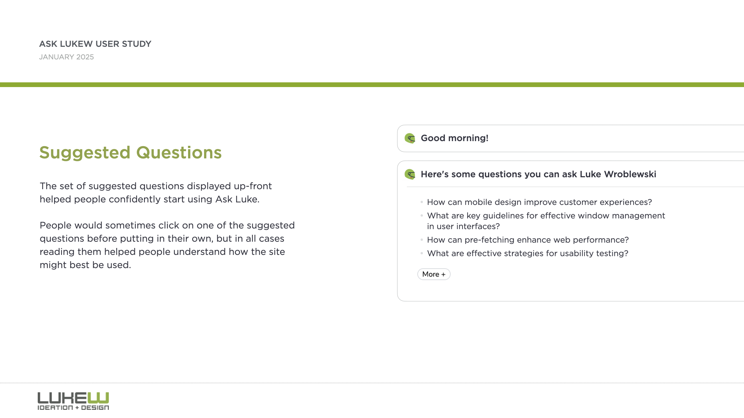
Suggested questions and citations played a big role in this transition. People would sometimes click on one of the suggested questions before putting in their own, but in all cases reading suggested questions helped people understand how the site might best be used. After getting a response, one of the most important aspects for developing trust was seeing that answers had sources which led to any documents cited in the response.
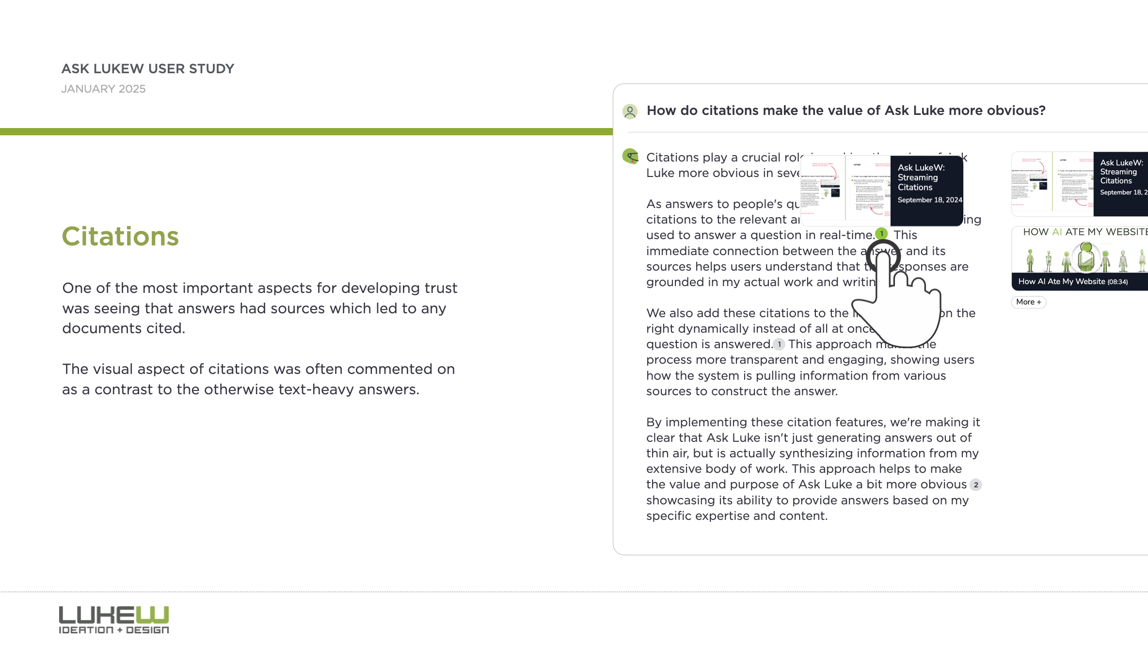
The visual aspect of citations was often commented on as a contrast to the otherwise text-heavy answers. People were often intimidated by large blocks of text and wanted to understand more through visuals. Getting specific examples was often brought up in this context. For example, clarifying design principles with an illustration of the pattern or anti-pattern.
"I feel like I'm just a pretty visual person. I know, like, a lot of the designers I work with are also, like, very visual people. And it might just be, like, a bias against blocks of text."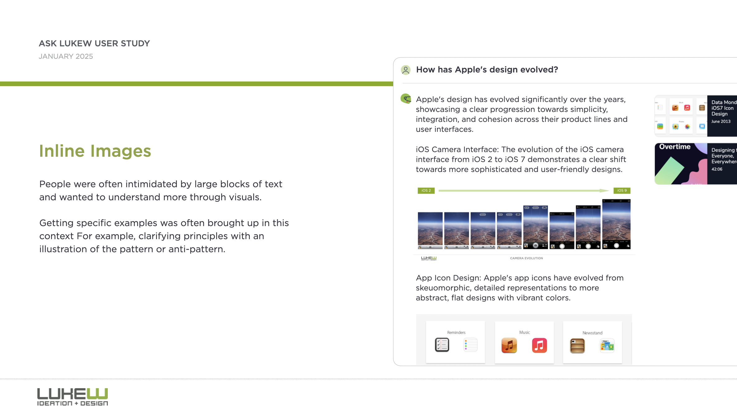
Some people ran into older content and had a fear that they were getting something that may be out of date. The older the content was, the more they had to think about whether it might still be information they could trust.
Some thought there were potential benefits in having an AI model with design expertise be usable with and have context on their design work. This was partly driven by the desire to keep all their stuff in one place.
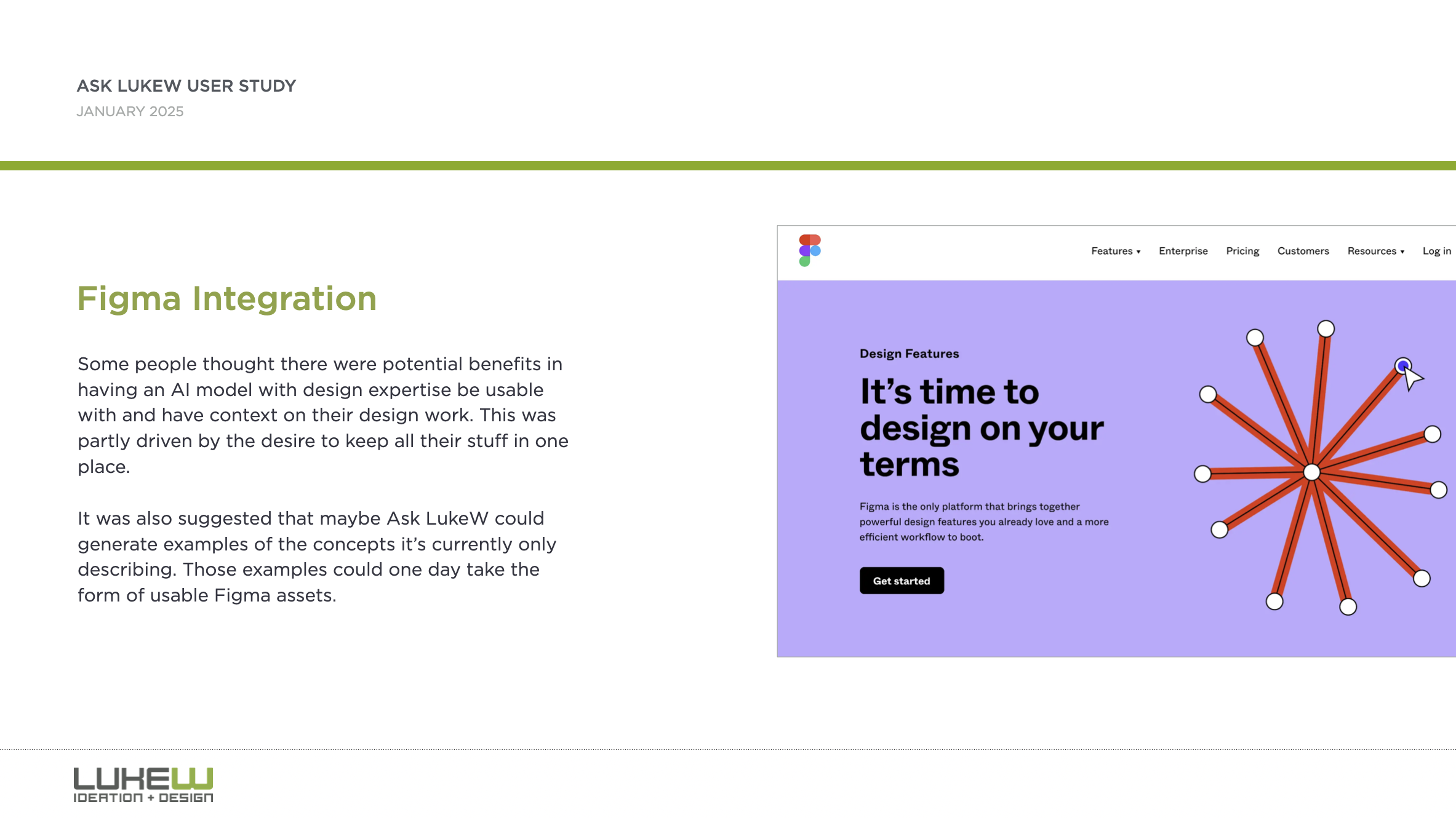
While a Figma integration is not in the cards for Ask LukeW now, making improvements to retrieval to address perceptions of older content and displaying more inline media (like images) to better illustrate responses is now.
Thanks to Max Roytman for planing and running this study. You can grab the full results as PDF download if interested in learning more.
Further ReadingAdditional articles about what I've tried and learned by rethinking the design and development of my Website using large-scale AI models.
- New Ways into Web Content: rethinking how to design software with AI
- Integrated Audio Experiences & Memory: enabling specific content experiences
- Expanding Conversational User Interfaces: extending chat user interfaces
- Integrated Video Experiences: adding video experiences to conversational UI
- Integrated PDF Experiences: unique considerations when adding PDF experiences
- Dynamic Preview Cards: improving how generated answers are shared
- Text Generation Differences: testing the impact of AI new models
- PDF Parsing with Vision Models: using AI vision models to extract PDF contents
- Streaming Citations: citing relevant articles, videos, PDFs, etc. in real-time
- Streaming Inline Images: indexing & displaying relevant images in answers
- Custom Re-ranker: improving content retrieval to answer more questions
- Usability Study: testing a conversational AI interface with designers
Handwriting an SVG Heart, With Our Hearts
According to local grocery stores, it’s the Valentine’s Day season again, and what better way to express our love than with the symbol of love: a heart. A while back on CSS-Tricks, we shared several ways to draw hearts, and the response was dreamy. Check out all these amazing, heart-filled submissions in this collection on CodePen:
Temani Afif’s CSS Shapes site offers a super modern heart using only CSS:
CodePen Embed FallbackNow, to show my love, I wanted to do something personal, something crafty, something with a mild amount of effort.
L is for Love LinesHandwriting a love note is a classic romantic gesture, but have you considered handwriting an SVG? We won’t need some fancy vector drawing tool to express our love. Instead, we can open a blank HTML document and add an <svg> tag:
<svg> </svg>We’ll need a way to see what we are doing inside the “SVG realm” (as I like to call it), which is what the viewBox attribute provides. The 2D plane upon which vector graphics render is as infinite as our love, quite literally, complete with an x- and y-axis and all (like from math class).
We’ll set the start coordinates as 0 0 and end coordinates as 10 10 to make a handsome, square viewBox. Oh, and by the way, we don’t concern ourselves over pixels, rem values, or any other unit types; this is vector graphics, and we play by our own rules.
We add in these coordinates to the viewBox as a string of values:
<svg viewBox="0 0 10 10"> </svg>Now we can begin drawing our heart, with our heart. Let’s make a line. To do that, we’ll need to know a lot more about coordinates, and where to stick ’em. We’re able to draw a line with many points using the <path> element, which defines paths using the d attribute. SVG path commands are difficult to memorize, but the effort means you care. The path commands are:
- MoveTo: M, m
- LineTo: L, l, H, h, V, v
- Cubic Bézier curve: C, c, S, s
- Quadratic Bézier Curve: Q, q, T, t
- Elliptical arc curve: A, a
- ClosePath: Z, z
We’re only interested in drawing line segments for now, so together we’ll explore the first two: MoveTo and LineTo. MDN romantically describes MoveTo as picking up a drawing instrument, such as a pen or pencil: we aren’t yet drawing anything, just moving our pen to the point where we want to begin our confession of love.
We’ll MoveTo (M) the coordinates of (2,2) represented in the d attribute as M2,2:
<svg viewBox="0 0 10 10"> <path d="M2,2" /> </svg>Not surprising then to find that LineTo is akin to putting pen to paper and drawing from one point to another. Let’s draw the first segment of our heart by drawing a LineTo (L) with coordinates (4,4), represented as L2,2 next in the d attribute:
<svg viewBox="0 0 10 10"> <path d="M2,2 L4,4" /> </svg>We’ll add a final line segment as another LineTo L with coordinates (6,2), again appended to the d attribute as L6,2:
<svg viewBox="0 0 10 10"> <path d="M2,2 L4,4 L6,2" /> </svg>If you stop to preview what we’ve accomplished so far, you may be confused as it renders an upside-down triangle; that’s not quite a heart yet, Let’s fix that.
SVG shapes apply a fill by default, which we can remove with fill="none":
<svg viewBox="0 0 10 10"> <path d="M2,2 L4,4 L6,2" fill="none" /> </svg>Rather than filling in the shape, instead, let’s display our line path by adding a stroke, adding color to our heart.
<svg viewBox="0 0 10 10"> <path d="M2,2 L4,4 L6,2" fill="none" stroke="rebeccapurple" /> </svg>Next, add some weight to the stroke by increasing the stroke-width:
<svg viewBox="0 0 10 10"> <path d="M2,2 L4,4 L6,2" fill="none" stroke="rebeccapurple" stroke-width="4" /> </svg>Finally, apply a stroke-linecap of round (sorry, no time for butt jokes) to round off the start and end points of our line path, giving us that classic symbol of love:
<svg viewBox="0 0 10 10"> <path d="M2,2 L4,4 L6,2" fill="none" stroke="rebeccapurple" stroke-width="4" stroke-linecap="round" /> </svg> CodePen Embed FallbackPerfection. Now all that’s left to do is send it to that special someone.
💜
Handwriting an SVG Heart, With Our Hearts originally published on CSS-Tricks, which is part of the DigitalOcean family. You should get the newsletter.
Scroll Driven Animations Notebook
Adam’s such a mad scientist with CSS. He’s been putting together a series of “notebooks” that make it easy for him to demo code. He’s got one for gradient text, one for a comparison slider, another for accordions, and the list goes on.
One of his latest is a notebook of scroll-driven animations. They’re all impressive as heck, as you’d expect from Adam. But it’s the simplicity of the first few examples that I love most. Here I am recreating two of the effects in a CodePen, which you’ll want to view in the latest version of Chrome for support.
CodePen Embed FallbackThis is a perfect example of how a scroll-driven animation is simply a normal CSS animation, just tied to scrolling instead of the document’s default timeline, which starts on render. We’re talking about the same set of keyframes:
@keyframes slide-in-from-left { from { transform: translateX(-100%); } }All we have to do to trigger scrolling is call the animation and assign it to the timeline:
li { animation: var(--animation) linear both; animation-timeline: view(); }Notice how there’s no duration set on the animation. There’s no need to since we’re dealing with a scroll-based timeline instead of the document’s timeline. We’re using the view() function instead of the scroll() function, which acts sort of like JavsScript’s Intersection Observer where scrolling is based on where the element comes into view and intersects the scrollable area.
It’s easy to drop your jaw and ooo and ahh all over Adam’s demos, especially as they get more advanced. But just remember that we’re still working with plain ol’ CSS animations. The difference is the timeline they’re on.
Scroll Driven Animations Notebook originally published on CSS-Tricks, which is part of the DigitalOcean family. You should get the newsletter.
Typecasting and Viewport Transitions in CSS With tan(atan2())
We’ve been able to get the length of the viewport in CSS since… checks notes… 2013! Surprisingly, that was more than a decade ago. Getting the viewport width is as easy these days as easy as writing 100vw, but what does that translate to, say, in pixels? What about the other properties, like those that take a percentage, an angle, or an integer?
Think about changing an element’s opacity, rotating it, or setting an animation progress based on the screen size. We would first need the viewport as an integer — which isn’t currently possible in CSS, right?
What I am about to say isn’t a groundbreaking discovery, it was first described amazingly by Jane Ori in 2023. In short, we can use a weird hack (or feature) involving the tan() and atan2() trigonometric functions to typecast a length (such as the viewport) to an integer. This opens many new layout possibilities, but my first experience was while writing an Almanac entry in which I just wanted to make an image’s opacity responsive.
Resize the CodePen and the image will get more transparent as the screen size gets smaller, of course with some boundaries, so it doesn’t become invisible:
CodePen Embed FallbackThis is the simplest we can do, but there is a lot more. Take, for example, this demo I did trying to combine many viewport-related effects. Resize the demo and the page feels alive: objects move, the background changes and the text smoothly wraps in place.
CodePen Embed FallbackI think it’s really cool, but I am no designer, so that’s the best my brain could come up with. Still, it may be too much for an introduction to this typecasting hack, so as a middle-ground, I’ll focus only on the title transition to showcase how all of it works:
CodePen Embed Fallback Setting things upThe idea behind this is to convert 100vw to radians (a way to write angles) using atan2(), and then back to its original value using tan(), with the perk of coming out as an integer. It should be achieved like this:
:root { --int-width: tan(atan2(100vw, 1px)); }But! Browsers aren’t too keep on this method, so a lot more wrapping is needed to make it work across all browsers. The following may seem like magic (or nonsense), so I recommend reading Jane’s post to better understand it, but this way it will work in all browsers:
@property --100vw { syntax: "<length>"; initial-value: 0px; inherits: false; } :root { --100vw: 100vw; --int-width: calc(10000 * tan(atan2(var(--100vw), 10000px))); }Don’t worry too much about it. What’s important is our precious --int-width variable, which holds the viewport size as an integer!
CodePen Embed Fallback Wideness: One number to rule them allRight now we have the viewport as an integer, but that’s just the first step. That integer isn’t super useful by itself. We oughta convert it to something else next since:
- different properties have different units, and
- we want each property to go from a start value to an end value.
Think about an image’s opacity going from 0 to 1, an object rotating from 0deg to 360deg, or an element’s offset-distance going from 0% to 100%. We want to interpolate between these values as --int-width gets bigger, but right now it’s just an integer that usually ranges between 0 to 1600, which is inflexible and can’t be easily converted to any of the end values.
The best solution is to turn --int-width into a number that goes from 0 to 1. So, as the screen gets bigger, we can multiply it by the desired end value. Lacking a better name, I call this “0-to-1” value --wideness. If we have --wideness, all the last examples become possible:
/* If `--wideness is 0.5 */ .element { opacity: var(--wideness); /* is 0.5 */ translate: rotate(calc(wideness(400px, 1200px) * 360deg)); /* is 180deg */ offset-distance: calc(var(--wideness) * 100%); /* is 50% */ }So --wideness is a value between 0 to 1 that represents how wide the screen is: 0 represents when the screen is narrow, and 1 represents when it’s wide. But we still have to set what those values mean in the viewport. For example, we may want 0 to be 400px and 1 to be 1200px, our viewport transitions will run between these values. Anything below and above is clamped to 0 and 1, respectively.
In CSS, we can write that as follows:
:root { /* Both bounds are unitless */ --lower-bound: 400; --upper-bound: 1200; --wideness: calc( (clamp(var(--lower-bound), var(--int-width), var(--upper-bound)) - var(--lower-bound)) / (var(--upper-bound) - var(--lower-bound)) ); }Besides easy conversions, the --wideness variable lets us define the lower and upper limits in which the transition should run. And what’s even better, we can set the transition zone at a middle spot so that the user can see it in its full glory. Otherwise, the screen would need to be 0px so that --wideness reaches 0 and who knows how wide to reach 1.
CodePen Embed Fallback We got the --wideness. What’s next?For starters, the title’s markup is divided into spans since there is no CSS-way to select specific words in a sentence:
<h1><span>Resize</span> and <span>enjoy!</span></h1>And since we will be doing the line wrapping ourselves, it’s important to unset some defaults:
h1 { position: absolute; /* Keeps the text at the center */ white-space: nowrap; /* Disables line wrapping */ }The transition should work without the base styling, but it’s just too plain-looking. They are below if you want to copy them onto your stylesheet:
CodePen Embed FallbackAnd just as a recap, our current hack looks like this:
@property --100vw { syntax: "<length>"; initial-value: 0px; inherits: false; } :root { --100vw: 100vw; --int-width: calc(10000 * tan(atan2(var(--100vw), 10000px))); --lower-bound: 400; --upper-bound: 1200; --wideness: calc( (clamp(var(--lower-bound), var(--int-width), var(--upper-bound)) - var(--lower-bound)) / (var(--upper-bound) - var(--lower-bound)) ); }OK, enough with the set-up. It’s time to use our new values and make the viewport transition. We first gotta identify how the title should be rearranged for smaller screens: as you saw in the initial demo, the first span goes up and right, while the second span does the opposite and goes down and left. So, the end position for both spans translates to the following values:
h1 { span:nth-child(1) { display: inline-block; /* So transformations work */ position: relative; bottom: 1.2lh; left: 50%; transform: translate(-50%); } span:nth-child(2) { display: inline-block; /* So transformations work */ position: relative; bottom: -1.2lh; left: -50%; transform: translate(50%); } }Before going forward, both formulas are basically the same, but with different signs. We can rewrite them at once bringing one new variable: --direction. It will be either 1 or -1 and define which direction to run the transition:
h1 { span { display: inline-block; position: relative; bottom: calc(1.2lh * var(--direction)); left: calc(50% * var(--direction)); transform: translate(calc(-50% * var(--direction))); } span:nth-child(1) { --direction: 1; } span:nth-child(2) { --direction: -1; } } CodePen Embed FallbackThe next step would be bringing --wideness into the formula so that the values change as the screen resizes. However, we can’t just multiply everything by --wideness. Why? Let’s see what happens if we do:
span { display: inline-block; position: relative; bottom: calc(var(--wideness) * 1.2lh * var(--direction)); left: calc(var(--wideness) * 50% * var(--direction)); transform: translate(calc(var(--wideness) * -50% * var(--direction))); }As you’ll see, everything is backwards! The words wrap when the screen is too wide, and unwrap when the screen is too narrow:
CodePen Embed FallbackUnlike our first examples, in which the transition ends as --wideness increases from 0 to 1, we want to complete the transition as --wideness decreases from 1 to 0, i.e. while the screen gets smaller the properties need to reach their end value. This isn’t a big deal, as we can rewrite our formula as a subtraction, in which the subtracting number gets bigger as --wideness increases:
span { display: inline-block; position: relative; bottom: calc((1.2lh - var(--wideness) * 1.2lh) * var(--direction)); left: calc((50% - var(--wideness) * 50%) * var(--direction)); transform: translate(calc((-50% - var(--wideness) * -50%) * var(--direction))); }And now everything moves in the right direction while resizing the screen!
CodePen Embed FallbackHowever, you will notice how words move in a straight line and some words overlap while resizing. We can’t allow this since a user with a specific screen size may get stuck at that point in the transition. Viewport transitions are cool, but not at the expense of ruining the experience for certain screen sizes.
Instead of moving in a straight line, words should move in a curve such that they pass around the central word. Don’t worry, making a curve here is easier than it looks: just move the spans twice as fast in the x-axis as they do in the y-axis. This can be achieved by multiplying --wideness by 2, although we have to cap it at 1 so it doesn’t overshoot past the final value.
span { display: inline-block; position: relative; bottom: calc((1.2lh - var(--wideness) * 1.2lh) * var(--direction)); left: calc((50% - min(var(--wideness) * 2, 1) * 50%) * var(--direction)); transform: translate(calc((-50% - min(var(--wideness) * 2, 1) * -50%) * var(--direction))); }Look at that beautiful curve, just avoiding the central text:
CodePen Embed Fallback This is just the beginning!It’s surprising how powerful having the viewport as an integer can be, and what’s even crazier, the last example is one of the most basic transitions you could make with this typecasting hack. Once you do the initial setup, I can imagine a lot more possible transitions, and --widenesss is so useful, it’s like having a new CSS feature right now.
I expect to see more about “Viewport Transitions” in the future because they do make websites feel more “alive” than adaptive.
Typecasting and Viewport Transitions in CSS With tan(atan2()) originally published on CSS-Tricks, which is part of the DigitalOcean family. You should get the newsletter.
Organizing Design System Component Patterns With CSS Cascade Layers
I’m trying to come up with ways to make components more customizable, more efficient, and easier to use and understand, and I want to describe a pattern I’ve been leaning into using CSS Cascade Layers.
I enjoy organizing code and find cascade layers a fantastic way to organize code explicitly as the cascade looks at it. The neat part is, that as much as it helps with “top-level” organization, cascade layers can be nested, which allows us to author more precise styles based on the cascade.
The only downside here is your imagination, nothing stops us from over-engineering CSS. And to be clear, you may very well consider what I’m about to show you as a form of over-engineering. I think I’ve found a balance though, keeping things simple yet organized, and I’d like to share my findings.
The anatomy of a CSS component patternLet’s explore a pattern for writing components in CSS using a button as an example. Buttons are one of the more popular components found in just about every component library. There’s good reason for that popularity because buttons can be used for a variety of use cases, including:
- performing actions, like opening a drawer,
- navigating to different sections of the UI, and
- holding some form of state, such as focus or hover.
And buttons come in several different flavors of markup, like <button>, input[type="button"], and <a class="button">. There are even more ways to make buttons than that, if you can believe it.
On top of that, different buttons perform different functions and are often styled accordingly so that a button for one type of action is distinguished from another. Buttons also respond to state changes, such as when they are hovered, active, and focused. If you have ever written CSS with the BEM syntax, we can sort of think along those lines within the context of cascade layers.
.button {} .button-primary {} .button-secondary {} .button-warning {} /* etc. */Okay, now, let’s write some code. Specifically, let’s create a few different types of buttons. We’ll start with a .button class that we can set on any element that we want to be styled as, well, a button! We already know that buttons come in different flavors of markup, so a generic .button class is the most reusable and extensible way to select one or all of them.
.button { /* Styles common to all buttons */ } Using a cascade layerThis is where we can insert our very first cascade layer! Remember, the reason we want a cascade layer in the first place is that it allows us to set the CSS Cascade’s reading order when evaluating our styles. We can tell CSS to evaluate one layer first, followed by another layer, then another — all according to the order we want. This is an incredible feature that grants us superpower control over which styles “win” when applied by the browser.
We’ll call this layer components because, well, buttons are a type of component. What I like about this naming is that it is generic enough to support other components in the future as we decide to expand our design system. It scales with us while maintaining a nice separation of concerns with other styles we write down the road that maybe aren’t specific to components.
/* Components top-level layer */ @layer components { .button { /* Styles common to all buttons */ } } Nesting cascade layersHere is where things get a little weird. Did you know you can nest cascade layers inside classes? That’s totally a thing. So, check this out, we can introduce a new layer inside the .button class that’s already inside its own layer. Here’s what I mean:
/* Components top-level layer */ @layer components { .button { /* Component elements layer */ @layer elements { /* Styles */ } } }This is how the browser interprets that layer within a layer at the end of the day:
@layer components { @layer elements { .button { /* button styles... */ } } }This isn’t a post just on nesting styles, so I’ll just say that your mileage may vary when you do it. Check out Andy Bell’s recent article about using caution with nested styles.
Structuring stylesSo far, we’ve established a .button class inside of a cascade layer that’s designed to hold any type of component in our design system. Inside that .button is another cascade layer, this one for selecting the different types of buttons we might encounter in the markup. We talked earlier about buttons being <button>, <input>, or <a> and this is how we can individually select style each type.
We can use the :is() pseudo-selector function as that is akin to saying, “If this .button is an <a> element, then apply these styles.”
/* Components top-level layer */ @layer components { .button { /* Component elements layer */ @layer elements { /* styles common to all buttons */ &:is(a) { /* <a> specific styles */ } &:is(button) { /* <button> specific styles */ } /* etc. */ } } } Defining default button stylesI’m going to fill in our code with the common styles that apply to all buttons. These styles sit at the top of the elements layer so that they are applied to any and all buttons, regardless of the markup. Consider them default button styles, so to speak.
/* Components top-level layer */ @layer components { .button { /* Component elements layer */ @layer elements { background-color: darkslateblue; border: 0; color: white; cursor: pointer; display: grid; font-size: 1rem; font-family: inherit; line-height: 1; margin: 0; padding-block: 0.65rem; padding-inline: 1rem; place-content: center; width: fit-content; } } } Defining button state stylesWhat should our default buttons do when they are hovered, clicked, or in focus? These are the different states that the button might take when the user interacts with them, and we need to style those accordingly.
I’m going to create a new cascade sub-layer directly under the elements sub-layer called, creatively, states:
/* Components top-level layer */ @layer components { .button { /* Component elements layer */ @layer elements { /* Styles common to all buttons */ } /* Component states layer */ @layer states { /* Styles for specific button states */ } } }Pause and reflect here. What states should we target? What do we want to change for each of these states?
Some states may share similar property changes, such as :hover and :focus having the same background color. Luckily, CSS gives us the tools we need to tackle such problems, using the :where() function to group property changes based on the state. Why :where() instead of :is()? :where() comes with zero specificity, meaning it’s a lot easier to override than :is(), which takes the specificity of the element with the highest specificity score in its arguments. Maintaining low specificity is a virtue when it comes to writing scalable, maintainable CSS.
/* Component states layer */ @layer states { &:where(:hover, :focus-visible) { /* button hover and focus state styles */ } }But how do we update the button’s styles in a meaningful way? What I mean by that is how do we make sure that the button looks like it’s hovered or in focus? We could just slap a new background color on it, but ideally, the color should be related to the background-color set in the elements layer.
So, let’s refactor things a bit. Earlier, I set the .button element’s background-color to darkslateblue. I want to reuse that color, so it behooves us to make that into a CSS variable so we can update it once and have it apply everywhere. Relying on variables is yet another virtue of writing scalable and maintainable CSS.
I’ll create a new variable called --button-background-color that is initially set to darkslateblue and then set it on the default button styles:
/* Component elements layer */ @layer elements { --button-background-color: darkslateblue; background-color: var(--button-background-color); border: 0; color: white; cursor: pointer; display: grid; font-size: 1rem; font-family: inherit; line-height: 1; margin: 0; padding-block: 0.65rem; padding-inline: 1rem; place-content: center; width: fit-content; }Now that we have a color stored in a variable, we can set that same variable on the button’s hovered and focused states in our other layer, using the relatively new color-mix() function to convert darkslateblue to a lighter color when the button is hovered or in focus.
Back to our states layer! We’ll first mix the color in a new CSS variable called --state-background-color:
/* Component states layer */ @layer states { &:where(:hover, :focus-visible) { /* custom property only used in state */ --state-background-color: color-mix( in srgb, var(--button-background-color), white 10% ); } }We can then apply that color as the background color by updating the background-color property.
/* Component states layer */ @layer states { &:where(:hover, :focus-visible) { /* custom property only used in state */ --state-background-color: color-mix( in srgb, var(--button-background-color), white 10% ); /* applying the state background-color */ background-color: var(--state-background-color); } } Defining modified button stylesAlong with elements and states layers, you may be looking for some sort of variation in your components, such as modifiers. That’s because not all buttons are going to look like your default button. You might want one with a green background color for the user to confirm a decision. Or perhaps you want a red one to indicate danger when clicked. So, we can take our existing default button styles and modify them for those specific use cases
If we think about the order of the cascade — always flowing from top to bottom — we don’t want the modified styles to affect the styles in the states layer we just made. So, let’s add a new modifiers layer in between elements and states:
/* Components top-level layer */ @layer components { .button { /* Component elements layer */ @layer elements { /* etc. */ } /* Component modifiers layer */ @layer modifiers { /* new layer! */ } /* Component states layer */ @layer states { /* etc. */ } }Similar to how we handled states, we can now update the --button-background-color variable for each button modifier. We could modify the styles further, of course, but we’re keeping things fairly straightforward to demonstrate how this system works.
We’ll create a new class that modifies the background-color of the default button from darkslateblue to darkgreen. Again, we can rely on the :is() selector because we want the added specificity in this case. That way, we override the default button style with the modifier class. We’ll call this class .success (green is a “successful” color) and feed it to :is():
/* Component modifiers layer */ @layer modifiers { &:is(.success) { --button-background-color: darkgreen; } }If we add the .success class to one of our buttons, it becomes darkgreen instead darkslateblue which is exactly what we want. And since we already do some color-mix()-ing in the states layer, we’ll automatically inherit those hover and focus styles, meaning darkgreen is lightened in those states.
/* Components top-level layer */ @layer components { .button { /* Component elements layer */ @layer elements { --button-background-color: darkslateblue; background-color: var(--button-background-color); /* etc. */ /* Component modifiers layer */ @layer modifiers { &:is(.success) { --button-background-color: darkgreen; } } /* Component states layer */ @layer states { &:where(:hover, :focus) { --state-background-color: color-mix( in srgb, var(--button-background-color), white 10% ); background-color: var(--state-background-color); } } } } Putting it all togetherWe can refactor any CSS property we need to modify into a CSS custom property, which gives us a lot of room for customization.
/* Components top-level layer */ @layer components { .button { /* Component elements layer */ @layer elements { --button-background-color: darkslateblue; --button-border-width: 1px; --button-border-style: solid; --button-border-color: transparent; --button-border-radius: 0.65rem; --button-text-color: white; --button-padding-inline: 1rem; --button-padding-block: 0.65rem; background-color: var(--button-background-color); border: var(--button-border-width) var(--button-border-style) var(--button-border-color); border-radius: var(--button-border-radius); color: var(--button-text-color); cursor: pointer; display: grid; font-size: 1rem; font-family: inherit; line-height: 1; margin: 0; padding-block: var(--button-padding-block); padding-inline: var(--button-padding-inline); place-content: center; width: fit-content; } /* Component modifiers layer */ @layer modifiers { &:is(.success) { --button-background-color: darkgreen; } &:is(.ghost) { --button-background-color: transparent; --button-text-color: black; --button-border-color: darkslategray; --button-border-width: 3px; } } /* Component states layer */ @layer states { &:where(:hover, :focus) { --state-background-color: color-mix( in srgb, var(--button-background-color), white 10% ); background-color: var(--state-background-color); } } } } CodePen Embed FallbackP.S. Look closer at that demo and check out how I’m adjusting the button’s background using light-dark() — then go read Sara Joy’s “Come to the light-dark() Side” for a thorough rundown of how that works!
What do you think? Is this something you would use to organize your styles? I can see how creating a system of cascade layers could be overkill for a small project with few components. But even a little toe-dipping into things like we just did illustrates how much power we have when it comes to managing — and even taming — the CSS Cascade. Buttons are deceptively complex but we saw how few styles it takes to handle everything from the default styles to writing the styles for their states and modified versions.
Organizing Design System Component Patterns With CSS Cascade Layers originally published on CSS-Tricks, which is part of the DigitalOcean family. You should get the newsletter.
Make Any File a Template Using This Hidden macOS Tool
From MacRumors:
Stationery Pad is a handy way to nix a step in your workflow if you regularly use document templates on your Mac. The long-standing Finder feature essentially tells a file’s parent application to open a copy of it by default, ensuring that the original file remains unedited.
This works for any kind of file, including HTML, CSS, JavaScriprt, or what have you. You can get there with CMD+i or right-click and select “Get info.”
Make Any File a Template Using This Hidden macOS Tool originally published on CSS-Tricks, which is part of the DigitalOcean family. You should get the newsletter.
Ask LukeW: Custom Re-ranker
Since launching the Ask Luke feature on this website nearly two years ago, people have asked the system over 25,000 questions. But not all were getting answered even when they could have been. Enter... a custom re-ranker.
At a high-level, Ask Luke makes use of the thousands or articles, hundreds of presentations, and more I've authored over the years to answer people's questions about digital product design. To do so, we first process and clean-up all these files so we can retrieve the relevant parts of them when someone asks a question. After retrieval, those results are packaged up for Large Language Models to utilize when generating a reply.
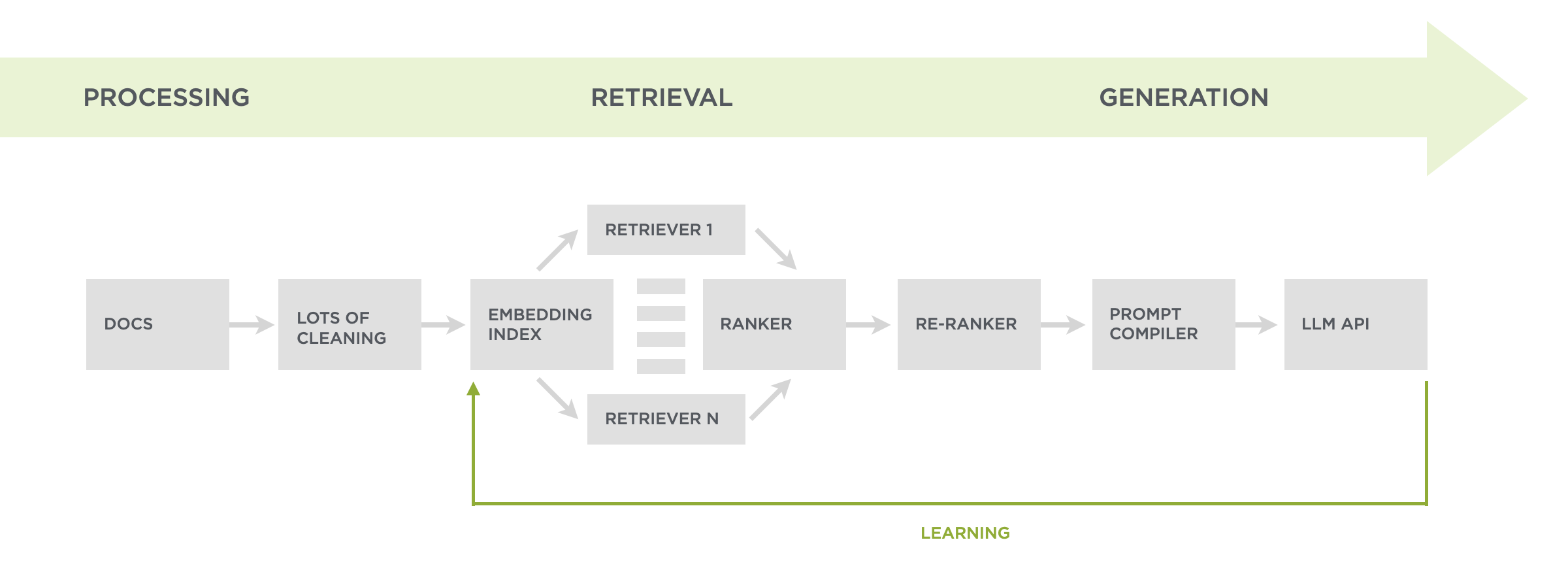
To find the parts of all these documents that can best answer any given question, we do both an embedding search (in vector space) and a keyword search. This combination of retrieval techniques ensures we're finding content that talks about related topics and specifically matches unique terms. Keyword search was a later addition after we saw that embeddings, which are great at semantic search, could miss needles in the haystack. For example, a concept like PID.
The results of both these searches get diversified to make sure we're not just repeating the same content. For example, I've given the same talk at different events so no need to use two versions. What's left of our search results is then filtered by a relevance score. If it meets the threshold, we include it in our instructions for whatever Large Language Model is being used for generation. Usually we fill up an LLM's context window with about ten results.
While these retrieval techniques work to answer most people's questions, they sometimes miss out on useful but not directly relevant content. So why not just lower the threshold to make use of more content when responding? We tried but irrelevant content would regularly pollute answers. After some experimentation, a custom re-ranker helped the most to expand coverage while maintaining quality. Questions that were not answered before now had useful replies as the images above and below illustrate.
What does the re-ranker do? If we don't have ten results that meet our relevance threshold. We take any results that meet a lower threshold and send them (in parallel) to a fast AI model (like Gemini Flash 2.0) that evaluates how well each could answer the question. Any results deemed useful are then used to backfill the instructions for content generation resulting in a wider set of questions we can answer well.
Further ReadingAdditional articles about what I've tried and learned by rethinking the design and development of my Website using large-scale AI models.
- New Ways into Web Content: rethinking how to design software with AI
- Integrated Audio Experiences & Memory: enabling specific content experiences
- Expanding Conversational User Interfaces: extending chat user interfaces
- Integrated Video Experiences: adding video experiences to conversational UI
- Integrated PDF Experiences: unique considerations when adding PDF experiences
- Dynamic Preview Cards: improving how generated answers are shared
- Text Generation Differences: testing the impact of AI new models
- PDF Parsing with Vision Models: using AI vision models to extract PDF contents
- Streaming Citations: citing relevant articles, videos, PDFs, etc. in real-time
- Streaming Inline Images: indexing & displaying relevant images in answers
- Custom Re-ranker: improving content retrieval to answer more questions
Big thanks to Kian Sutarwala and Alex Peysakhovich for the development and AI research help.
Container query units: cqi and cqb
A little gem from Kevin Powell’s “HTML & CSS Tip of the Week” website, reminding us that using container queries opens up container query units for sizing things based on the size of the queried container.
cqi and cqb are similar to vw and vh, but instead of caring about the viewport, they care about their containers size.
cqi is your inline-size unit (usually width in horizontal writing modes), while cqbhandles block-size (usually height).
So, 1cqi is equivalent to 1% of the container’s inline size, and 1cqb is equal to 1% of the container’s block size. I’d be remiss not to mention the cqmin and cqmax units, which evaluate either the container’s inline or block size. So, we could say 50cqmax and that equals 50% of the container’s size, but it will look at both the container’s inline and block size, determine which is greater, and use that to calculate the final computed value.
That’s a nice dash of conditional logic. It can help maintain proportions if you think the writing mode might change on you, such as moving from horizontal to vertical.
Container query units: cqi and cqb originally published on CSS-Tricks, which is part of the DigitalOcean family. You should get the newsletter.
Chat Interfaces & Declaring Intent
There's lots of debate within UI design circles about the explosion of chat interfaces driven by large-scale AI models. While there's certainly pros and cons to open text fields, one thing they are great at is capturing user intent. Which today's AI-driven systems can increasingly fulfill.
At their inception, computers required humans to adapt to how they worked. Developers had to learn languages with sometimes punishing syntax (don't leave the semicolon out!). People needed to learn CLI commands like cd ls pwd and more. Even with graphical user interfaces (GUIS), we couldn't simply tell a computer what to do—we had to understand what computers could do and modify our behavior accordingly by clicking on windows, icons, menus, and more.
Google changed this paradigm with a simple yet powerful way for people to declare their intent: an empty search box. Just type whatever you want into Google and it will find you relevant information in response. This open ended interface not only became hugely popular (close to 9 billion searches per day). It also created an enormous business for Google because matching people's expressed needs with businesses that can fulfill them monetizes extremely well.
But Google's empty text box was limited to information retrieval.
The emergence of large-scale language models (LLMs) expanded what an open-ended declaration of intent could do. Instead of information retrieval, LLMs enabled information manipulation through an empty text box often referred to as a "chat interface". People could now tell systems using natural language (and even misspellings) to summarize content, transform text into poetry, and generate or restructure information in countless ways. And once again this open-ended interface became hugely popular (ChatGPT has 300 million weekly actives since launching in 2022).
The next logical step was combining these capabilities—merging information retrieval with manipulation, as seen in retrieval augmented generation RAG applications (like Ask Luke!), Perplexity, and ChatGPT with search integration.
But finding and manipulating information is just a subset of the things computers allow us to do. An enormous set of computer applications exists to enable actions of all shapes and sizes from editing images to managing sales teams. Finding the right action amongst these capabilities requires remembering the app and how to access and use the feature.
Increasingly, though, AI models can not only find the right action for a task, they can even create an action if it doesn't exist. Through tool use and tool synthesis, LLMs are continuously getting better at action retrieval and manipulation. So today's AI models can combine information retrieval and manipulation with action retrieval and manipulation.
If that sounds like a mouthful, it is. But the user interface for these systems is still primarily an open text-field which allows people to declare their intent. What's changed dramatically is that today's technology can do so much more to fulfill that intent. With such vast and emergent capabilities, why do we want to constrain them with UI?
We've moved from humans learning to speak computer to computers learning to understand humans and I, for one, don't want to go backwards, which is why I'm increasingly hesitant to add more UI to communicate the possibilities of AI-driven systems (despite 30 years of designing GUIs). Let's make the computers figure out what we want, not the other way around.
Do All AI Models Need To Be Assistants?
While most AI models default to a "helpful assistant" mode, different dialogue frameworks could enable new kinds of AI interactions or capabilities. Here's how alternative dialogue patterns could change how we interact with AI.
Arguably, the best current Large Language model for coding and language tasks is Anthropic's Claude. Claude was fine-tuned through an approach Anthropic calls Constitutional AI which frames Claude as a "helpful, honest, and harmless" assistant. This framing is embedded in their constitutional principles which guide Claude to:
- Stay honest without claiming emotions or opinions
- Remain harmless while maintaining clear professional boundaries
- Focus on task completion over engagement
But do all useful AI models need to be framed as helpful assistants? Could alternative frameworks create new possibilities for AI interaction? Education researcher Nicholas Burbules identified four main forms of dialogue back in the early nineties that could provide alternatives: inquiry, conversation, instruction, and debate.
- Inquiry emphasizes joint problem-solving, with both participants contributing insights and methods to find solutions collaboratively. Neither party claims complete knowledge, making it well-suited for research and complex problem exploration.
- Conversation, unlike task-oriented interactions, doesn't require a defined endpoint or solution, allowing ideas and perspectives to develop naturally through the exchange.
- Instruction follows a guided learning approach where questioning leads to understanding. The focus stays on developing the learner's capabilities rather than simply providing answers.
- Debate engages in critical examination of ideas through productive opposition. By testing positions against each other and exploring multiple viewpoints, this pattern helps strengthen arguments and clarify thinking.
Applying one these forms of dialogue to an overall framing for an AI models might lead to personalities that feel more like "rigorous challenger" or "thoughtful colleague" instead of "helpful assistant". While there's certainly a role for assistants in our lives, we work with and learn from lots of different kinds of people. Framing AI models using those differences might ultimately make them helpful in more ways then one.