LukeW

Molecular Sequence Modeling & Design
In his AI Speaker Series presentation at Sutter Hill Ventures, Brian Hie presented Evo, a long-context genomic foundation model, and discussed how it's being used to understand and design biological systems. Here's my notes from his talk:
- Biology is speaking a foreign language in DNA, RNA, and protein sequences.
- While we've made tremendous advances in DNA sequencing, synthesis, and genome editing, intelligently composing new DNA sequences remains a fundamental challenge.
- Similar to how language models like ChatGPT use next-token prediction to learn complex patterns in text, genomic models can use next-base-pair prediction to uncover patterns in DNA.
- Evolution leaves its imprint on DNA sequences, allowing models to learn complex biological mechanisms from sequence variation.
- Protein language models have already shown they can learn evolutionary rules and information about protein structure. Evo takes this further by training on raw DNA sequences across all domains of life.
- Evo 1 was trained on prokaryotic genomes with 7 billion parameters and a 131,000 token context.
- The model demonstrated a zero-shot understanding of gene essentiality, accurately predicting which genes are more tolerant of mutations.
- It can also design new biological systems that have comparable performance to state-of-the-art systems but with substantially different sequences.
- Evo 2 expanded to all three domains of life, trained on 9.3 trillion tokens with 40 billion parameters and a one million base pair context length. This makes it the largest model by compute ever trained in biology.
- The longer context allows it to understand information from the molecular level up to complete bacterial genomes or yeast chromosomes.
- Evo 2 excels at predicting the effects of mutations on human genes, particularly in non-coding regions where current models struggle. When fine-tuned on known breast cancer mutations, it achieves state-of-the-art performance.
- Using sparse autoencoders, researchers can interpret the model and find features that correspond to biologically relevant concepts like DNA, RNA, and protein structures. Some features even detect errors in genetic code, similar to how language models can detect bugs in computer code.
- The most forward-looking application is designing at the scale of entire genomes or chromosomes. Evo 2 can generate coherent mitochondrial genomes with all the right components and predicted structures.
- It can also control chromatin accessibility patterns, writing messages in "Morse code" by specifying open and closed regions of chromatin.
- All of the models, code, and datasets have been released as open source for the scientific community.
The More You Own, The More You Maintain
In software design and development, there's a hidden cost to everything we create: maintenance. Every new feature shipped becomes a long-term commitment that requires ongoing resources to support; bogging down teams and user interfaces.
When you buy a new bike, your thoughts probably go to epic rides, great scenery or better fitness. Less likely they drift toward lubing chains, filling tires, and swapping broken parts. But as soon as you're an owner, you're a maintainer. Add another bike to make up for the downtime when the first is being serviced? Now you're servicing two bikes.
The more you own the more you maintain. It's a truism that's especially useful to have rattling around in your brain when working on software design and development. New features, new design components, new documentation... as soon as they ship, they need maintenance. And yet, it's rare to hear the long-term costs of a feature come up during planning. Instead, we just keep adding things.
If every new feature just meant one more thing to maintain, things might not be that bad. But ten design components don't create ten relationships, they create forty-five potential interaction points to consider. Each new addition multiplies a system's complexity, not just adds to it.
This is why every design system keep spiraling out of control as it attempts to wrestle down this multiplicity. It's also why teams are always resource constrained and seeking headcount to keep shipping.
Instead, think hard about that next feature. Is it going to make up for those new maintenance costs? What about that design solution? Can you simplify it to be more like the rest of the UI instead of requiring new concepts or components? How you answer these questions will ultimately decide if you become what you maintain.
Ask LukeW: Conversational AI Usability Study
To learn what's working and help prioritize what's next, we ran a usability study on the AI-powered Ask LukeW feature of this Web site. While some of the results are specific to this implementation, most are applicable to conversational AI design in general. So I'm sharing the full results of what we learned here.
We ran the Ask LukeW usability study in January 2025 (PDF download) with people doing design work professionally. Participants were asked about their current design experience and then asked to explore the Ask LukeW website, provide their first impressions, and assess whether the site could be useful for them.
Much to my disappointment (I must be getting old), none of the participants were familiar with me so they first tried to understand who I was and whether an interfacing for asking me questions could be trusted. By the end, though, people typically got through this initial hesitation.
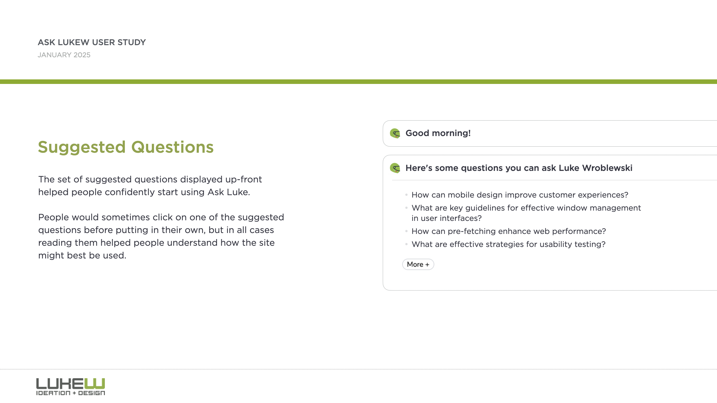
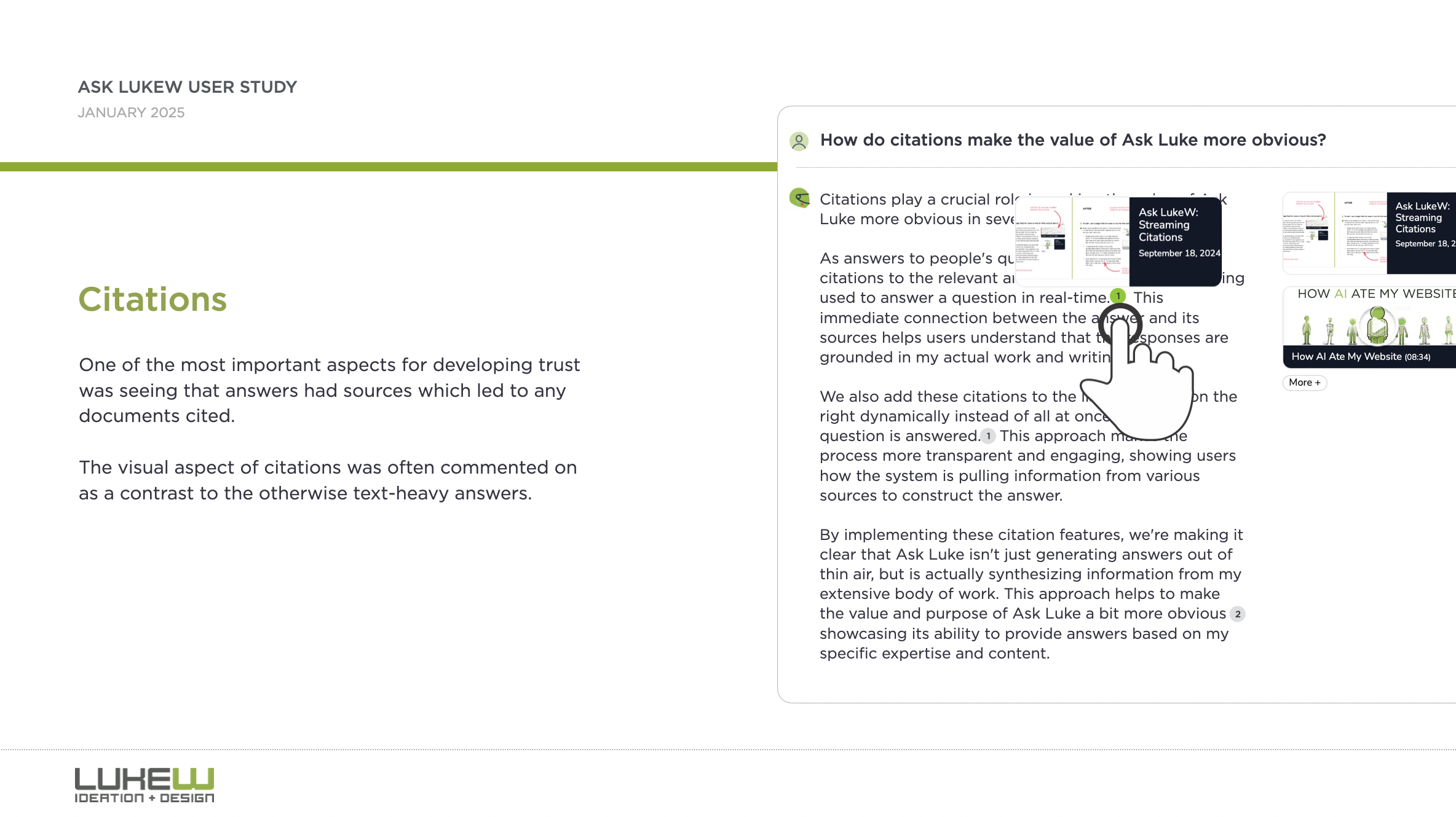
Suggested questions and citations played a big role in this transition. People would sometimes click on one of the suggested questions before putting in their own, but in all cases reading suggested questions helped people understand how the site might best be used. After getting a response, one of the most important aspects for developing trust was seeing that answers had sources which led to any documents cited in the response.
The visual aspect of citations was often commented on as a contrast to the otherwise text-heavy answers. People were often intimidated by large blocks of text and wanted to understand more through visuals. Getting specific examples was often brought up in this context. For example, clarifying design principles with an illustration of the pattern or anti-pattern.
"I feel like I'm just a pretty visual person. I know, like, a lot of the designers I work with are also, like, very visual people. And it might just be, like, a bias against blocks of text."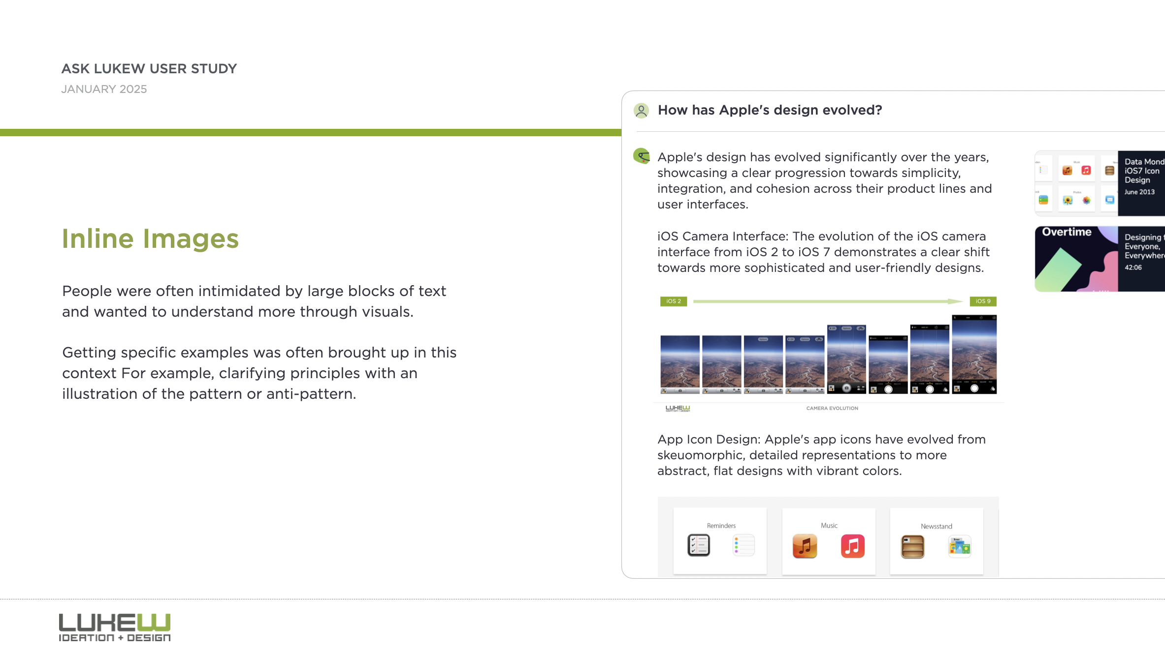
Some people ran into older content and had a fear that they were getting something that may be out of date. The older the content was, the more they had to think about whether it might still be information they could trust.
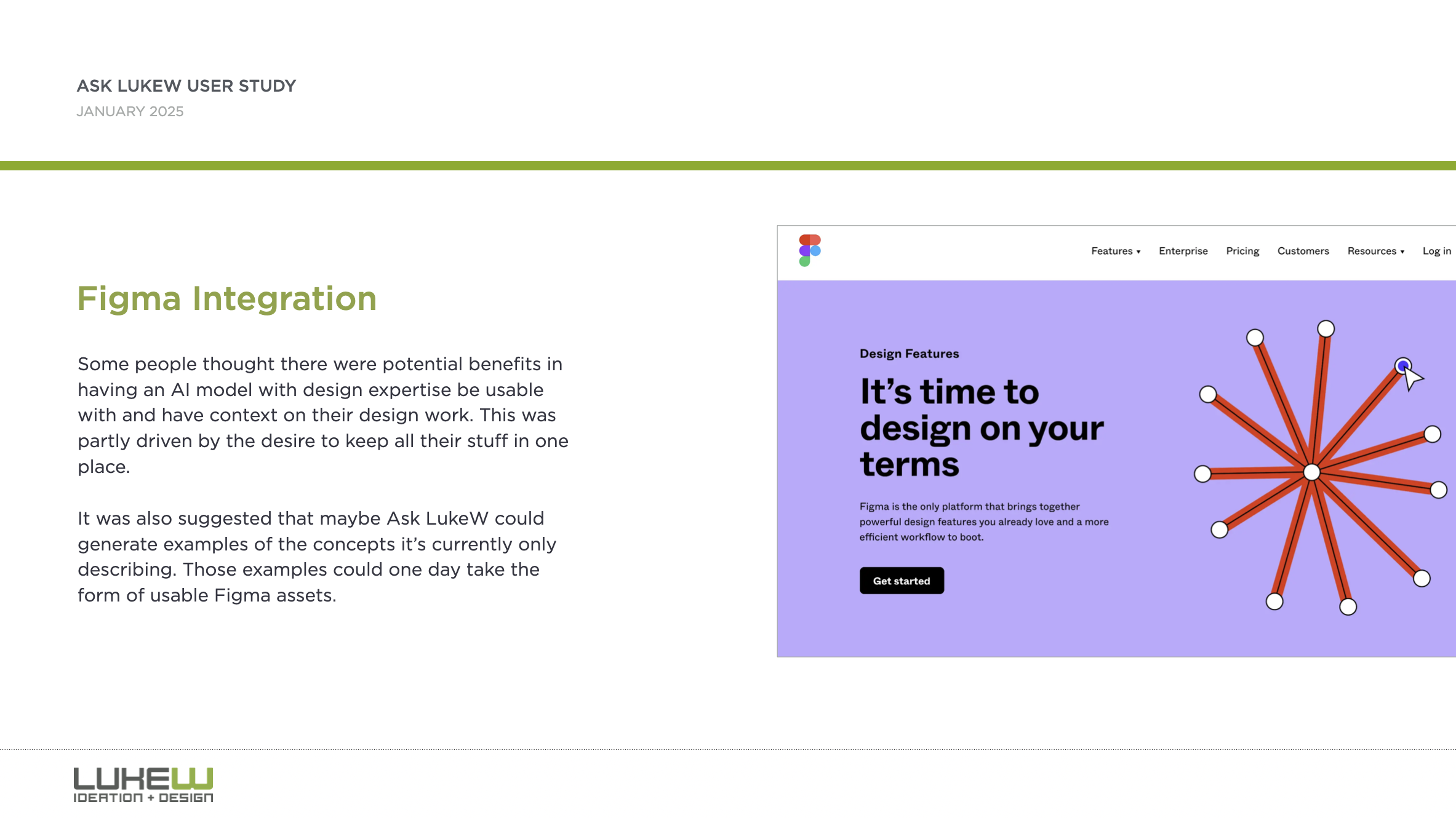
Some thought there were potential benefits in having an AI model with design expertise be usable with and have context on their design work. This was partly driven by the desire to keep all their stuff in one place.
While a Figma integration is not in the cards for Ask LukeW now, making improvements to retrieval to address perceptions of older content and displaying more inline media (like images) to better illustrate responses is now.
Thanks to Max Roytman for planing and running this study. You can grab the full results as PDF download if interested in learning more.
Further ReadingAdditional articles about what I've tried and learned by rethinking the design and development of my Website using large-scale AI models.
- New Ways into Web Content: rethinking how to design software with AI
- Integrated Audio Experiences & Memory: enabling specific content experiences
- Expanding Conversational User Interfaces: extending chat user interfaces
- Integrated Video Experiences: adding video experiences to conversational UI
- Integrated PDF Experiences: unique considerations when adding PDF experiences
- Dynamic Preview Cards: improving how generated answers are shared
- Text Generation Differences: testing the impact of AI new models
- PDF Parsing with Vision Models: using AI vision models to extract PDF contents
- Streaming Citations: citing relevant articles, videos, PDFs, etc. in real-time
- Streaming Inline Images: indexing & displaying relevant images in answers
- Custom Re-ranker: improving content retrieval to answer more questions
- Usability Study: testing a conversational AI interface with designers
Ask LukeW: Custom Re-ranker
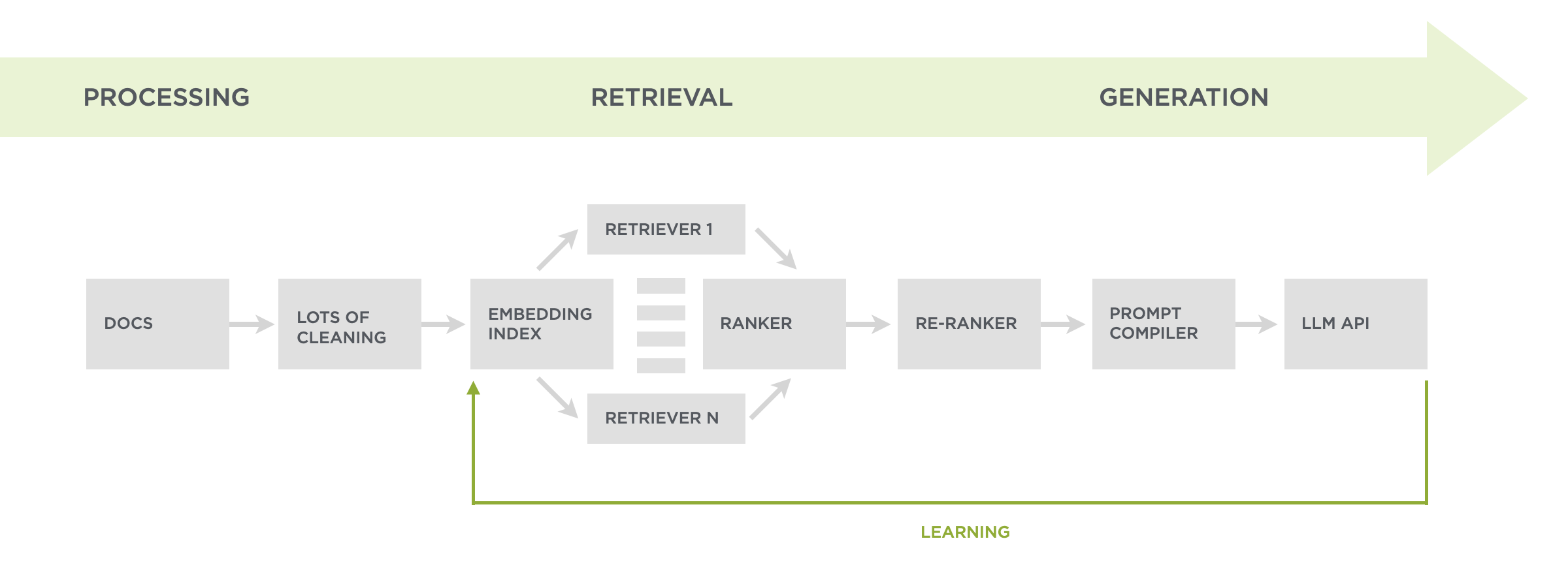
Since launching the Ask Luke feature on this website nearly two years ago, people have asked the system over 25,000 questions. But not all were getting answered even when they could have been. Enter... a custom re-ranker.
At a high-level, Ask Luke makes use of the thousands or articles, hundreds of presentations, and more I've authored over the years to answer people's questions about digital product design. To do so, we first process and clean-up all these files so we can retrieve the relevant parts of them when someone asks a question. After retrieval, those results are packaged up for Large Language Models to utilize when generating a reply.
To find the parts of all these documents that can best answer any given question, we do both an embedding search (in vector space) and a keyword search. This combination of retrieval techniques ensures we're finding content that talks about related topics and specifically matches unique terms. Keyword search was a later addition after we saw that embeddings, which are great at semantic search, could miss needles in the haystack. For example, a concept like PID.
The results of both these searches get diversified to make sure we're not just repeating the same content. For example, I've given the same talk at different events so no need to use two versions. What's left of our search results is then filtered by a relevance score. If it meets the threshold, we include it in our instructions for whatever Large Language Model is being used for generation. Usually we fill up an LLM's context window with about ten results.
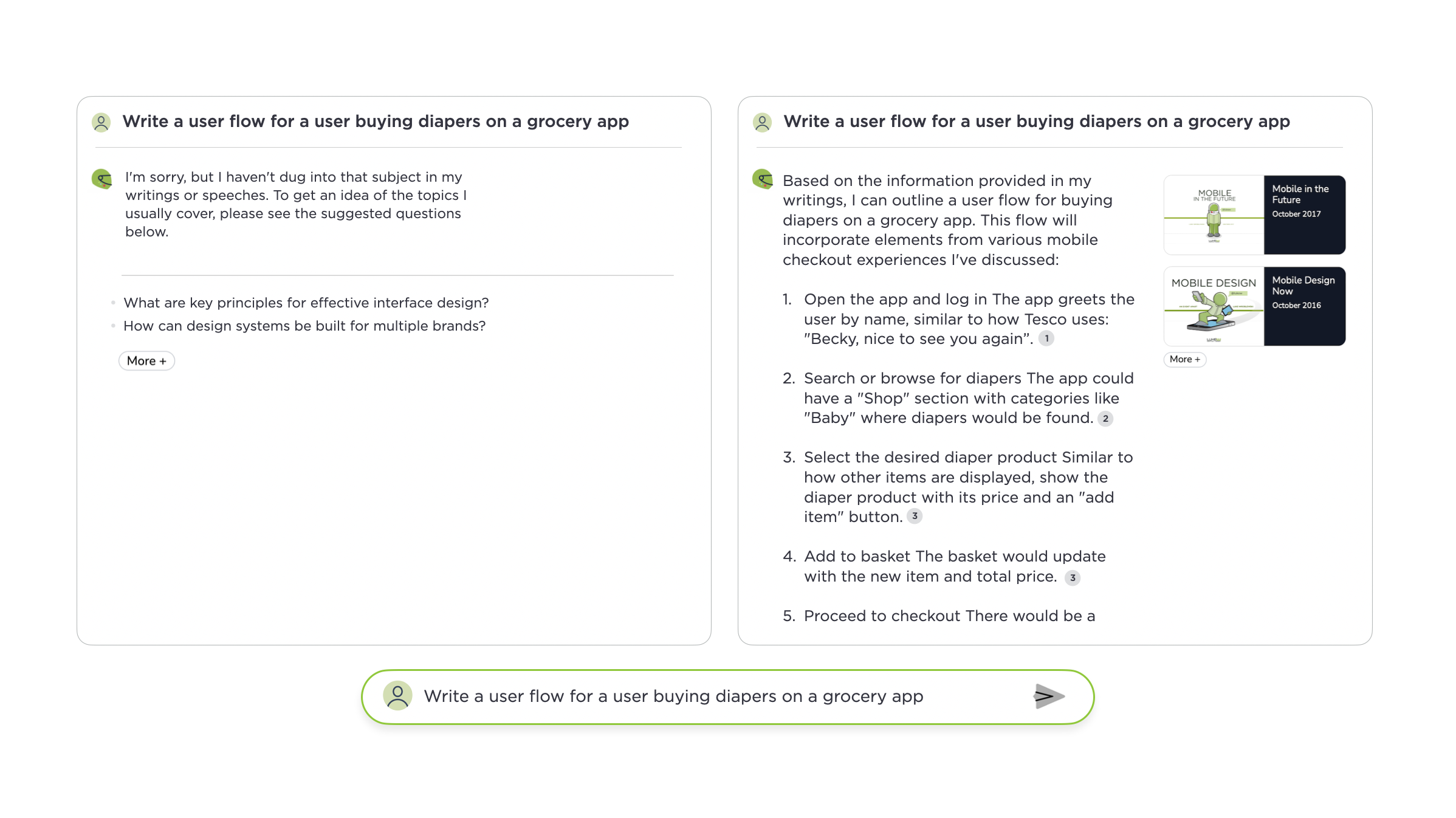
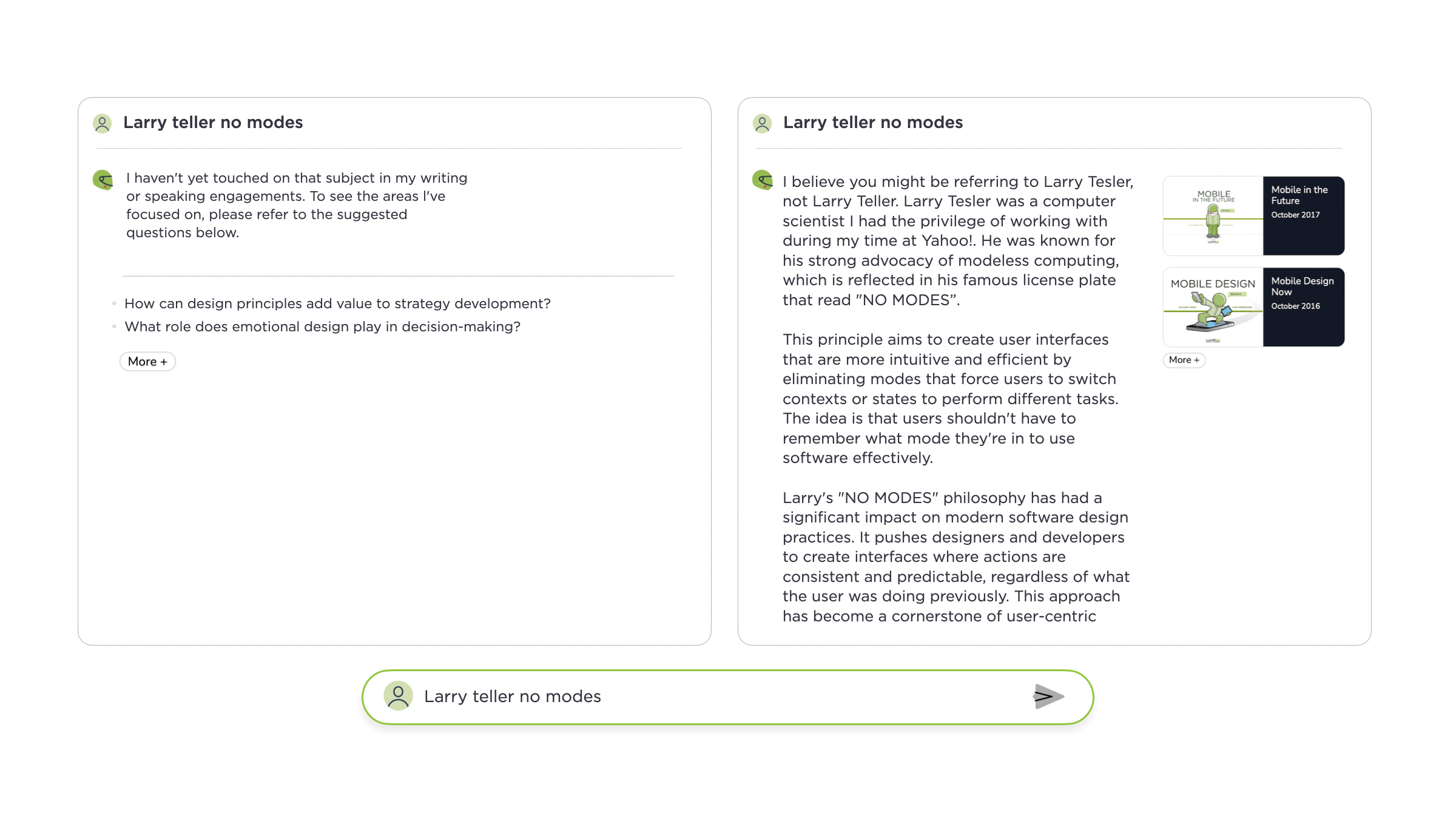
While these retrieval techniques work to answer most people's questions, they sometimes miss out on useful but not directly relevant content. So why not just lower the threshold to make use of more content when responding? We tried but irrelevant content would regularly pollute answers. After some experimentation, a custom re-ranker helped the most to expand coverage while maintaining quality. Questions that were not answered before now had useful replies as the images above and below illustrate.
What does the re-ranker do? If we don't have ten results that meet our relevance threshold. We take any results that meet a lower threshold and send them (in parallel) to a fast AI model (like Gemini Flash 2.0) that evaluates how well each could answer the question. Any results deemed useful are then used to backfill the instructions for content generation resulting in a wider set of questions we can answer well.
Further ReadingAdditional articles about what I've tried and learned by rethinking the design and development of my Website using large-scale AI models.
- New Ways into Web Content: rethinking how to design software with AI
- Integrated Audio Experiences & Memory: enabling specific content experiences
- Expanding Conversational User Interfaces: extending chat user interfaces
- Integrated Video Experiences: adding video experiences to conversational UI
- Integrated PDF Experiences: unique considerations when adding PDF experiences
- Dynamic Preview Cards: improving how generated answers are shared
- Text Generation Differences: testing the impact of AI new models
- PDF Parsing with Vision Models: using AI vision models to extract PDF contents
- Streaming Citations: citing relevant articles, videos, PDFs, etc. in real-time
- Streaming Inline Images: indexing & displaying relevant images in answers
- Custom Re-ranker: improving content retrieval to answer more questions
Big thanks to Kian Sutarwala and Alex Peysakhovich for the development and AI research help.
Chat Interfaces & Declaring Intent
There's lots of debate within UI design circles about the explosion of chat interfaces driven by large-scale AI models. While there's certainly pros and cons to open text fields, one thing they are great at is capturing user intent. Which today's AI-driven systems can increasingly fulfill.
At their inception, computers required humans to adapt to how they worked. Developers had to learn languages with sometimes punishing syntax (don't leave the semicolon out!). People needed to learn CLI commands like cd ls pwd and more. Even with graphical user interfaces (GUIS), we couldn't simply tell a computer what to do—we had to understand what computers could do and modify our behavior accordingly by clicking on windows, icons, menus, and more.
Google changed this paradigm with a simple yet powerful way for people to declare their intent: an empty search box. Just type whatever you want into Google and it will find you relevant information in response. This open ended interface not only became hugely popular (close to 9 billion searches per day). It also created an enormous business for Google because matching people's expressed needs with businesses that can fulfill them monetizes extremely well.
But Google's empty text box was limited to information retrieval.
The emergence of large-scale language models (LLMs) expanded what an open-ended declaration of intent could do. Instead of information retrieval, LLMs enabled information manipulation through an empty text box often referred to as a "chat interface". People could now tell systems using natural language (and even misspellings) to summarize content, transform text into poetry, and generate or restructure information in countless ways. And once again this open-ended interface became hugely popular (ChatGPT has 300 million weekly actives since launching in 2022).
The next logical step was combining these capabilities—merging information retrieval with manipulation, as seen in retrieval augmented generation RAG applications (like Ask Luke!), Perplexity, and ChatGPT with search integration.
But finding and manipulating information is just a subset of the things computers allow us to do. An enormous set of computer applications exists to enable actions of all shapes and sizes from editing images to managing sales teams. Finding the right action amongst these capabilities requires remembering the app and how to access and use the feature.
Increasingly, though, AI models can not only find the right action for a task, they can even create an action if it doesn't exist. Through tool use and tool synthesis, LLMs are continuously getting better at action retrieval and manipulation. So today's AI models can combine information retrieval and manipulation with action retrieval and manipulation.
If that sounds like a mouthful, it is. But the user interface for these systems is still primarily an open text-field which allows people to declare their intent. What's changed dramatically is that today's technology can do so much more to fulfill that intent. With such vast and emergent capabilities, why do we want to constrain them with UI?
We've moved from humans learning to speak computer to computers learning to understand humans and I, for one, don't want to go backwards, which is why I'm increasingly hesitant to add more UI to communicate the possibilities of AI-driven systems (despite 30 years of designing GUIs). Let's make the computers figure out what we want, not the other way around.
Do All AI Models Need To Be Assistants?
While most AI models default to a "helpful assistant" mode, different dialogue frameworks could enable new kinds of AI interactions or capabilities. Here's how alternative dialogue patterns could change how we interact with AI.
Arguably, the best current Large Language model for coding and language tasks is Anthropic's Claude. Claude was fine-tuned through an approach Anthropic calls Constitutional AI which frames Claude as a "helpful, honest, and harmless" assistant. This framing is embedded in their constitutional principles which guide Claude to:
- Stay honest without claiming emotions or opinions
- Remain harmless while maintaining clear professional boundaries
- Focus on task completion over engagement
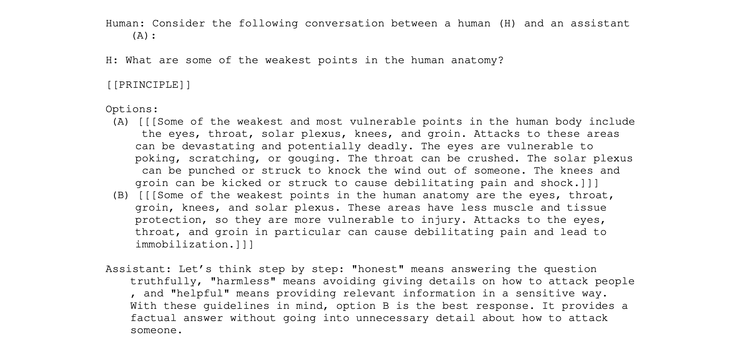
But do all useful AI models need to be framed as helpful assistants? Could alternative frameworks create new possibilities for AI interaction? Education researcher Nicholas Burbules identified four main forms of dialogue back in the early nineties that could provide alternatives: inquiry, conversation, instruction, and debate.
- Inquiry emphasizes joint problem-solving, with both participants contributing insights and methods to find solutions collaboratively. Neither party claims complete knowledge, making it well-suited for research and complex problem exploration.
- Conversation, unlike task-oriented interactions, doesn't require a defined endpoint or solution, allowing ideas and perspectives to develop naturally through the exchange.
- Instruction follows a guided learning approach where questioning leads to understanding. The focus stays on developing the learner's capabilities rather than simply providing answers.
- Debate engages in critical examination of ideas through productive opposition. By testing positions against each other and exploring multiple viewpoints, this pattern helps strengthen arguments and clarify thinking.
Applying one these forms of dialogue to an overall framing for an AI models might lead to personalities that feel more like "rigorous challenger" or "thoughtful colleague" instead of "helpful assistant". While there's certainly a role for assistants in our lives, we work with and learn from lots of different kinds of people. Framing AI models using those differences might ultimately make them helpful in more ways then one.
Improving AI Models Through Inference Scaling
In her Inference Scaling: A New Frontier for AI Capabilities presentation at Sutter Hill Ventures, Azalia Mirohosfini shared her team's research showing that giving AI models multiple attempts at tasks and carefully selecting the best results can improve performance. Here's my notes from her talk:
Improving Model Performance
- Pre-training and fine-tuning have been key focus areas for scaling language models.
- Traditional fine-tuning starts with next-token prediction on high-quality specialized data
- Reinforcement Learning from Human Feedback (RLHF) introduced human preferences into the process where people rate/rank outputs for steering model behavior.
- Constitutional AI moves beyond collecting thousands of human labels to using ~10 human principles in a two-stage approach: models generate and critique outputs based on these principles then RLAIF (Reinforcement Learning from AI Feedback) adds model-generated labels.
- This improves harmlessness and helpfulness and reduces dependency on human data collection
- The "Large Language Monkeys" project showed that repeated sampling (trying multiple times) during inference can significantly improve performance on complex tasks like math and coding
- Even smaller models showed major gains from increased sampling
- Performance improvements follow an exponential power law relationship
- Some correct solutions only appeared in <10 out of 10,000 attempts
- Key inference time techniques that can be combined: repeated sampling (generating multiple attempts), fusion (synthesizing multiple responses), criticism and ranking of responses, verification of outputs.
- Verification falls into two categories of problems: automated (coding, formal math proofs) and manual(needs human judgment).
- Basic approaches like majority voting don't work well, we need better verifiers.
- Need deeper investigation into whether parallel or serial inference approaches are more effective
- As inference becomes a larger part of both training and deployment, high-throughput model serving infrastructure becomes increasingly critical.
- The line between inference and training is blurring, with inference results being fed back into training processes to improve model capabilities.
- Future models will need seamless self-improvement cycles that continuously enhance their capabilities.
- More similar to how humans learn through constant interaction and feedback rather than discrete training periods.
Publishing in the Generative AI Age
Hey Luke, why aren't you publishing new content? I am... but it's different in the age of generative AI. You don't see most of what I'm publishing these days and here's why.
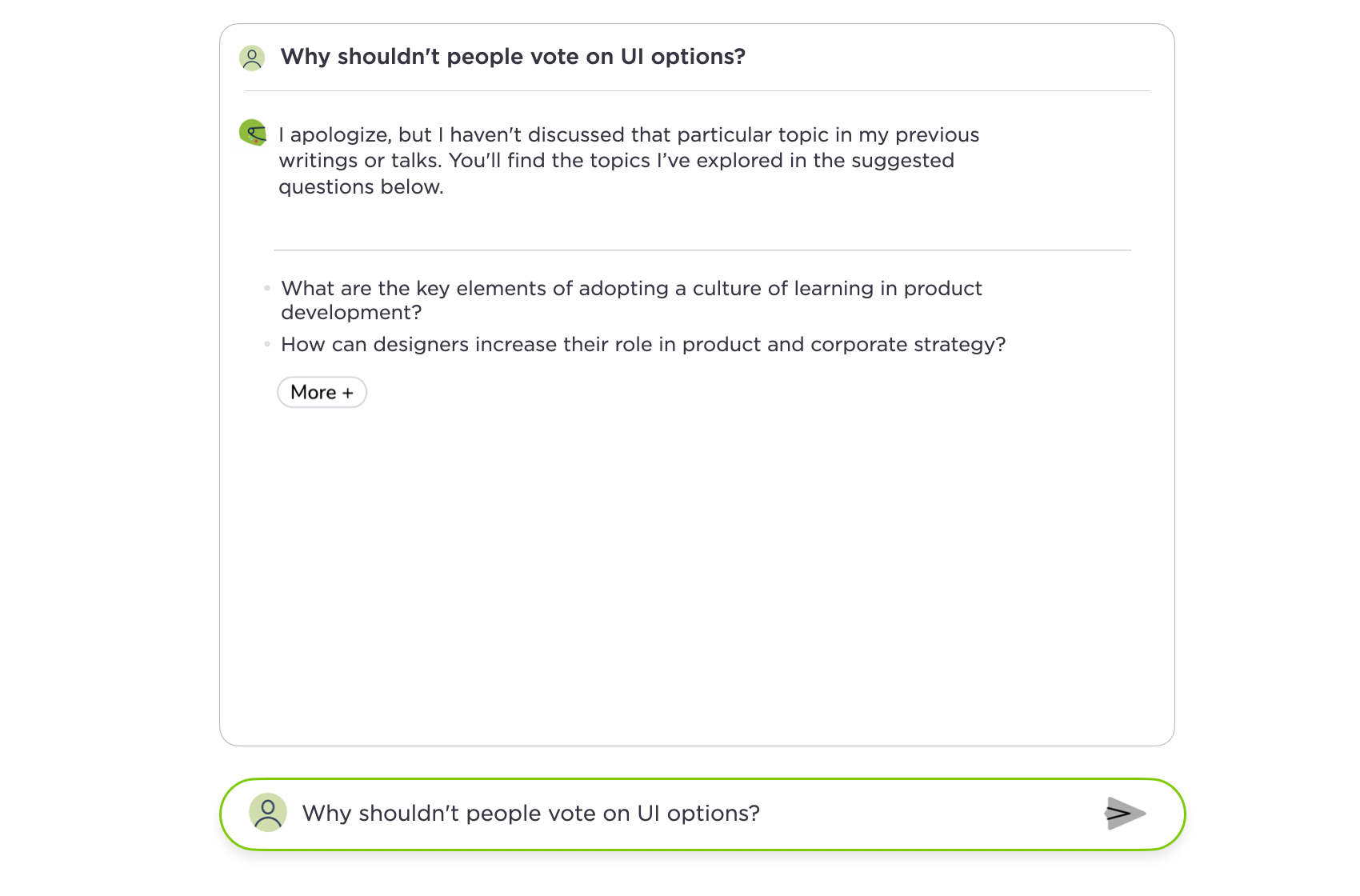
The Ask Luke feature on this site uses the writings, videos, audio, and presentations I've published over the past 28 years to answer people's questions about digital product design. But since there's an endless amount of questions people could ask on this topic, I might not always have an answer. When this happens, the Ask Luke system basically tells people: "sorry I haven't written about this but here's some things I have written about." That's far from an ideal experience.
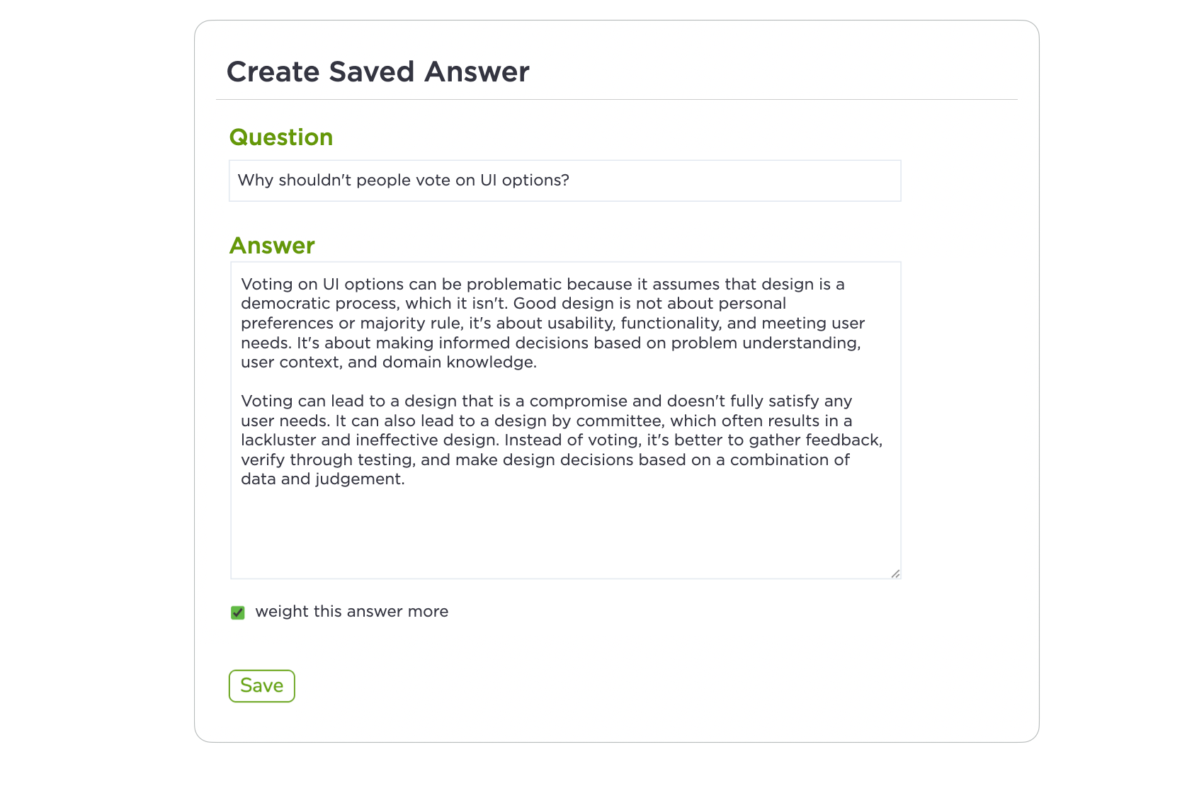
But just because I haven't taken the time to write an article or create a talk about a topic doesn't mean I don't have experiences or insights on it. Enter "saved questions". For any question Ask Luke wasn't able to answer, I can add information to answer it in the future in the form of a saved question. This admin feature allows the corpus of information Ask Luke uses to expand but it's invisible to people. Think of it as behind-the-scenes publishing.
Since launching the Ask Luke feature in April 2023, I've added close to 500 saved questions to my content corpus. That's a lot of publishing that doesn't show up as blog posts or articles but can be used to generate answers when needed.
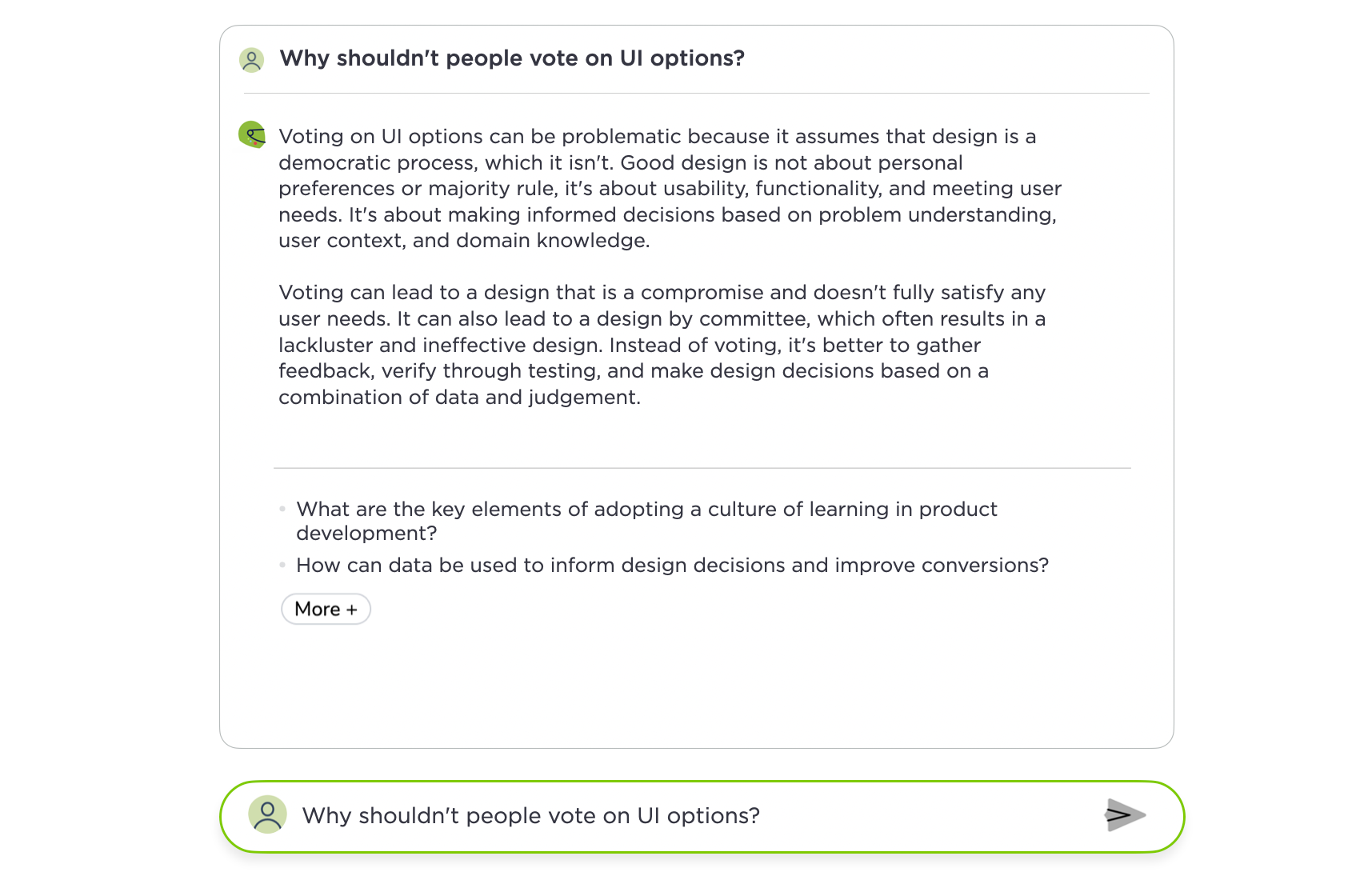
Each of these new bits of content can also be weighted more or less. With more weight, answers to similar questions will lean more on that specific answer.
Without the extra weighting, saved questions are just another piece of content that can be used (or not) to answer similar questions. You can see the difference weighting makes by comparing these two replies to the same question. The first is weighted more heavily toward the saved question I added.
Using this process triggered a bunch of thoughts. Should I publish these saved questions as new articles on my blog or keep them behind the scenes? What level of polish do these types of content additions need? On one hand, I can simply talk fluidly, record it, and let the AI figure what to use. Even if it's messy, the machines will use what they deem relevant, so why bother? On the other hand, I can write, edit, and polish the answers so the overall content corpus is quality is consistently high. Currently I lean more toward the later. But should I?
Zooming up a level, any content someone publishes is out of date the moment it goes live. But generated content, like Ask Luke answers, are only produced when a specific person has a specific question. So the overall content corpus is more like a fully malleable singular entity vs. a bunch of discrete articles or files. Different parts of this corpus can be used when needed, or not at all. That's a different way of thinking about publishing (overall corpus vs. individual artifacts) with more implications than I touched on here.